
Random Card of the Day |

Tuesday, March 30, 2021Set: 1922 Sport and Adventure Famous Footballers (Rate) “ Unless the image has been cropped this card is in immaculate condition. Amazing something from 1922 could be so pristine. ” -Id8jlb8666
3
“ “Given free with sport and adventure” is an interesting tag line ” -pugchump
1
“ The look i give my wife when she asks if im going to play fortnite or go to sleep. ” -parsley24
8
“ Nice vintage. Not bad for an almost 100 year old card. I hardly noticed the front was slightly off center to the right. The back it is more noticeable. ” -captkirk42
“ I don't imagine these are standard sized cards (even though alternate dimensions are not given), but yes, this is awesome! ” -bkklaos
“ Pretty sweet they tell you what the next week's card is on the back. ” -pjdionne12
“ Fred could use a V8. ” -NJDevils
1
“ I really was surprised this was from 1922. The color photo and the quality of the photo threw me off. Very very nice! ” -muskie027
|

Monday, March 29, 2021Set: 2005 Bowman Chrome - Blue Refractors (Rate) “ This card looks particularly nice with players in blue uniforms such as Dodgers & Blue Jays ” -abide
2
“ Like the contrast of blue and red, and all Refractors are great. This card's a winner. ” -Billy Kingsley
4
“ I might be in the minority but I love all the color parallels that Bowman has. ” -pugchump
2
“ Rated as Baseball Prospects 3rd best in gulf coast league in 2004. Wonder what happened to 1 and 2? ” -parsley24
“ Bowman Blue OH with a nice low serial number. OK. ” -captkirk42
“ Design on this one seems a little boring to me. ” -muskie027
|

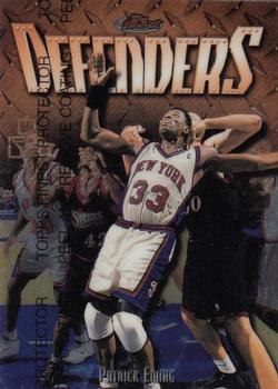
Sunday, March 28, 2021Set: 1999 Finest - Refractors (Rate) “ Love the set. Albert, that's good fundamentals using 2 hands to catch the ball. What's that in the background? Trees? Tornados? ” -abide
“ “Peel and remove coating”, never seen that before. Is that allowed for scans on this site? ” -pugchump
3
“ I didn't know this design was used for baseball, but that shouldn't be a surprise. I love the NBA version of it, quite possibly my favorite Finest design. At least in the running. Too bad the back scan is so washed out. ” -Billy Kingsley
1
“ Every sport needs it's protagonists. Albert Belle was a beast. Can't really tell it is a refractor. I like the Finest 1998 Moment on the back. The overall look is okay but protective film will always hold a special place in my collection. ” -pjdionne12
“ I didn't remember him as an Oriole. ” -muskie027
“ Nice design for one of the biggest misnamed brands. ” -captkirk42
“ Definitely a fall from grace, I hope he is doing better these days. ” -UKboogie
|

Friday, March 26, 2021Set: 2015 Topps Heritage (Rate) Card: #217 National League 2014 Home Run Leaders (Lucas Duda / Anthony Rizzo / Giancarlo Stanton) “ I like this card design and concept / subset within main set in Topps Flagship, I'm not a heritage fan, but I know a lot of my fellow collectors are. I wonder what they think about this. ” -abide
1
“ Nice looking card, reminds me of 1980’s era Topps. ” -Derek McDonough
“ These are the kinds of League Leaders cards I like. The top three on the front and a big long list on the back. Wish they still did them like this. ” -Gunny
14
“ I always like league leaders cards. And I still feel like Topps should bring back the 3-player league leaders cards.
Overall, good looking card. ” -mkb
“ Nice Heritage card. I really wish Topps would do the leader cards like this again. Now days the league leaders, team leaders, team cards, checklists and all those other fun "subset" cards look like regular player cards they are no longer "special". The look more like some attempt at a variation card or a parallel to the base card. ” -captkirk42
“ I get that these are a throwback to old Topps, but you know you roll your eyes when you pull this from a pack. ” -pjdionne12
“ You could win a lot of money in bar trivia if you knew Lucas Duda had this bronze medal on his mantle... ” -stdolan1
1
“ Look at that baby face on Rizzo ” -pugchump
|

Thursday, March 25, 2021Set: 2011-12 Montreal Canadiens (Rate) “ Hockey "police" card? Or just team card? Either way nice card. ” -captkirk42
“ We need more team issued card sets. Great buy for collectors. ” -OverkillKid
3
“ I like team issues including this card. Team issues sometimes will include players you won't find in any other issues. ” -Brendan Barrick
2
“ I like these team postcard sets but have no memory of this player and had to look him up. His career NHL totals: 15 games, 0 goals, 0 assists, 0 points, and 4 penalty minutes. He went on to play one season in the KHL after his NHL "career" ended and was out of hockey at 25. ” -bevans
“ Tres bien ” -NJDevils
“ Not sure what this one is. A card? Photo? No company name. Interesting. ” -muskie027
|

Wednesday, March 24, 2021Set: 1998 Pacific Paramount - Holographic Silver (Rate) “ talked to a guy at the Dallas show a couple days ago, and we agreed: Pacific made some great cards. Across their brands of Crown Collection, Paramount, Omega, Invincible, Revolution, Prism and so on, cool die cuts, and a plethora of parallels. ” -abide
8
“ Awkward timing for a Damon card! ” -pugchump
13
“ Nice looking card with a really good player
The Royals around 1999 & 2000 had arguably one of the best outfields in the MLB and a pretty good lineup
But that pitching man ” -mkb
4
“ good looking card, but i dont like pacific. graphics are blah ” -parsley24
“ Cool! Another card that got me to buy a box off eBay (yes, through the site...trying to do my part)! I know someone that used to work for Pacific Trading Cards, so I've always had a soft spot in my heart for them! ” -bkklaos
“ OK A Pacific set that due to the overuse or poor use of foil lettering I do not like. I used to say I liked most of Pacific's sets, but now I'm not so sure about that "most" part. The overall front design is OK but executed in foil letter that is near impossible to read. Combination font type and being in silver, gray or light powder blue lettering. Back more poor choice of font designs, plus vertical print. ” -captkirk42
“ Damon is one of my favorite players and I especially enjoyed him with the Royals. Never a fan of Pacific in the 90s but seem be growing more fond of it as I've grown older. I like how the shot captures his odd follow through and the little wave at the bottom is a nice touch. Wish his name was a little easier to read. I'd like to see this one in my collection. ” -andersonadams1
“ Is this the Disney Princess parallel? ” -pjdionne12
2
“ Not crazy about this . . . Very difficult to read any of the writing . . . poor font choice . . . (and don't blame it on the scan . . . it's a terrible card) . . . ” -georgecf
1
“ my favorite part of the pacific cards was the circle with the set name and card number made for easy identification ” -Thunderfoot
“ Wow, I almost forgot about his days as a Royal. It’s been awhile since I said it, but Pacific released some cool sets from the time period I was away from collecting. ” -muskie027
|

Tuesday, March 23, 2021Set: 2004 Leaf Rookies & Stars (Rate) “ I love game-used memorabilia and I love the Bengals. Even cooler that it's /750. I wish his name was bigger on the front but it's very cool either way. ” -pugchump
“ Old school "jersey" card (aka: relic, game used, event used, player worn, player used). Glad to see it serial numbered. ” -captkirk42
“ Good Looking jersey card right there ” -parsley24
1
“ I am glad that Panini still produces Rookies & Stars. I always enjoyed collecting Rookies and Stars. By the way this is a nice card. ” -Brendan Barrick
“ my first RCOTD ” -abide
1
“ I love a nice looking jersey card. This is one of them! ” -muskie027
|

Monday, March 22, 2021Set: 2016 Panini Origins (Rate) “ Inception? What is Inception? This was a totally original idea by Panini. ” -buckstorecards
2
“ What's going on here? Is he in the upper atmosphere? The cosmos? I'll pass. ” -mkaz80
“ Reminds me of Topps Valor which the 2014 set is one of my favorites. ” -SFC Temple
“ I always liked Origins. I always think the cards look really nice. ” -mkb
1
“ Looks out Delanie, a radioactive meteor is about to strike you! And that's the origins of Meteor Man. ” -PMB
“ Did he die? Looks like the cover of Disney's Angels in the Endzone II. ” -pjdionne12
1
“ It's kind of morbid, but my first thought was "that would make a nice 'In Memoriam' insert design." ” -jackal726
1
“ Difficult to read player name. Is the card really that miscut on the bottom or did someone crop the scan too far? ” -captkirk42
“ I like the design of this card. ” -Brendan Barrick
“ Although this type of front does not usually appeal to me, this one works. Unexpectedly, but it is appealing. The back is basically a "throwaway" - but the front seems sppealing. ” -georgecf
“ I think this one looks sweet! I am not sure if it works in all color schemes, but looks like he is catching a football in a cloudy twilight. ” -muskie027
“ This has to be one of the nicest card fronts I have seen. I wish I could say the same about the back, but the front alone makes me think maybe I should start to collect football cards. ” -goreds00
|
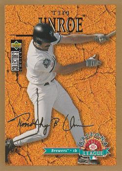
Sunday, March 21, 2021Set: 1996 Collector's Choice - Gold Signature (Rate) “ That's interesting. I am normally not a fan of the player in front of the made up background concept but this is at least visually interesting enough that I like it. ” -Billy Kingsley
1
“ Ah the days when the logo for the Brewers looked like the logo for the Mariners. I still always confuse them. Like the occasional red C for the Indians for the Reds. ” -captkirk42
2
“ Neat. The backdrop fits the Arizona League theme pretty well. ” -pugchump
2
“ Would have been a very nice card had they not put the collectors choice logo on the players back. ” -NJDevils
“ Wow! Hit me right in the feels. I remember chasing these as a kid. Your heart would get pumping seeing that gold border. Collector's Choice silver/gold signatures will always hold a special place in my collection. ” -pjdionne12
1
“ With a sweet swing like that hard to believe unroe is not a household name ” -parsley24
“ Cool looking card, too bad I never really heard of him. ” -muskie027
|

")