
Random Card of the Day |
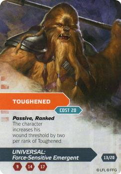
Friday, January 29, 2021Set: 2014 Fantasy Flight Games Star Wars Age of Rebellion Specialization Deck Universal Force-Sensitive Emergent (Rate) “ I never got into the gaming cards, have no one to play with. As such I've never seen this set before even though it was issued when I still loved Star Wars. I don't really understand what this card means. ” -Billy Kingsley
“ How long does it take to play the game when it takes 10 minutes to say the name of the card? ” -Dave Sosidka
4
“ Anything Star Wars is good. I'm not familiar with this game, I'll have to look into it. Hoping not to see a whole lot of 'Disney ruined Star Wars' comments, however. ” -Brimose
“ I'm no going card expert...but does this look like the front is supposed to be the back and the back the front? ” -rmpaq5
“ Cthulhu x Chewbacca mashup. pretty cool. Not sure who that is on the front. ” -parsley24
“ Odd looking Star Wars CCG/TCG whatever. Thought it was an awful double sided card at first. ” -captkirk42
“ This is the guy you know hits 40 homeruns then strikes out every other time. ” -Soarin22
“ What is the opposite of two snaps up? Malla and Lumpy would not approve. ” -UKboogie
|
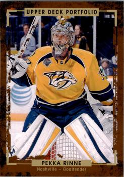
Thursday, January 28, 2021Set: 2015-16 Upper Deck Portfolio (Rate) “ I really like this set a lot. I wish the higher numbers weren't so short printed, but at least they are subsets. My best pull ever came from a box of this set I picked up in a Black Friday sale. A Wayne Gretzky dual patch SN 1/2. ” -Billy Kingsley
7
“ Seems like more of a wild west wanted poster or something for a racer that drives on dirt tracks. It's not a bad design at all, but just seems like it'd be better fitted for different purposes. ” -IfbBirdsCards
1
“ Nice hockey card. ” -captkirk42
“ Currently in his 15th season as Nashville's goalie ” -pugchump
“ Good looking card. ” -parsley24
“ Great picture
” -cjjt
“ I like the picture on the front of the card. The back is pretty good. I like the feel of these cards. They feel like canvas used for painting. ” -Brendan Barrick
“ Honestly just a mediocre card in my opinion. The design is kinda nice but not something worth writing home about. The reverse is well-structured though. ” -DarkSide830
“ One of the better modern day goalies. A cool looking card. ” -muskie027
|

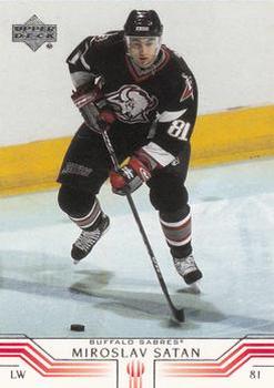
Tuesday, January 26, 2021Set: 2001-02 Upper Deck (Rate) “ I know he didn't pronounce it that way, but he should have played for the Devils. ” -Billy Kingsley
10
“ The biggest tragedy in hockey was that he never played for New Jersey. ” -buckstorecards
10
“ Another nice design from Upper Deck for their flagship NHL product. Sadly this was made during my time away from the hobby so I ain't got too many of this set. Also I have always liked this Sabres logo, the buffalo head looks like he(she) is looking away mischievously after doing something naughty. ” -Gunny
1
“ The scale of the team name and the player name, I was not a fan of. The front and the back both have this issue. ” -parsley24
“ For those unfamiliar, his name is pronounced Shah-tan, not like a certain ruler of the underworld. Really like this design, although the bio info gets a bit lost on top of his position on the back. ” -IfbBirdsCards
“ Hail Satan ” -abide
1
“ I'm not too sure about this one. Interesting design. ” -Phil
“ I like the design of this card. ” -Brendan Barrick
“ with a name like that you'd think he played for New Jersey ” -Thunderfoot
1
“ Miro!!!! Awesome player for the Sabres during our Stanley Cup run (Hull's foot was in the creass!). Probably one of my favorite Sabres from the time period along with the Dominator!!!
Let's Go Buffalo!!!!!! ” -muskie027
“ Stuck around St. Pittsburgh
When he saw it was a time for a championship ” -volbox
“ I hope I'm pronouncing that name wrong. ” -UKboogie
1
|

Monday, January 25, 2021Set: 1995 Comic Images Species (Rate) Card: #40 Night falls, and Sil lures John into the hot tub. “ I have no idea what this is referencing. ” -muskie027
2
“ Curious to see the reactions to this card/set! Personally, I loved the movie! ” -bkklaos
1
“ Species? Really? I don't remember seeing this scene, maybe it's time to rewatch. ” -captkirk42
“ I must see card #41 now! ” -UKboogie
4
|

Sunday, January 24, 2021Set: 2014 Stadium Club - Future Stars (Rate) “ Kinda looks like he's dancing. Cropped a little too closely perhaps? ” -Billy Kingsley
5
“ This design bothers me. It looks like he has no arms...Also too busy for me. ” -Camstone
2
“ this guy is about to be very rich.....awesome player that would look great in a Met uniform ” -Tmac7
“ Reminds me a little of the 2020 Topps design. ” -muskie027
“ Astros. Big thumbs down. ” -switzr1
1
“ I guess they were right about the "future star" thing ” -DarkSide830
“ How can he hit the ball like that with things exploding all around him?!?! Amazing! ” -kents_stuff
“ Nice looking card but looks like it should be a Flagship Topps insert not Stadium Club insert. ” -captkirk42
|

Saturday, January 23, 2021Set: 1998-99 Panini Photocards (Rate) “ I was not aware of this set before it came up just now. Very cool. When I began collecting hockey the Lightning had a wide lead on most hockey cards in my collection, as one of my best friends sent me several hundred of them, all his duplicates, back in 2015. It did play a role in my becoming a hockey fan, and now it's what I spend the most time watching. If there's hockey on, I watch it, period. No matter what team or even if it's new...even if I've seen it already, I watch it again. ” -Billy Kingsley
2
“ I completely forgot that the Lightning third jerseys from this era also had yellow bolts on the sleeves until I saw this card. At least you can't see the rain storm and waves on the front. How did these last more than one season? ” -buckstorecards
“ Cool picture. ” -muskie027
“ The card has a nice action shot on the front, but with a plain white back. ” -Brendan Barrick
“ I think it's going in ” -Soarin22
“ nice card..but to the novice hockey fan..which player is Puppa... ” -Tmac7
“ Nice postcard is it? ” -captkirk42
“ I love this picture ” -switzr1
|

Friday, January 22, 2021Set: 2016 Topps Allen & Ginter (Rate) “ A&G as usual nice. It has been a few years since I've even tried to collect A&G sets. I have gotten tired of the mini parallels and hunting for those. My only real beef with the sets is after the 15 or 16 years it is getting difficult to identify A&Gs by year. Many similar designs and to be honest many limitations to any designs. They need to keep them resembling the original late 19th Century A&G cards. ” -captkirk42
1
“ I think I'm over A&G base sets. Fun, novel concept for a while, but the backs are annoying, and the non-sport entries arent interesting people anymore. The insert and mini insert sets are still fun though. ” -switzr1
4
“ I don't mind Allen & Ginter, but their designs are too similar and boring each year for me to go hardcore with em. ” -suomibear8
2
“ Suggestion to those still putting out really, really old-timey cards (A&G, Goudey, etc.)--put the players in really, really old-timey uniforms. Surely you have enough pull with MLB to get something like that green-lighted. ” -kents_stuff
“ Started getting into these this year and I really like them. ” -muskie027
|
Thursday, January 21, 2021Set: 2002 Topps - Home Team Advantage (Rate) “ Why is any symbols on the front of the uni photo shopped out, or on not photo shopped in? ” -rmpaq5
“ I really like the border on the 2002 sets.. ” -NJDevils
2
“ This seems like a weird color scheme choice when you have an established "gold" variation every year. ” -jackal726
“ Base card is great. Parallel--why. ” -cjjt
“ I love parallel cards. My familiarity with them is not the best. First time I have ever seen / heard of, this parallel ” -abide
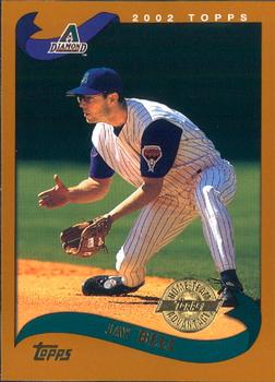
“ 2002 Topps during my semi-absence from the hobby. When I first saw them a couple of years later I hated them because I thought the overproduced years hadn't yet ended. I eventually got to like this set. Team Advantage variant. UGH. I forget what the "advantage" was for these. Also not a huge Diamondbacks fan. ” -captkirk42
“ Oof, what a rough set. Bell was a pretty good player. ” -crushnmove
“ The color of this set has always bothered me, baby poop is not a good color. ” -Corky
3
“ As a TCU player collector, this isn't one of my favorite cards, but I love seeing it pop up in the RCotD. Go Frogs! ” -jlamberth
“ Jay Bell sort of looks like that 8th-grade math teacher who tried too hard during the teacher's softball game. The one that brought his own cleats. ” -Soarin22
|

Wednesday, January 20, 2021Set: 1971 O-Pee-Chee CFL (Rate) “ Is this a politically correct team name? And Edmonton actually is not so far up in the North. You would not call people in northern part of Germany Es***os, for example. ” -Duke
5
“ Love this card. Wish I had some ” -NJDevils
1
“ He looks more like an actor playing a football player in a tv show. ” -switzr1
10
“ Awesome card. A little haevy on the bottom with the red, but overall a fantastic card. ” -parsley24
“ the duplication of the comment on the back - English / French - is interesting. didn't realize that the Canadian language laws extended to sports cards ” -abide
1
“ A nice old-fashioned card . . . Love cards from that era; they always look a bit "primitive" compared to today's . . . They have character and seem much more appealing than current cards . . . ” -georgecf
“ nice looking base design, cartoons on the back are always a plus for me, eskimos logo simple but gets the job done ” -Thunderfoot
“ I like this card. It reminds me of the 1971 Topps NFL issue. The card can use stats on the back. ” -Brendan Barrick
“ Wonderful! Go Eskimos! ” -cjjt
“ CFL! Very cool. ” -crushnmove
“ Way too much red in the lower left, and the font is very 1970s. But that doesn't eliminate the "cool" factor for me. Interestingly it does remind me of cards from my youth, but not Topps....Wonder Bread. ” -kents_stuff
“ This card is everything that any card in the history of cards should strive to be. The back should be in the trading card HOF. ” -UKboogie
1
|

")