Random Card of the Day
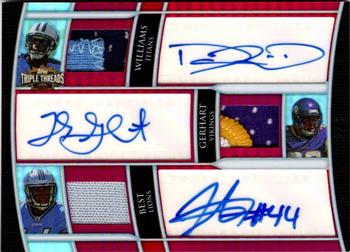


Thursday, June 25, 2020

Set: 2010 Topps Triple Threads - Autographed Relic Combos Ruby (Rate)

Card: #TTARC-15 Damian Williams / Toby Gerhart / Jahvid Best


“ That is a very impressive card! ” -Billy Kingsley

“ Might as well make Topps Micro Signature Editions ” -volbox

“ Someone spent $300(?) to get a box of Triple Threads and this was their 'hit.' That being stated, it's a pretty neat looking specimen. If you're a fan of any of these guys or their teams, it's a pretty special card to have, I'm sure. ” -mkaz80

“ Going to resist saying anything. Love auto cards when they are on card. I think this one is a stickergraph. ” -captkirk42

“ Sometimes I think card companies forget to ask the simple question: Why would someone want to collect this card? Yes, I get that three autos and relics on the same card is a big hit, but you have three players from three different pro teams and three different colleges. Took me a minute to realize they were all running backs. I think that's the only thing they have in common. Cool card if you had it I suppose, but not something I would chase personally. ” -vanstryland

“ Always fun to look back at these "triple prospect" cards a decade later. I think it's fair to say this one did not pan out. Couple cool patches on here though. ” -rmcketchnie

“ Well, I wonder how much this is worth. Three jersey peices and 3 autographs, that has to be worth quite a bit. ” -dollar guy


Wednesday, June 24, 2020

Set: 1987 ProCards (Rate)

Card: #2033 Rob Livchak


“ The epitome of simplicity. And that's a good thing. ” -vrooomed

“ Nice Minor League Card. ” -captkirk42

“ Behold! A true rarity. There were only two different Rob Livchak baseball cards ever created (this one and a 1998 card). I hope he has a copy of each to commemorate his career. He made it a lot farther than the vast majority. ” -bpaul14

“ Card number 2033? How big og a set is this? This design is kindof plain but that is to be expected for cards produced in 1987. ” -dollar guy

“ I believe the photos for this set were snapped with one of those Kodak one-time use cameras. ” -mkaz80

“ Very simple. Sometimes that's all I ask in a card. Clear current pic, name and team clearly displayed, some stats/info on back. That's all it takes. ” -chvlDm

“ Fun Fact: One in every six million cards in this database is of Rob Livchak. ” -UKboogie

“ I have said it before and will say it again. I love minor league baseball cards. Just something so pure about them. ” -davidhandberry


Tuesday, June 23, 2020

Set: 1993 SkyBox Marvel Masterpieces (Rate)

Card: #2 Human Torch


“ I don't have this one, but I have others from this set...I went from probably 1994 to 2016 without getting a new addition to the set. Even though I'm a DC fanatic through and through, Marvel has had a much better card presence over the years. I liked this set because it has two colors of foil on each card and not just silver and gold. ” -Billy Kingsley

“ This card is on fire...... ” -parsley24

“ I like this one from a design perspective. ” -muskie027

“ This is certainly not a card I would recommend. "Human Torch" really? Certainly not a "Masterpiece". ” -dollar guy


Monday, June 22, 2020

Set: 2004-05 Bowman (Rate)

Card: #85 Chris Kaman


“ Pretty ugly looking card to be honest. This does not seem like a set I would go after if I was a basketball fan. ” -dollar guy

“ Sort of a standard basketball card showing some game action. Nothing special. ” -John Kerry

“ For a long time he was alphabetically first in the letter K for the NBA, until this season, when Mfiondu Kabengele was drafted, coincidentally also by the Clippers. Front scan is a little dark. ” -Billy Kingsley

“ Good looking card. ” -parsley24

“ Thought this was a die cut card at first. The card showing for today is one and I either didn't realize that last week or didn't bother to mention it. Looks like there is lost space on this design. Don't like the sideways writing. Hard to read in these scans. Back more yearly stats not just one year. ” -captkirk42

“ I didn't even know Bowman did Basketball. I like this one. ” -muskie027

“ Strange. I was just reading an article this morning about 30 athletes that have gone crazy and Chris Kamman was the first one listed at number 30. Apparently he has started preparing for the apocalypse buying lots of guns and ammo and supplies. Well the card is ok. Typical Bowman look but i like the color scheme more than most years. ” -davidhandberry


Sunday, June 21, 2020

Set: 1991 Pro Set (Rate)

Card: #387 Joe Montana


“ I didn't realize this was a painting at first. I'm not a football guy so I don't know if it really looks like him or not, but if so, that's an awesome painting. I really wish Pro Set had survived...and gotten the NBA license. ” -Billy Kingsley

“ Love 1991 pro set, I have the redeemed lithograph of this card signed by the artist but have never seen a redemption card in all my years of collecting ” -aussiewayne

“ I loved the first couple years of Pro Set.....although I am not a Joe Montana fan, I think this is a beautiful card. I could be wrong, but I do not remember many "painted" or "sketched" cards prior to this time frame. Upper Deck had their "painted" checklists, but that is all I can recall. Very nice! ” -tbshaw

“ Ah, '91 Pro Set. So many good memories. I remember getting a wax box of this stuff as a kid when it came out (even back then it was cheap!). I was so jazzed when I pulled the Rocket Ismail card. Incidentally, "Super Joe" just had a birthday recently. ” -mkaz80

“ I don't think the early Pro Set cards gets enough respect. This is a beautiful art card. The action shot were nice for Pro Set also. I'm a fan of the 1991 set especially. ” -CardFlipper1974

“ Looks like a painting. I don`t think this is a set I would collect if I was a football fan. ” -dollar guy

“ Pro Set was such an awesome blip in the card collecting hobby. I miss them. ” -muskie027

“ lejund ” -parsley24

“ For some reason I have always liked art cards. This is a decent example of the type. ” -John Kerry


Saturday, June 20, 2020

Set: 1992-93 Hoops (Rate)

Card: #351 Mookie Blaylock


“ Wish I would have collected this back in the day. Old Pearl Jam favorite Mookie Blaylock! ” -muskie027

“ Mookie calling a play for Ronnie James Dio. ” -DanD

“ College stats on the back are pretty cool. ” -jarosa04

“ I think it is pretty cool how it has one leg in front of the red band and one leg behind it. Minor detail, but it looks cool. ” -SandersFan

“ I am not sure at all on what to say about this. The card is pretty plain and that is about it. ” -dollar guy

“ The world needs more people named Mookie in it, I'm talking to you, Spike Lee. ” -UKboogie

“ One of my favorite players and one of the best unis ever in the NBA. All early Hoops sets are good sets with a smooth front and back of the cards. ” -ericidol1984

“ "Mookie with the 'Devil Sign'. Blaylock spelled backwards is Kcolyalb.... coincidence? You decide. This week on, Satanic Panic." ” -CardFlipper1974

“ Nice hoops card. Name should be horizontal not vertical. Back is pretty good. ” -captkirk42


Friday, June 19, 2020

Set: 2015-16 Panini Prizm - Red, White & Blue Prizms (Rate)

Card: #193 Taj Gibson


“ These cards are so cool looking in hand. Pretty sure this parallel was Target exclusive. Taj Gibson would later become the only player in NBA history to wear #67, which he has worn for the Timberwolves and Knicks, where he currently plays...it's a reference to the school he attended as a child in NYC. Not a spectacular, high flying player, but you know you can always count on him, if he's playing, he never takes a play off. Specializes in rebounding. ” -Billy Kingsley

“ good look. Am i the only one that doesnt like the prizm tho? ” -parsley24

“ "In your face" dunk in action. Nice design even though I really really don't like the Prizm cards. I prefer chrome cards and even those as many of you know I don't really like at all. Back same old typical Panini back nothing to see there move along. ” -captkirk42

“ Nice looking card. ” -muskie027

“ Another useless Panini parallel. Good picture ” -cjjt


Thursday, June 18, 2020

Set: 2019 Panini Absolute - Red Squares (Rate)

Card: #27 J.J. Watt


“ Cool looking card! The NBA set this season went back to being Absolute Memorabilia after several years of being called Absolute Basketball. ” -Billy Kingsley

“ Great player. Too bad the card doesn’t do the player justice. I do like the stitching on the front. It reminds me of the stitching on a football. ” -Brendan Barrick

“ I like the design . Its a good action photo they just should put a different photo on the back . JJ Watt is an impact player. So thumbs up on this card. ” -ericidol1984

“ There are also white ovals. ” -vanstryland

“ Pretty neat parallel. Cool photo good looking card. ” -parsley24

“ Basic set design OK but not a huge fan of it. Nice ball lace look. Not a fan of the way the player name is text boxed. "Red Squares" RED? OK so the corner is red and the refractor things look like squares I guess. Don't like it. Serial number pretty cool but with the squares it was hard to see if this was 042/100 or 142/200 or even 142/100. Back unfortunately typical Panini one year only stats and no personal stats (ht, wt, age, college) ” -captkirk42

“ Probably not that special when there are also Black Galaxy, Blue, Blue Diamonds, Gold Stars, Green, Green Waves, Orange Mosaic, Purple Rain, Red, Spectrum, Spectrum Black, Spectrum Blue, Spectrum Gold, Spectrum Green, Spectrum Orange, Spectrum Purple, Spectrum Red and Yellow parallels ” -volbox

“ This scan doesn't give this design justice. In hand these cards are beautiful. ” -CardFlipper1974

“ The squares in the backround kinda hurts my eye. It`s a nice design. ” -dollar guy

“ Absolute was my favorite football set design from 2019. This is a pretty cool looking parallel of the great JJ Watt. ” -mkaz80

“ 1 of 19 parallels. Yuck. Plus same picture front & back. Panini is terrible. ” -cjjt

“ I wish the background didn't affect the picture quality, as J.J. Watt became pixelated as well, but the concept is good ” -BasketbalHQ


Wednesday, June 17, 2020

Set: 1973 Topps (Rate)

Card: #348 Walt Sumner


“ Classic 1970s football pose ” -parsley24

“ Nice '73 card.The back image looks bright and clean enough to almost be the OPC version. ” -captkirk42

“ A classic set. ” -Brendan Barrick

“ Please, Walt, if you're reading this don't be offended. Man, lookit the twigs that used to play in the NFL. That guy wouldn't last 10 minutes in the game today. ” -bpaul14

“ People who think that elite athletes from the 70's can do the same in today's game needs to see this card of Walt. Imagine Walt trying to stop Derrick Henry. ” -jarosa04

“ Pretty plain card, but that is what you would expect from an early 70s card. ” -dollar guy

“ One of the most classic, iconic designs in trading card history. ” -mkaz80

“ nice clean classic topps design, cartoons are always a plus, and looks like we both suffer from male pattern baldness ” -Thunderfoot

“ B-E-A-UTIFUL!!! ” -muskie027

“ I have this set. I always thought the banners were stupid -- did not coordinate with the player's team or position. Plus it was when Topps only had the Players' Association contract and not the NFL contract so they could not show team emblems, etc. sucked. ” -cjjt


Tuesday, June 16, 2020

Set: 2019-20 Parkhurst (Rate)

Card: #48 Aleksander Barkov


“ I never saw Parkhurst for 19-20 in any store, hobby or retail. The only place I saw Parkhurst was on e-Pack. The only 19-20 Parkhurst I got on e-Pack was through trades. ” -Gunny

“ Nice looking card. Sneaky stick design on the front there. Just needs his position on front. Team logo would be nice but at least the team name is there. Back should have a different photo than front. Needs more than one year of stats. ” -captkirk42

“ I like this card. Parkhurst is a good product by Upper Deck. The product tend to have good designs, and is low cost. ” -Brendan Barrick

“ I actually like this set, the only negative would be the front seems crowded. There is a blurb on the back which is always good. Barkov is a bear, pretty hard to stop ,when he gets going. ” -uncaian

“ I wish my local stores had bothered to stock this set...I would have enjoyed collecting it. ” -Billy Kingsley

“ parkhurst cards are probably my least favorite for hockey. i like barkov though, he's underrated ” -torald

“ Parkhurst cards look like they were made by a 4th Grader learning PowerPoint. ” -jarosa04

“ Pretty regular base card. The slanted name is kinda cool. Overall, it`s an okay base. ” -dollar guy

Page:


Copyright © 2024 Trading Card Database LLC
Designated trademarks and brands are the property of their respective owners.