
Random Card of the Day |

Monday, February 24, 2020Set: 2018 Stadium Club - Rainbow Foilboard (Rate) “ He has been a beast! Card isn't bad, but I don't like the name superimposed over the team name. ” -muskie027
“ nice card ” -crashdavis28
“ Pretty good, but the bottom with the name,team, and position is a mess. Just put a small DBacks logo in the top right and a readable nameplate on the bottom and this card would be great. ” -chvlDm
“ Stadium Club modern reboot. Not at good as when SC first came onto the market in late 80s early 90s but still pretty good. ” -captkirk42
“ This is a good looking card. Great cover photo. ” -parsley24
“ Nice looking card, reminds me of the early 90's Stadium Club cards that are still amazing to this day. ” -davidhandberry
|
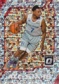
Sunday, February 23, 2020Set: 2017-18 Donruss Optic - All Stars Fast Break Holo (Rate) “ Cool! I like when the All-Star game is documented on cards. This may qualify for Card of the Day Coincidence- it's come up to write about on 2/16/20, the date the 2019-20 NBA All-Star game is being played. ” -Billy Kingsley
“ I do not have the words to properly offer my absolute disdain for this card. ” -rmpaq5
“ cool card ” -crashdavis28
“ Optics on this card are hard on my eyes. The action shot is drowned out by the background. I don't understand what the card designers were trying to accomplish, other than optical-illusion-delusion. ” -CollectingAfterDeath
“ Ouch a glitter rock card. Oh wait it is some kind of Donruss Chrome er Optic card with a SUPERFRACTOR type design. Not for me Nope. Can barely read "All-Stars" across the bottom with the white lettering on a white sequin back. I'm guessing that the player name is at the top? Back is OK not great but OK. ” -captkirk42
“ For as crazy as it looks, it is kind of cool. ” -muskie027
|


Friday, February 21, 2020Set: 2017 Topps Gypsy Queen - Autograph Garments Black (Rate) “ An autographed SN1 Eck is always sweet. But I have no idea what that MEM is and the wallpaper stuff makes the card a bit too busy for my taste. ” -Uncorrected Error
“ Now THAT is a cool card! Does a button count as a patch? It is sewn on, after all! ” -Billy Kingsley
“ I like the AU and the button, but I hate this design. It is WAY too busy for what should be a simple card design. Gypsy Queen (and A&G too) is always too busy for my taste. Couldn't Topps just drop all the swirls and put a plain photo with an AU spot and the hole for the button?! The back is missing basically everything that Topps was known for over many decades. ” -spazmatastic
“ Cool. Don't see cards like this in RCOTD often ” -Lennoxmatt
“ Whoa...isn't this the second SN1/1 to pop up very recently? ” -rmpaq5
“ Wow, that's a damn nice piece of someone's collection right there. And a 1/1 to boot. ” -mkaz80
“ Wow very nice Auto card. UGH typical "Congratulations" spiel on back. Holy Cow its a 1/1 "Garments" does that mean the "relic" on this card is a button? Hard to tell from the scan what it is. I thought it was some kind of gem. Shame being colored white it blends into the design of the cards and looks like part of the intended design. ” -captkirk42
“ Gypsy Queen cards can be a bit busy with graphics and visuals. I think this one strikes a good balance with photo, autograph and a piece of memorabilia. Having something as specific as a uniform button is very neat, and works especially well as a 1 of 1. ” -Toddbwd
“ This is a cool card in a set that has otherwise run its course and needs to go away. I don’t mean to be one who just chimes in to point out flaws with the COTD but Gypsy Queen as a set is such a piece of crap boring product I couldn’t sleep at night if I didn’t say so. Too many artsy cards as it is. ” -BrewerAndy
“ Makes my 1976 Topps card seem meek in comparison. ” -UKboogie
“ It's busy, but still has a pretty cool look. ” -muskie027
|
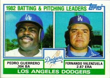
Thursday, February 20, 2020Card: #681 Dodgers Leaders / Checklist (Pedro Guerrero / Fernando Valenzuela) “ These were the first baseball (or any sport, save Mork&Mindy and Hulk) packs that I opened. Not in mint condition but I still have this one. ” -volbox
“ I like this. As far as team checklists go, this is a quality card. And so much green, which is my favorite color, just makes it better. Quite a disparity in the photos. ” -Billy Kingsley
“ This is This is my favorite Topps best baseball issue during the 1980's. This was the era when Topps printed Team Cards for all teams. The best part is this card is that it shows my favorite baseball team with two Dodgers legends on it. ” -Brendan Barrick
1
“ Team leaders and team checklist on the back ahh these were the days...... of mass production and thank goodness, this way there is enough for everyone to enjoy. ” -baseballcardstoreca
1
“ I miss Fernando mania. ” -UKboogie
“ I loved this card as a kid. Beautiful. ” -parsley24
“ Ahh, the good old team checklist .Nice card. ” -uncaian
“ Love the style of these older team leader subsets. The modern ones don't stand out as being anything special. Then again now they don't do any "sub-sets" do they? ” -captkirk42
“ I like the 'Leaders' cards. However, I prefer the 'League Leaders' with the top league leaders on the front of the card. The uniform number on the back of the card is unique. ” -jayoneill
“ Two guys that seemed destined for absolute greatness early in their careers. I'm glad they both spent some time with St Louis, even if only briefly in Fernando's case, and certainly had careers to be proud of, but man oh man they both had HOF aspirations that never came to fruition. ” -Brimose
“ 82 was a great year, Pedro hit 304 and Fernando threw 2.87 and I was born. I'm sure other things happened but those were the top 3. I loved these old checklist, the best way to find if you had all the players for your team, at this time. Too bad me and countless others actually drew on the back of these cards to keep track. ” -davidhandberry
“ Fernando Mania! Part of me wishes they still did team leader cards like this. ” -vanstryland
“ What a combo in `82.......... ” -OogaBooga
“ Topps could easily do these Team Leader cards now. Why don't they? ” -rmitchell6700
“ not gonna lie I didn't realise they had those batting helmets with just the 1 ear cover back in the 80s, I didn't think they came around till the late 90s ” -Thunderfoot
“ Love the 1983 Topps set. But this card is not great. ” -cjjt
|
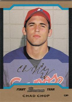
Wednesday, February 19, 2020Set: 2004 Bowman - Gold (Rate) “ I looked up Chad Chop thinking that he had a cool name and I always love looking up minor league players. This one did not disappoint. One of the more interesting stories I have found. Chad started off great, making a minor league All-Star team in one of his first seasons but his production fizzled and he was dropped after just a few years in the minors. He retired and went to work as a fireman and opened a baseball academy. It did well and he sold it and started a new one in California, where he became friends with Hunter Pence, who brought him along to spring training with the Giants and he did so well the Giants they brought him on their staff and he became their video replay analyst. He spent several years with the Giants including reversing a call to help them in Game 7 of the 2014 World Series. As of 2018 he was no longer with the Giants and seems to be back coaching youth sports. ” -davidhandberry
“ Well this one probably just found itself added to the "Funniest Names" lists some members have. ” -rmpaq5
“ Ryan Helsley finds Chad's name disrespectful. ” -jackal726
“ Never heard of him, but it's an Expos card so I approve ” -Lennoxmatt
“ Back when you could identify a gold parallel very easily. Ah early 2000s Bowman they all look the same. Love this guy's name CHAD CHOP. Someone who has a list of funny names should put this on it. ” -captkirk42
“ This card is simple. Not a big fan of the color choice for the border. Hopefully the background in the other cards is better than this bland brick wall. The foil stamping blends in with the color of the card too much. That said, you must give extra credit to Chad Chop. The name alone is worth 3 points. ” -coreymacleod
“ Nice name bro ” -Paullilko
“ Weird creepy photo. Kind of a dissappointing card. Lack of pop. ” -parsley24
“ I've never heard of anyone named Chop before. ” -Billy Kingsley
“ I love all expos cards. I love the idea of the teams of the past. I collect baseball cards and so does one of my friends. I showed him the card and his first thought was “Who in the world does this guy play for”. ” -ethan2934
“ How many hits could Chad Chop chop if Chad Chop could chop hits? Answer: You have to do your own math because the card only lists average and at bats. ” -vanstryland
“ This one is pretty boring. ” -muskie027
“ Chad Chop...he don't take kindly to being joshed 'bout his name. ” -CollectingAfterDeath
“ AWESOME name. Terrible picture. Bad card design ” -cjjt
|

Tuesday, February 18, 2020Set: 2017 Topps Holiday - Metallic Snowflakes (Rate) “ I am a huge Christmas person so every year I get a few boxes of these. I understand the hypocrisy since I rail against parallels quite often. ” -davidhandberry
“ Baby, it's cold outside. ” -royals
“ Baseball, snow flakes, apple pie and Chevrolet. ” -UKboogie
“ Maybe I am just getting old but card designs in the last decade are just boring and unoriginal. This is no exception ” -YoRicha
“ *bangs on garbage can* cant pass on this one. ” -parsley24
“ Silly but fun parallel. Can't imagine Houston sees actual snow very often. ” -Billy Kingsley
“ I understand Topps' desire to capture a piece of the "holiday dollars pie", but a winter-themed design doesn't marry well with images depicting the boys of summer. Fantastic cash grab. Forgettable design. ” -dilemma19
“ Not a fan of the holiday snowflake sets. Way too many parallels to the regular flagship base set(s) already. ” -captkirk42
“ I like the front design. It's pretty clean and easy to read. The back is good even though it is pretty standard. My only negative is that it's yet another unnecessary parallel. Let's throw some snowflakes on a card and give collectors something else to chase! ” -BSwagger
“ I wish topps still a a football license, Im really down with design, back could be better with a picture though ” -Thunderfoot
“ I dig the holiday snowflake cards, I think they are quite more unique than having 12 different parallels. ” -Corky
“ I don’t mind parallels, but too many is ridiculous. There is no need for these. ” -muskie027
|

Monday, February 17, 2020Set: 1991 JOGO - Stamp Cards (Rate) Card: #1 Albert Henry George Grey “ Great history on the back. ” -parsley24
“ Beauty! Didn't quite make it to age 66, but became well known for both the Grey Cup and Earl Grey Tea. A pretty good dude. Deserves recognition in an A&G set someday... ” -dilemma19
“ This card does little for me. Stamps are stamps. They shouldn't be trading cards. ” -BSwagger
“ Nice card of a stamp image. I don't know what else to say. ” -captkirk42
“ The man who provided the Grey Cup which in turn lead to Canada's party of the year (aka the Grand National Drunk). I salute you, good sir! ” -buckstorecards
“ Not wearing a baseball cap, must be a Donruss. ” -NJDevils
“ I think this is pretty neat. ” -muskie027
“ Governor General of Canada from 1904 - 1911. But more importantly, he established the Grey Cup. ” -Uncorrected Error
|
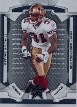
Sunday, February 16, 2020Set: 2008 Leaf Rookies & Stars - Longevity Silver (Rate) “ Cool looking card ” -parsley24
“ Oh! Me! Mine card & scan!! I actually have this entire set. Pretty tough. All sn249. 200 cards. That said, it is amazing that I really don't like the set. Just happy to complete something ” -cjjt
“ This is an average design. I do like the helmet on the back. Longevity is not only a stand along issue it is a parallel to the basis Rookies and Stars sets. At times this causes confusion when searching cards on Ebay. ” -Brendan Barrick
“ For a few years R&S looked the same each year. This design is one of those years. ” -captkirk42
|


")