
Random Card of the Day |

Wednesday, February 5, 2020Set: 1997 Pinnacle Inside (Rate) “ If you move the mouse over it fast, you can sort of make it look like he's twerking. Yes, I'm weird. ” -Billy Kingsley
“ What a forgettable era in Milwaukee Brewers uniform history. ” -vanstryland
“ Sorry I don't like this Pinnacle design. I usually like Pinnacle but this one I don't. Bad time for the Brewers uniforms. Don't like their cap logo at that time. ” -captkirk42
“ Awwww yeah! ” -BrewerAndy
“ Yikes. Let's be nice and say I really am not a fan of this card. ” -muskie027
“ I wish that they hadn't put the second photo on the front. It doesn't help and actually makes it look too busy. Same with the back but not as bad. Having 3 different photos would have been nice but the duplication of the 3rd photo on the front and back bothers me. ” -davidhandberry
|

Tuesday, February 4, 2020Set: 1999 Pacific Paramount - Copper (Rate) “ Pacific always had the best looking cards when they were producing them. ” -YoRicha
“ Not a fan of pacific cards at all. But this one is not that pad. ” -parsley24
“ Nice card, especially the back. ” -NJDevils
“ I know I rail against parallels but I liked these. They didn't seem impossible to get and they were obvious right away, this is gold, this is red, this is silver. Too much white border but besides that this is a fantastic set. ” -davidhandberry
|
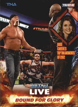
Monday, February 3, 2020Set: 2013 TriStar TNA Impact Live (Rate) “ One of my favorite fight screens from the Rocky movies was Hulk Hogan playing a character fighting Rocky in a charity bout. As for the card I can live without it. ” -Brendan Barrick
“ Such an odd layout. Too much real estate taken up by logos and graphics. Love Hogan's expression but this greaseball phase of his was pretty gross. ” -crimnos2
“ Good old fashioned Wrastlin' What could go wrong? ” -captkirk42
“ Hulk belongs in yellow. ” -muskie027
“ Was Hulk Hogan 60 in 2013? Also, Bound for Glory was Woody Guthrie's autobiography. ” -Uncorrected Error
|
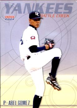
Sunday, February 2, 2020Set: 2004 Choice Battle Creek Yankees (Rate) “ Not a fan of this minor league card. Not much thought put into it just a cropped action shot with a distracting background added to it. At least you know who the parent team is. ” -Firemedic1242
“ I thought that this was an insert card at first glance. How is it the base set for a minor league card is better than most, if not all of the Topps designs for the past 30 years? ” -davidhandberry
“ for a minor league card this is awesome ” -parsley24
“ Not bad for a minor league card. ” -cjjt
“ Better than many major league issues. ” -NJDevils
“ Nice Minor league card. ” -captkirk42
“ Only made it as high as A ball. Lots of K's, but lots of BB's too. ” -Splinter_9
“ This is a pretty cool look for a Minor League Baseball card. It looks like something Donruss or Score would do in the 90’s. The colors also make me think of ice cream which is the second best thing in the summer, Baseball is #1 of course. ” -Derek McDonough
|

Friday, January 31, 2020Set: 2006 SPx - Winning Materials (Rate) “ The front is boring and has too much white space, especially since they made the font for the player name and position so small. It looks like someone put the name and position in with basic black font as a place holder and someone was supposed to put in graphics but they forgot or ran out of time. Let's count the things I hate on the back, duplicate photo, congratulations note, too much white, no player info, very small fonts. I would give this card a 1 and Upper Deck should feel ashamed. ” -davidhandberry
“ Wow, that's a tiny relic. ” -Billy Kingsley
“ I like this card. Frye is another under whelming Browns' quarterback. He lasted 6 years in the league after being a 3rd round pick. At least he had a better career than Johnny Manziel. This not saying much. ” -Brendan Barrick
“ I love that, as far as I can tell, there is no indication about what the "game used memorabilia" is. Could be cut out of his jockstrap, for all we know. Yeah, I want that. ” -Vvvergeer
“ As a Browns card, they probably should have put "winning" in quotation marks. ” -vanstryland
“ Kind of ironic that the Browns are featured on an insert called Winning Materials. Maybe someday they'll turn it around... ” -rmitchell6700
“ Nice GU (Relic) card. Oh it is SPx that explains the nice looking design. Back is just the same old same old "Congratulations Yadda Yadda Yadda" spiel. OK Browns QB Charlie Frye. At first glance of seeing this card I thought it was a Johnny "Johnny Football" Manziel card. ” -captkirk42
“ Winning should not be on this card. ” -parsley24
|

Thursday, January 30, 2020Set: 1986 Jiffy Pop Discs (Rate) “ This one has sentimental value for me. I remember making pop corn at my aunt’s house when I was a teenager and this was the card that I got. I love this card because of that memory. ” -Corky
“ Oh how I miss these wonderfully ugly oddball food cards. I love these! ” -YoRicha
“ I know this is strange. I don't like the variations in size and shape most card companies do such as Topps mini or 89 Bowman but I like when others do it like jiffy pop or small card companies. ” -davidhandberry
“ Good scan. Terrible card. ” -cjjt
“ A great food collectible. Always nice to see a giveaway that a kid can get interested in. ” -NJDevils
“ I miss oddball food issues like this from the 80's and early 90's. They are always fun cards to collect, especially if you are a player collector. ” -DocOso
“ So, is this a round card or a pog? Pretty much the same thing, actually. ” -Billy Kingsley
“ I miss the days when I could base my grocery purchases on whether they came with cards or not. ” -jackal726
“ Jiffy Pop, not Jiffy Lube. ” -Kirbythedodger
“ Wow Jiffy Pop is a blast from the past. Since the introduction of microwavable pop-corn popping pop corn the old fashioned way went out of favor (or is it flavor?) The only thing from a microwave oven that is worse than burned pop-corn is microwaved fish. Office no-nos. OH the card. Nice design I didn't see what the size of these were. I would think sort of big coming from a Jiffy Pop package, but then again it is probably the same size as the Drake Discs and other sports disc sets out there (which is smaller than a Jiffy Pop package top. ” -captkirk42
“ Sweet disc. Food issues need to make a bigger comeback. The Utz cards seemed to be relatively successful last year but let’s get weird again, not just use Topps design. ” -BrewerAndy
“ I always like cards sponsored by other businesses. They're fun and unique. Not a fan of circular cards/discs, but once you get them in a top loader, flipping through them is easier. ” -MTHRILL22
|

Wednesday, January 29, 2020Set: 1996 Cornerstone Hammer Horror Series 2 (Rate) “ I loved the hammer horror movies, brings back memories ” -aussiewayne
“ Not sure what this is but nice picture on the front and interesting story on the back. Seems like almost a book that you have to collect the cards to be able to read. Interesting concept, if so. ” -davidhandberry
“ I have never seen or heard of this one before. I do like the photo used ” -SCC
“ An OK Non-Sport Art set. ” -captkirk42
“ I can't believe that Akhoba would act so rashly. I mean, really.... ” -Vvvergeer
“ Never heard of it. ” -muskie027
|

Tuesday, January 28, 2020Set: 1993 Stadium Club - Members Only (Rate) “ This is a great set. Photography was spot on. The card on the back that showed the first Topps card of the player was a great help to me in my early collecting days before I had the internet to help. I don't have any of the members only cards but the base set I have collected most of the cards I need. ” -davidhandberry
“ This set just works. The images are high quality and the subtle logo and nameplate are just enough. Only complaints are I'd love a team logo and this set is very prone to chipping and bricking. ” -chvlDm
“ pretty good clean card. ” -parsley24
“ Stadium Club in it's infancy before it got stale faded away and then made a big come-back. Even though there is no team name or logo on front I like the front. The back I love that they show the player's (Topps) Rookie card and identify the year. ” -captkirk42
|

")