
Random Card of the Day |
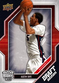
Monday, October 9, 2017Set: 2009-10 Upper Deck Draft Edition (Rate) “ Son of former NBA player Darren Daye. I do not collect college cards but this one came in a repack. That's how 99% of my college collection came to me. ” -Billy Kingsley
“ College basketball over NBA all day! ” -carthage44
“ Not big fan of draft cards of any sport. This guy actually did get into the pros and has gone international. ” -captkirk42
“ Nice design. A lot going on, but not too distracting for my tastes. ” -kents_stuff
“ A basketball scan by Billy or a YuGi-Oh card is all we seem to get lately. Oh well. ” -mkaz80
“ I think he was a Raptor for about two seconds or so. ” -DanD
“ I don't collect basketball, so my opinion is probably less valuable than others. I like the border design, though I'm not so sure about the "DRAFT edition" text in the lower right. The background is okay. The player photo is absolutely awful. It looks like UD purchased a generic stock photo and put it on the card, which makes me sad. I hope UD made a better effort in the years following this. ” -mycardboardhabit
|

Saturday, October 7, 2017Set: 2004-05 SP Authentic - Signatures Dual (Rate) Card: #SP2-JC John Stockton / Carlos Arroyo “ Cool auto. My first thought was how cool would these be if there weren't 1,000 different autos per set per year. I would have like to see more Jazz colors in the color scheme. ” -muskie027
“ Nice! Stockton was the best point guard ever in my opinion. All-Time leader in both assists and steals in NBA history...two of the 5 main statistical categories in the entire sport, and he's the all-time best at them...glad I got to see him play. Him passing to Karl Malone for a dunk was the game as art. Arroyo is still playing on the Puerto Rico national team, hopefully they still have a place to play after hurricane Irma leveled the island...of course basketball pales in comparison to just trying to survive, with how bad they were hit. ” -Billy Kingsley
“ Nice autograph card! I really like SP Authentics in baseball, and this is a pretty nice card, too. ” -kents_stuff
“ These two both played for the Jazz. That is about all they have in common. ” -carthage44
“ Pretty awesome duo. Not a Jazz fan, but always loved Stockton -- an original Dream Teamer. And Arroyo will forever be linked to the P.R. team that crushed the fake "Dream Team" in the 2004 Olympics. ” -mkaz80
“ An attractive autograph card, but I'd prefer a signature on a regular card with a personal inscription. ” -Sportzcommish
“ Oh a dual auto card had to come up here at one time or another. Basically I love auto cards especially the on card ones, even some of the on-sticker ones that are the hi-end and make the sticker area look like it is on card. But I could never get into these multi-player on-sticker autos, even though I have a few that I had gotten mostly through group box breaks. More from when I had random teams I didn't like that much than I would like. ” -captkirk42
“ Not impressed by this. ” -NJDevils
“ I don't like when the picture is so small. Autographs just don't excite me. ” -switzr1
|

Wednesday, October 4, 2017Set: 2014-15 Panini Prestige (Rate) “ It's so weird to see Adams without a beard and sleeve tattoos. He has already played in the most games of anyone from his country, he's a New Zealand native...not that Panini can be bothered to include hometowns. This set was ok, but not great. At 200 cards it's far too small. There were three sets that year all using the same designs and checklists, but different SN for the autos and relics. Doing the checklists was not fun. It took me more than a day of working on nothing else to get them posted. The base version, which this is, is just standard card stock. The Plus is mirror foil, which I did not open any of, and Premium was holofoil, and a box of it was my Christmas present from my mom that year. ” -Billy Kingsley
“ No thank you on the card, but Adams looks so much different without the long hair and tattoos. ” -IfbBirdsCards
“ I normally don't comment on basketball because it's not my thing, but as a map geek, I kinda like the little state/province outlines on the reverse. ” -vrooomed
“ Now let's unveil the winner of Panini's annual "design a card in 60 seconds or less" contest. ” -dilemma19
“ Good looking card front. I like the in-action photo in the background. There is a little too much white space on the front though.Good looking back. All-in-all a quality looking card. ” -cnangle
“ I dislike the setup/design of the stats on the back. ” -carthage44
“ Now that is one terrible back of card. ” -NJDevils
“ Nice card design. back could use some help but the front is nice. ” -captkirk42
“ I recognize Dirk Nowitzki in the background more than I do Steven Adams. ” -rmitchell6700
“ Never seen these before. I like the front, despite the 30% white space. It's a stylish design with a couple of different images. It's easy to read. Perhaps that team logo could be a bit bigger to drown out the snowbank background. The back--not a fan. A nice faded image of him trying to scare a referee? And just 9 stats--4 basketball and 5 vital. Panini could've done better, I think. ” -kents_stuff
“ Where is his fabulous mustache? Must be an UER card. ” -UKboogie
“ The more RCOTD I see, the more I am annoyed by Panini using the same photo on the back of cards. ” -rmpaq5
|

Tuesday, October 3, 2017Set: 2014 Upper Deck - '94 UD Tribute (Rate) “ I think I like the original 1994 set better. ” -trauty
“ Great scan. Card number is kind of funny. ” -Billy Kingsley
“ Upper Deck always seems to be in an Upper Echelon! ” -muskie027
“ With the popularity of college football (and basketball) in the States, I'm surprised there aren't more mainsteam sets out there. ” -olerud363
“ nice looking scan! ” -UKboogie
“ Awesome, a Buckeye in his Scarlet and Gray! Roby surprised most of us Ohio State faithful by being a first round selection; he was the source of great anxiety for us in several games. Capable of amazing athletic plays, then on the next play get lazy and get beat or get a stupid penalty. But I've still followed his progress with Denver with great interest, despite being a Chiefs fan. ” -Brimose
“ Annoys me to no end to have the same picture on the front and back. ” -cjjt
“ Nice design. However I do not like these mostly pros in college uniforms because the card maker doesn't have the NFL license and they often don't tell you which team the guy plays for in the pros. In Roby's case he was part of the Draft class and eventually signed with the Broncos. If I were a college football card collector I would love this set and all the trendy draft and prospect sets that are super popular now-days. ” -captkirk42
“ Loved the 1994 Upper Deck Football Rookie Cards! ” -carthage44
“ Oh boy. We have a questionable Rookie Card here. I'm gonna go run and hide. ” -switzr1
“ I've heard of Reggie Roby, but not Bradley. Sorry Bradley ” -rmitchell6700
“ That is a lot of 94s. ” -rmpaq5
“ not a bad looking card, but never was super excited by upper deck stuff, especsially once they lost the NFL liscense, dont remember here the players name ever ” -Thunderfoot
|
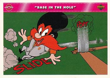
Monday, October 2, 2017Set: 1992 Upper Deck Comic Ball 3 (Rate) “ Yosemite Sam! ” -trauty
“ A Comic Ball card with only one number on it! I don't know what to think of that. I still watch Looney Tunes on a somewhat regular basis...have some on DVD even. ” -Billy Kingsley
“ Yosemite Sam RC! ” -olerud363
“ "Oooo I'm gonna get ya you long eared, fur bearin’ flat-footed varmint!” ” -IfbBirdsCards
“ I just bought a box of these for my daughter at the National Card Show last month! ” -carthage44
“ wow, I didn't know Yosemite Sam could run like that, cool card ” -Lennoxmatt
“ Any Jr card is a winner in my book. ” -DarkSide830
“ Comic Ball nice concept at the time if not more than a bit silly. Comic Ball is definitely Odd Ball. You can't call it Non-Sport because it has the baseball theme. Series one was just the Looney Tune cartoon characters, Series 2 had Nolan Ryan and Reggie Jackson join the characters. this Series 3 continued the real baseball players with the cartoon characters Ken Griffey Jr and two others, then series 4 had Football and i think that was the last one. ” -captkirk42
“ Great set for kids. ” -NJDevils
“ I do like Yosemite Sam ” -switzr1
“ "Now slide DiMaggio,slide!!!!!!", "Hey I'm not DiMarrio." ” -deporcoruña
“ Ah...a card from one of my three vices as a sports card collector: Comic Ball, Beanie Babies, and Bill Nye the Science Guy. Biggest problem with this set is how to display them so the story reads properly. In a 9-sheet page, you need two sets. The front gets numbered left-to-right, top-to-bottom. But the back needs to be numbered top-to-bottom, left-to-right. ” -kents_stuff
“ Why do I have the feeling that right after this moment an anvil fell on Sam's head? ” -rmpaq5
|
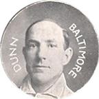
Saturday, September 30, 2017Set: 1909-11 Colgan's Chips Stars of the Diamond (E254) (Rate) “ Wow, awesome. Beware of Imitations. Not the sort of verbiage you see anymore. A shame. ” -Billy Kingsley
“ Wow. How awesome is that!? I love it. ” -702tpr777
“ It's old so it's awesome! ” -muskie027
“ Nice ! ” -uncaian
“ So, Colgan's Chips is actually gum? Sweet little piece of history right here. ” -RoyalChief
“ Super Cool! ” -rmpaq5
“ It's fascinating to see the evolution (or devolution) of trading collectibles. From the simplistic design of a photograph on a small disc to sometimes a convoluted technologically-enhanced card of today. I like both, actually. ” -Sportzcommish
“ Very cool! ” -carthage44
“ You know, I was just thinking, why all the cards? Why not something else? Something different? But finally I see that the RCOTD is getting a round tuit. [Sorry...but I had to do that. Actually, I guess I'm not so sorry, as it this old pun still makes me chuckle.] This is a really nice example of early 20th century promotions. ” -kents_stuff
“ More vintage baseball! And the original Orioles! All around thumbs up. ” -IfbBirdsCards
“ First impression was that it was a coin. Kind of neat that the set would use Jack Dunn when he was with Baltimore, as he only played one year for the Baltimore Orioles, that being 1901. Absolutely cool. ” -CollectingAfterDeath
“ I think I still have a bag of those in my closet. ” -NJDevils
“ Wow going old school vintage here. Over 100 years old, old school vintage. Not much in the looks department but the "wow factor" of it being odd ball over 100 years old is enough to chase at least your homie team of these. If your homie team existed back then. ” -captkirk42
“ Love the slogan on the back "the gum that's round". Seeing older stuff like this is great, even though I don't know the player pictured it's still a good piece to see. Anyone know what violet chips are? ” -rmitchell6700
“ Mmmmm. Chips. ” -mkaz80
|

")