
Random Card of the Day |
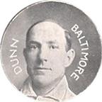
Saturday, September 30, 2017Set: 1909-11 Colgan's Chips Stars of the Diamond (E254) (Rate) “ Wow, awesome. Beware of Imitations. Not the sort of verbiage you see anymore. A shame. ” -Billy Kingsley
“ Wow. How awesome is that!? I love it. ” -702tpr777
“ It's old so it's awesome! ” -muskie027
“ Nice ! ” -uncaian
“ So, Colgan's Chips is actually gum? Sweet little piece of history right here. ” -RoyalChief
“ Super Cool! ” -rmpaq5
“ It's fascinating to see the evolution (or devolution) of trading collectibles. From the simplistic design of a photograph on a small disc to sometimes a convoluted technologically-enhanced card of today. I like both, actually. ” -Sportzcommish
“ Very cool! ” -carthage44
“ You know, I was just thinking, why all the cards? Why not something else? Something different? But finally I see that the RCOTD is getting a round tuit. [Sorry...but I had to do that. Actually, I guess I'm not so sorry, as it this old pun still makes me chuckle.] This is a really nice example of early 20th century promotions. ” -kents_stuff
“ More vintage baseball! And the original Orioles! All around thumbs up. ” -IfbBirdsCards
“ First impression was that it was a coin. Kind of neat that the set would use Jack Dunn when he was with Baltimore, as he only played one year for the Baltimore Orioles, that being 1901. Absolutely cool. ” -CollectingAfterDeath
“ I think I still have a bag of those in my closet. ” -NJDevils
“ Wow going old school vintage here. Over 100 years old, old school vintage. Not much in the looks department but the "wow factor" of it being odd ball over 100 years old is enough to chase at least your homie team of these. If your homie team existed back then. ” -captkirk42
“ Love the slogan on the back "the gum that's round". Seeing older stuff like this is great, even though I don't know the player pictured it's still a good piece to see. Anyone know what violet chips are? ” -rmitchell6700
“ Mmmmm. Chips. ” -mkaz80
|

Friday, September 29, 2017Set: 2012 Panini Adrenalyn XL Euro (Rate) “ I like the uniform. It looks more 80s than current but that's not a bad thing at all. ” -Billy Kingsley
“ For a while, the best goalie on the planet. Now, way past his prime. ” -deporcoruña
“ Very busy design. Too much going on for my liking. ” -olerud363
“ I thought we were done with the soccer! Oh well, super busy, not a very good card. ” -IfbBirdsCards
“ These must be popular for some reason? ” -carthage44
“ The Soccer CCGs are back. This one looks more like an online sweepstakes type card on the back. Don't like the design at all too busy and his yellow uniform blends into the yellow back ground. ” -captkirk42
“ I'm laughing to myself picturing all the comments about another soccer card now. ” -jasongerman9
“ Those are some serious gloves. ” -RoyalChief
“ It looks like an electric football game in the lower corner. Still don't know what the all numbers on soccer cards are. You think I would have figured it out by now with all the soccer cards showing up here. ” -cnangle
“ Good photo on an interesting background. A bit noisy, but not distracting for me. I know it's a game card of sorts, but I still wish it had some stats or something to learn about this guy. And although the gloves were a giveaway, I presume the lower right icon indicates he's a goalkeeper. It probably wouldn't have been hard for Panini to take a little extra time to actually spell that out somewhere, though. ” -kents_stuff
“ Are most Panini European releases gaming cards, or just soccer? ” -rmpaq5
|

Thursday, September 28, 2017Set: 1994 Magic the Gathering Revised Edition (Rate) “ I never learned how to play this...surprisingly none of my friends played...back when my friends were people I knew locally and not spread all over the world via the internet. ” -Billy Kingsley
“ I have some many good memories of this set and it was the first set I ever collected. ” -ketchupman36
“ Awesome! I must be the target creature because I feel invincible! You here that Admins I have protection from red! You can't stop me from my crafty plot of thwarting your goals of being the greatest collecting card database ever! I will dodge every fireball you throw at me! I will riposte ever swing of your sword! All because of my Red Ward! ” -YoRicha
“ I suppose players of MTG would know what the heck this is. ” -olerud363
“ Zero interest. Zilch. ” -Sportzcommish
“ But red is my favorite color! ” -Brimose
“ I head this was making a comeback. Sad ” -carthage44
“ I was hoping for the Burt Ward Card. ” -kirkscards
“ MTG The mother of Collectible Card Games (CCG). When these puppies first came out early 1990s and the game was taking off I was tempted to try to collect them but I got wise before even attempting to start. ” -captkirk42
“ It's like sunscreen for vacations to Krypton. ” -kents_stuff
“ Magic? Nope. ” -rmitchell6700
“ So if I play this card, the Tigers have protection from the Reds and Red Sox? ” -rmpaq5
“ It isn't going to end well for this card/scan. It would only be worse if it was soccer. ” -UKboogie
|

Wednesday, September 27, 2017Set: 1970-71 Dad's Cookies (Rate) “ We just had one of these cards come up recently...what are the odds that an obscure set like this would get the nod twice in such a short time? I'm sure the stats could be calculated but I'm not going to do it! ” -Billy Kingsley
“ Darn it. I'm a bit too late to send my wrappers and a dime to get an NHLPA decal. Nice vintage hockey oddball! ” -olerud363
“ Classic hockey, nice! Interesting design, putting stats on the front. ” -IfbBirdsCards
“ Whoa. Great guy, great card ” -Lennoxmatt
“ Love this set ! Quinn was a tough hockey player & great coach . ” -uncaian
“ Classic hockey, nice! Interesting design, putting stats on the front. ” -IfbBirdsCards
“ They have no stats or team logos, but I still like these. Maybe due to the "uniformity" of the NHL Players uniforms and the odd shape makes it for a great "odd-ball" card. By using the posed photos, it gave a face to hockey players who weren't always seen too well (especially the goalies). Quinn went on to be a very successful and well-respected coach. ” -vrooomed
“ I wonder how many people started collecting because the bought a pack of cookies and received a few cards. ” -kirkscards
“ What is this? A Bookmark? ” -carthage44
“ I love it when food brands don't have logo rights. Cracks me right up. ” -wax_house
“ I like the title of this set and that's about it. It might make a good bookmark. ” -cnangle
“ Hmm didn't we have one of these about 3 months ago? Ah Yes posted on 27 June of this year John McKenzie. Older Brother to Bob & Doug. Hehehe. ” -captkirk42
“ Love the oddball food sets. ” -NJDevils
“ The legendary Pat Quinn, on an awesome vintage card. The NHLPA jersey is interesting. I'm curious about the backstory on this set. ” -kents_stuff
“ Dude! He looks like the brother from American Pickers! ” -Joshua825
“ Never mind him being so young here. I'm not used to seeing Pat Quinn without a piece of gum in his mouth. ” -DanD
“ The Mighty Quinn! Come on without, come on within... ” -Sportzcommish
“ Even with the odd shape, there is something really cool about it. I never knew Pat Quinn to be a player, I always knew him from modern day, so coaching, front office, etc. He wasn't much of a scorer, eh? Sorry, couldn't resist. ” -muskie027
“ God rest his soul, Pat Quinn gave people in Toronto reason to believe for a few years... ” -rmitchell6700
|

Tuesday, September 26, 2017Set: 2002 Wizards of the Coast Star Wars: Attack of the Clones TCG (Rate) “ Usually a long neck is made for eating leaves higher on the tree. I guess they are not very advanced. ” -NJDevils
“ Definitely not a card I'd care to have in my collection. ” -olerud363
“ OK back to card games here on the RCotD show. This episode we geek out to Star Wars. Pretty cool back/cover side. Front design looks original so much better than the standard "MTG/Pokemon" look. ” -captkirk42
“ I like Star Wars but I don't like this style of card. I'm not a fan of the game card genre. I do like the back though, it reminds me of the movie poster. ” -cnangle
“ I have never watched a Star Wars film. Blasphemy probably to a lot of people, but they just never interested me... ” -rmitchell6700
“ Star Wars and Pokémon don't mix. Anything Pokémon doesn't work. Nope. ” -IfbBirdsCards
“ Sorry, folks. I don't get these cards. To each his (or her) own, though. ” -kents_stuff
“ that guy needs a sandwich ” -UKboogie
“ Love Star Wars, don't love this. ” -muskie027
|
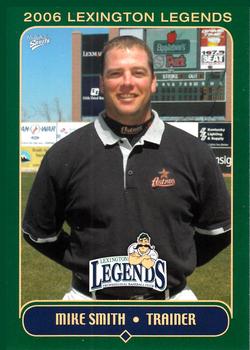
Monday, September 25, 2017Set: 2006 MultiAd Lexington Legends (Rate) “ This is the kind of card that my sport's lacking. I, for one, am glad to see it. ” -Billy Kingsley
“ Mike Smith? It must be terrible to have a super generic name like that. ” -trauty
“ Nice that they gave the trainer a card. Is this his RC? ” -olerud363
“ The classic minor league team trainer card. The green border just looks tacky to me. ” -IfbBirdsCards
“ Trainers finally getting their due. ” -carthage44
“ I don't like minor league cards. I realize they have a place in the hobby, but not in my collection. This is actually not a bad looking card though. Clean front design and good photo. The back looks like a typical minor league card.....cheap. ” -cnangle
“ Just my opinion, too many minor league and soccer cards. ” -NJDevils
“ Bout time trainers get some love. ” -RoyalChief
“ Nice minor league card of a Trainer. The only time trainers get a card. ” -captkirk42
“ I really like the design concept of the front. Now, the subject matter is a different situation. I mean, good for him and all, but does anyone clamor for a card of the trainer? ” -mkaz80
“ I had the opportunity to attend a Lexington Legends game a couple of years ago while I was interviewing in town. Good times. ” -RoundtheDiamond87
“ I'm not a big fan of MiLB cards, but I love that occasionally some of the behind-the-scenes crew get the cards and credit they are due. ” -kents_stuff
“ Don't know if I've ever seen a card set that features a trainer. It's good for people that go unnoticed to get some recognition such as this. ” -rmitchell6700
“ The old minor league trainer card. It needs a bunch of random numbers scattered around, like those soccer game cards. ” -switzr1
|

Saturday, September 23, 2017Set: 2000 Topps - MVP Promotion (Rate) “ Despite being pelted with golden bowls and fish, A-Rod was still able to field the company logo. ” -revnorb
“ A great card from the King of Topps MVP Promotion Cards! These cards are very, very tough to find- it's probably safe to say that many people don't know about them or have never seen them. Only 100 of each are said to exist. ” -Dave Sosidka
“ Ah, the elusive MVP Promotion cards. Still haven't seen an Olerud yet. ” -olerud363
“ I wish they would still honor these 17 years later. You know Topps still has a bunch of these unused redemptions in their inventory. ” -carthage44
“ A few too many things hiding the photo. And I'm not sure why this is numbered as #380. I don't see a number on the card. But maybe I'm just not familiar with this set, or it's just too small for me to see on my screen. ” -kents_stuff
“ This must be a PR card - Pre-Roid. ” -UKboogie
“ It's not a bad card, but the gray border is a little boring. ” -muskie027
“ In my opinion, the stamp ruined a perfectly good card front. The back explains it being a contest card though. ” -IfbBirdsCards
“ Is that the Alex Gonzalez, or the other Alex Gonzalez ” -rmitchell6700
“ What is this guy the MVP of? I don't get it. What if Topps used this for a Rediscover Topps gimmick.!?! Two foil stamps. Captain Kirk's head might explode! ” -switzr1
|

Friday, September 22, 2017Set: 2002-03 Pacific Calder (Rate) “ The positive is the basic design. The negative is the overuse of blue and white. ” -Sportzcommish
“ Not a huge fan of Pacific. Too many similar sets ” -Lennoxmatt
“ I like the overall card design, but what happened to Corvo's head? Looks like a small head Photoshopped onto a normal body. ” -olerud363
“ Glad to see another hockey card come up. Every one helps me learn something new about the sport. ” -Billy Kingsley
“ Nice overall card. Pacific? Wow I thought it was something else. Kind of dig the file folder design. ” -captkirk42
“ Not a bad looking card , but not something I would go out of my way to collect , Corvo was a bit of a journeyman played for 5 different N. H. L teams. ” -uncaian
“ I'm not into hockey at all, so tough to come up with something to say. I guess I like the colors and the design. ” -sahal694
“ Maybe it's the bright white with the bright purple, but this looks cool. I don't like the double name thing going on, but overall, a great look. ” -muskie027
“ I 'm OK with the design, although the front is very white given the ice plus the whitewashing. But I'm confused by this being an '02-'03 card. I mean, it shows his '01-'02 stats line, plus career stats, so that's logical. But it talks about him really lighting the lamp in '02-'03 and playing in the 2003 All-Star Game. I guess I'm a purist, but it sounds like this is an '03 off-season card or an '03-'04 card. ” -kents_stuff
“ Really nice card. When done right, hockey can produce some of the nicest looking cards. Well lit, with white background, really makes the player and uniform stand out. This one succeeds. I miss Pacific. ” -switzr1
“ With the Caps for a season, if that. The use of the first crown is clever, the second though, not so much. This Kings jersey logo looks more like a soccer shield. ” -IfbBirdsCards
“ Not that I'm a huge hockey fan, but boy it's a good thing that the team name is on the card, because I don't know that I've ever seen that jersey before. ” -jasongerman9
|

")