
Random Card of the Day |
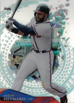
Tuesday, August 1, 2017Set: 2014 Topps High Tek (Rate) “ Such a neat card. The clear aspect really shows in this scan. ” -Billy Kingsley
“ Topps Tek...confusing collectors for two decades. ” -mkaz80
“ Wow, what a great scan for a clear card! ” -carthage44
“ J-Hey! He looks so much better in a Cubs uniform. Fact. ” -Doe MG
“ If I tried to design a crappier card I couldn't. ” -NJDevils
“ I am not a fan of Topps HIgh Tek. Too many variants and strange names for them. Not huge on acetate cards either. I have a few and like some of them, might even keep some of the PC guys but I don't seek them out. ” -captkirk42
“ Man, Tek is soooooooooooooo awful. ” -DarkSide830
“ Cool looking cards but I like the older sets a little more. ” -Joshua825
“ I think this look pretty cool. Hate the tiny stats on the back though. ” -muskie027
|

Monday, July 31, 2017Set: 1994 Collector's Choice (Rate) “ The thing that stands out from this average card design is the logo that shows the player's position. The set has five different logos, two for pitchers and three for batters. ” -Sportzcommish
“ I remember buying a lot of '94 Collector's Choice packs as a kid when it first came out. It was the first non-Topps set that I really wanted to complete. It still holds up as an awesome design today! ” -mkaz80
“ I have a soft spot for the Collector's Choice sets, especially this one! ” -carthage44
“ Meh ” -DarkSide830
“ Collectors Choice, a nice cheaper alternative to the popular base sets of the day. Does anyone today have as high a leg kick as does the pitcher in the lower right hand corner? ” -rmitchell6700
“ I like the subtle pinstriped border. More interesting than the plain white in other sports. ” -Billy Kingsley
“ Upper deck collectors choice mike butcher angels RHP ” -Jdgetz2004
“ Ohhhhhh good ole Collector's Choice. When I was a kid, I loved grabbing packs of these. ” -nubala
“ I used to love buying these for the silver parallels! Now, I see how how bad the quality they made these. But I still have a lot to add! ” -Joshua825
“ Not bad, but a bigger name and team and less of a generic pitch in the corner would have been better. Upper Deck base was so much better than Collector's Choice. ” -muskie027
|
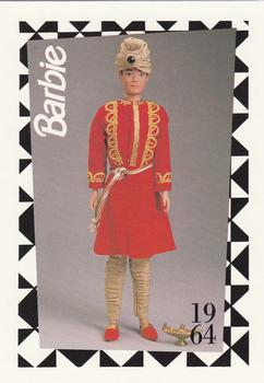
Sunday, July 30, 2017Set: 1991 Mattel Barbie (Rate) Card: #153 "Arabian Nights" Ken “ Oh holy heck. No. No, no, no, no, no. ” -muskie027
“ Ohh, that text on the back is terrible. Barbie, your man is wearing a skirt! (Not that it matters considering what Ken has going on down there) And his turban is crooked! Not to mention the countenance showing no emotion!my This is so bad it's actually good. So what would you wish for if you only got one wish? ” -Billy Kingsley
“ "I'm ready for our date, Arabian Ken!" "IT"S JUST KEN!!!" ” -DanD
“ All I can say about this card is "hmmm" ” -ketchupman36
“ Okay, so I just returned from a trip to the British Isles and Europe and witnessed firsthand Scotsmen in kilts. THEY looked tough and manly. Ken just looks like a doll. ” -Sportzcommish
“ I can't help but think about "Toy Story 3" when I look at this card. ” -mkaz80
“ Just plain hilarious! ” -carthage44
“ Parallel dimension of a skating rink ? The 'C' is blue instead of white. Nothing else to add. ” -jonnic
“ I don't ever want to hear jokes about the Pokemon cards again...EVER ” -SFC Temple
“ 1964s Aladdin Ken sure beats the heck out out 2017s "Man-bun" Ken. ” -captkirk42
“ Ken. Really dude. Don't you know your supposed to use the one wish to wish for a thousand more wishes? C'mon man. ” -CollectingAfterDeath
“ I needed a good laugh. ” -NJDevils
|
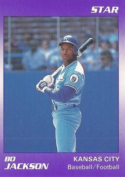
Saturday, July 29, 2017Set: 1990 Star Bo Jackson (Rate) “ Such an ugly card and the small Bo with nothing but what seems like a void space makes it worse. The color scheme is awful This card is bad. ” -muskie027
“ Sure a great athlete. Wish he was able to stay healthy. People said he should have stuck to one sport but he was fun to watch in both! ” -carthage44
“ Bo Knows Oddballs. ” -mkaz80
“ What can I say? I'm a little bit biased. Love it! ” -vrooomed
“ Great color......for an Easter egg ” -NJDevils
“ Two sports just like Tim Tebow. ” -kirkscards
“ Great athlete. Not so great card. ” -jayoneill
“ Bo knows Star Company? Card #3 is my favorite photo in this set. ” -UKboogie
“ I'm just tired of Star cards. They are OK and nice for what they were when they were but now I'm just tired of them. ” -captkirk42
|

Friday, July 28, 2017Set: 1999 Donruss Preferred QBC - Power (Rate) “ It's definitely going on my want list, not only because I collect Rice, but because it's an attractive card. I'd give it a 9.5. ” -Sportzcommish
“ I think I would prefer most other cards over this set ” -aussiewayne
“ Hmm I'd like to see this in person, is that foil, felt or glitter? Ugly as all get out, but is sort of close to matching team colors. Back is nice even though it has abbreviated stats. Come on showing only the last 3 years of a 14 year vet destined to be a HOFer. ” -captkirk42
“ Representing Mississippi Valley State Delta Devils. ” -carthage44
“ Nice looking card. Seems to be a parallel. I bet it looks even nicer in hand. And serially numbered, which I like! Actually, I'm addicted to SN cards, but that's no secret, lol. ” -Billy Kingsley
“ Partial career stats on back may be only issue, otherwise, a very good looking card. ” -CollectingAfterDeath
“ Not a fan of Donruss Preferred. Too much pizzazz. Not enough football. ” -jayoneill
“ Might as well blank out the people in the background if you are going to get artsy on the front. Just no point in the being there on the other side of the spikes. ” -NJDevils
|
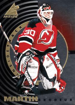
Thursday, July 27, 2017Set: 1997-98 Pinnacle Inside - Inside Track (Rate) “ Spent all but 7 games in his 1,266 career games with the Devils. Pretty amazing in this day in age! ” -carthage44
“ Goalies always look short and fat to me, and it's surprising sometimes when I see a photo of a goalie without all of his gear, how physically athletic they really are. I know it shouldn't be surprising, but my brain just can't help it sometimes ” -Brimose
“ That's a nice card!!! ” -CollectingAfterDeath
“ Nice insert...no missing the fact that it's a Pinnacle card, it just has that "look". Exceptionally great scan for what appears to be a mirror foil card. ” -Billy Kingsley
“ No major complaints here. The design reminds me a little of the James Bond looking through the gun barrel opening mixed with some kind of camera lens look. I like the look of this insert set better than the base cards from this set. ” -captkirk42
“ Holy goalies! I like the front, and the back is decent for an insert. ” -dilemma19
“ The cards that came in cans!! I think I had all the cans at one point. They may still be in my parent's attic. ” -DanD
“ Brodeur as ROTCD on the same day Lundvist is the feature. Is there a goalie or hockey streak coming? I am very meh on this card. ” -muskie027
|
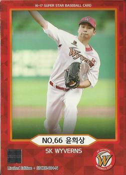
Wednesday, July 26, 2017Set: 2016-17 SMG Ntreev Superstar Black Edition (Rate) Card: #SBCBK-084-N Hee-Sang Yoon “ The front has a nice colored border, except that the border should have been smaller / thinner at the bottom side of the card. Maybe pull down the picture a smidge, so the hand with the ball makes it into the frame. The back appears to be nicely balanced. Not sure, but looks like an era of 4.84, with a whip of 1.52. Like the young pitcher, this card needs a little refinement, but I still like this card. ” -CollectingAfterDeath
“ I wonder if these are hot sellers! ” -carthage44
“ Pretty nice design. I can't read it, but it looks good. ” -Billy Kingsley
“ Good to see a card from Japan in the random card. There are a couple of card bloggers that chat about Japanese baseball cards. Both of the blogs I've seen the blogger is either currently living in Japan or had lived in Japan, there might be a few other bloggers who occasionally blog about the NPB (Nippon Professional Baseball) league. ” -captkirk42
“ Clean. Maybe too clean. It should be forbidden to use the same photo on both the front and back of a card. ” -dilemma19
“ I dig the cap logo. ” -mkaz80
“ This would make a nice card for an All Time St. Louis Cardinals set. I actually like this. A little less bottom border or something more to fill it and this would be really good. Can't say I know much about Hee Sang Yoon. I think it is funny that all the stat headers are in a foreign character set, except WHIP at the end. ” -muskie027
|
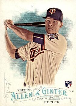
Tuesday, July 25, 2017Set: 2016 Topps Allen & Ginter (Rate) “ A big pass on the Allen & Ginter card. ” -carthage44
“ Love A&G sets. Really need to get off my butt and work those set builds. I'm sure people could send me their Non-Sports/non-Baseball ones? Never been a fan of the RC symbol, sure it makes the whole "Which card is his rookie card?" a lot easier but I don't like the way they have looked over the years. That might just be me. ” -captkirk42
“ I really like the Allen & Ginter sets , some of cards included are so random. I have to know is Kepler-maniacs out there ? ” -uncaian
“ Again. LOVE the card HATE the price!!!! This is why Cigars tag line makes me chuckle when I see it :) ” -RoyalChief
“ I am not an Allen & Ginter fan, but this looks cool. ” -muskie027
“ Great card! Any time a Twins player is the RCOTD is a good thing. ” -twinscollector34
“ Love A&G. Nice front designs year after year, but I'm not a fan of the backs. ” -olerud363
|
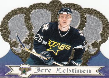
Monday, July 24, 2017Set: 1999-00 Pacific Crown Royale (Rate) “ Gotta love Pacific and their die cut crown cards...it may not have been their flagship set, but it is their iconic set! ” -Billy Kingsley
“ I've always been a fan of these Crown Royale cards...which were actually cut in the shape of a crown. Very cool, unlike today's 'die cuts' which come in any number of abstract shapes for no particular reason. ” -mkaz80
“ I like the "die cuts" Pacific put out , so easy to damage though. Great hockey player . ” -uncaian
“ Did not like that the die cut was the base card. ” -carthage44
“ ACK! the Crown Royale Die-Cut Crown cards. ["Men on" impersonation]Hate it! [/"Men on" impersonation] ” -captkirk42
“ Crown Royale always put out some interesting cads, but they are a pain to scan straight ” -Lennoxmatt
“ Cool player, cool set, cool card! ” -wax_house
“ Last non-center to win the Selke Trophy as the league's best defensive forward! ” -Howintensive
“ The font on this card is unjerable...Bere, Dere, uh quick look on the back...on Jere, I should have known, that's no one I know's name... ” -SaveDaKid
“ I used to love these cards but as time has gone on, I don't think they were much more than a pretty-looking gimmick. Still, I love die-cut cards. ” -nubala
“ I can't believe these were once considered high-end cards. ” -DanD
“ Don't like it. Actually, looks like he plays for the Kings. ” -muskie027
|
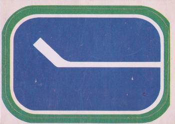
Sunday, July 23, 2017Set: 1972-73 O-Pee-Chee - Team Logos (Rate) “ This logo is awesome! ” -carthage44
“ Not a bad sticker for an album. Was this a card in the set or on a box? Is it a sticker? Were these inserts? These pre-date me and I don't know much about this set. Hockey is funny in that I feel like everyone thinks every team should wear the jerseys and use the uniforms from when they started watching. There is something special about the teams and logos from when you first enter following it. That being said, I love the Canucks black and yellow/orange logos and uniforms from the 80's/90's! ” -muskie027
“ No comment ” -Quinn820
“ Maybe some people like this 'classic' logo, but it doesn't do a thing for me. Looks more like a street sign. ” -mkaz80
“ I love team logo cards. I love all team cards but team logo cards are perhaps my favorite. This one appears to be a sticker. No matter, I want them for my collection. ” -Billy Kingsley
“ I wonder what a scratch and sniff hockey sticker would smell like. ” -DanD
“ Not much of a hockey man, but this is pretty cool. Almost looks like a whale head or something. ” -RoyalChief
“ Wow, an "In Action" shot. ” -cjjt
“ Love it....why not. Old school.....simple....and cannot offend anyone. ” -tbshaw
“ Simple, but cool! ” -bkklaos
“ The ultra-minimalist Canucks logo.. ” -Mike67
“ Cool Hockey team logo sticker. Oh and it's OPC too. Extra Cool. ” -captkirk42
|

")