
Random Card of the Day |
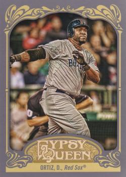
Saturday, July 22, 2017Set: 2012 Topps Gypsy Queen (Rate) “ Never liked the name of these cards or how they looked. ” -carthage44
“ The A-Rod of the Red Sox - in more ways than one. ” -DarkSide830
“ I'm puzzled by the placement of the umpire in this picture. ” -mkaz80
“ I love Gypsy Queen and this card is a perfect example of who. The color scheme is beautiful, the shot of Ortiz is timeless and the borders serve to enhance, and not detract, from the card. ” -nubala
“ These are growing on me, it's just they are so stupid expensive. Because of that though I am able to buy them a year later when they are in the bargain bins at Wal-Mart and Casey's. ” -RoyalChief
“ Nice GQ only problem I have with GQ now is every year looks like every other year. When Topps first brought back the old Gypsy Queen Tobacco Brand in 2008 or whenever I hated it thought it was too bland and dark. The next year or two I started to like it. Now I just sort of tolerate it because I still kind of like it, but am tired of all the different retro sets Topps puts out. ” -captkirk42
“ Always liked gypsy queen. ” -kirkscards
|
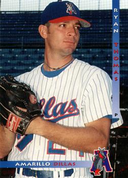
Friday, July 21, 2017Set: 1997 Grandstand Amarillo Dillas (Rate) “ Not a bad looking card for an MiLB card. It's not great but also not bad. Both sides are simple and to the point. Grandstand has been my favorite MiLB card manufacturer for a long time. I only go after cards of local teams and leagues when I'm at their games, but Grandstand always produces quality cards for a good price. ” -spazmatastic
“ Front isn't bad, but I hate the lowercase team name on the back. Not bad for a minor league card. ” -muskie027
“ I remember scanning this minor league set. ” -UKboogie
“ Pretty typical minor league card. I like the uniform combo. Is the nickname short for 'quesadillas' or what? That would be impressive! ” -mkaz80
“ Pretty nice front, interesting use of fonts on the back. I like. ” -rmpaq5
“ From the United League Baseball which played from 1994-2010. I could not find any future major leagers that played on the Amarillo Dillas. ” -carthage44
“ I like the front. I wonder if team and player names are coordinated with the team colors, or if this card was just a lucky example. Back is passable for a minor league issue, but I would have expected better in 1997. Fantastic team name! I'd love to own a hat, but that logo needs a rebuild... ” -dilemma19
“ Nice minor league card. I bet that team name can be a real tongue twister after a long night. ” -Billy Kingsley
“ Nice basic Minor League card. Looks like he was drafted by the Padres in 1996 but never made the Majors only played 96-97 in Minor League. :( ” -captkirk42
“ I like the simplicity. The color scheme on the right side and bottom reminds me of the 90s perfectly. ” -nubala
“ More like a collection of ugliest fonts plus the photo than a card. ” -Thomas_Kava
|
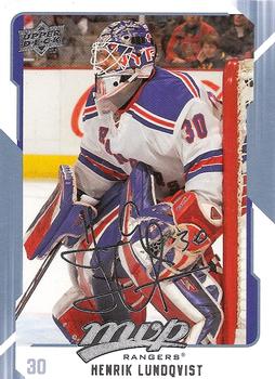
Thursday, July 20, 2017Set: 2008-09 Upper Deck MVP (Rate) “ The fake autograph has no place on this card. Just a waste. ” -carthage44
“ The MVP product always seemed to be a pretty solid product, especially for the price point. From what I see from this card, this is a typical MVP set. Nice photography, full stats, write-up, and a front design that is not over-bearing. A little bit of wasted space on the reverse, but I'm sure it wouldn't be for players who have been around the league for much longer. This is a set that would be nice to have. ” -vrooomed
“ This is my favorite card of the day in a long time...Since I got into the NHL in just this past November he has become my favorite player on my favorite team. And it's all because of the Database that I've now gotten into the sport...since then the NHL has been a big part of every day of my life, and I think it always will be! ” -Billy Kingsley
“ An OK card. Even for an Upper Deck MVP card. I think the thing that bugs me the most about MVP cards is the sliver facsimile signature (or the gold one for the "gold" parallels) those type of sigs are OK and tolerable when they are plain black and fine lines but thick lines or silver/gold sigs are awful. The back is OK. ” -captkirk42
“ Nice card overall. All required elements are there, but maybe not in proper proportions relative to one another (MVP logo bigger than player name on front?!). Could have squeezed a maskless headshot on the back. King Henrik was already showing his dominance over less than 3 seasons. ” -dilemma19
|
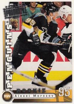
Wednesday, July 19, 2017Set: 1997-98 Donruss Priority (Rate) “ Very cluttered, no real structure. ” -carthage44
“ Got injured just as he was starting to find his game in North America. Love the robopen jersey! ” -wax_house
“ Too busy. What am I looking at? Priority? Priority for what exactly? Back is OK. For vets their full career stats look a bit nicer than the Rookie blurb. The "Priority" labels/stamps just get in the way and make things real ugly. ” -captkirk42
“ other than being a rookie card i like this card because of all the small details and the litle blonde girl in the corner her face is priceless ” -Starblazer
“ Odd photo. Blurry stick across the front and two players tangled up. Morozov doesn't really stand out enough. ” -olerud363
“ Another player who I went from having about a dozen cards of to now having none. ” -DanD
“ Cool Card ” -RexRusher23
“ "Priority"??? ” -cjjt
“ I never knew Donruss made hockey. This was during my out of the hobby years. This could have been way better. It was so close to being a good card though, just too much going on. ” -muskie027
|
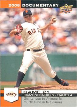
Tuesday, July 18, 2017Set: 2008 Upper Deck Documentary (Rate) “ I guess since it is a set called documentary, my joke about it looking like a documentary instead of a card isn't as funny as it is obvious. Given that its intent is to be informative, I guess it works. Not sure I like the concept, but if that is what you are going for, it actually is a nice card. ” -muskie027
“ Ah, the Topps Now precursor. I like it. ” -Doe MG
“ a bit bland on the front ” -Starblazer
“ Nice looking card from a very silly set or more accurately a set that would be a set collector's nightmare. Way way way too large a set to chase. Each team has at least 163 cards in the set one for each game plus a season summary card so that gives you a general idea of how big the set is. The grand total is 4,954 cards in the set. Not to mention the "Gold" parallel set and 3 insert sets All-Star game 55 cards, Home Run Derby 5 cards and Seasonal Signatures 60 cards. So yeah Set Collector's gonna hate. Whenever they repeat a player in the set they use the same photo on the front just change the game the card is talking about. Upper Deck was probably trying to out do Topps Total but I think they failed. Come to think about it maybe they set the stage for the Topps Now physical sets. ” -captkirk42
“ This set is way to big for a collector to collect the whole thing. Even if you're a team collector it is hard to collect just your team's set. ” -TheToddFather21
“ Ugh! This set was such a terrible idea. Ambitious, but terrible. ” -cckeith
|
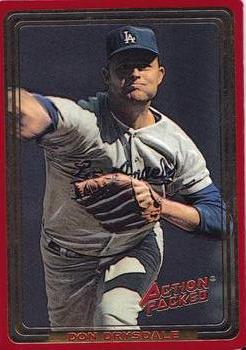
Monday, July 17, 2017Set: 1993 Action Packed All-Star Gallery Series II (Rate) “ I love Action Packed. If they had stayed around as a company longer they probably would have been my favorite. I'm not sure the red border on the front is actually on the card. ” -Billy Kingsley
“ This card did this the same year as he died. ” -dah15
“ I've always associated Action Packed with football. Didn't know they were into baseball, but in the early 90's who didn't produce baseball cards? ” -olerud363
“ These cards felt very bubbly. ” -carthage44
“ *Sigh* Action Packed. I am not a fan of thee. All Foil fronts and both sides of the card printed on the same side of the cardboard and then folded over. The back of the card information is actually very nice it is the fronts I tend not to like. ” -captkirk42
“ I like these Action Packed cards. Puffy cards are good. :) ” -Doe MG
“ I really like Action Packed. Love the stars of yesteryear. ” -cjjt
“ I really like this set. Hope to complete it someday. ” -jayoneill
“ The rounded corners and raised lettering on Action Packed cards made me think of credit cards when I'd get these as a kid. They were fun back then, but I don't think they've aged well. ” -DanD
“ don't collect baseball, but always loved Action Packed! ” -Thunderfoot
“ Not too bad. Action Packed definitely brought something new and innovative. Years later, I am still not quite sure if I like it or not. When they came out they were so cool and different. I honestly never knew they made baseball. ” -muskie027
|
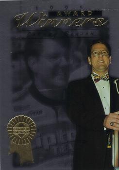
Sunday, July 16, 2017Set: 1996 Upper Deck Road to the Cup (Rate) “ Wow, I really don't like this. Such a boring card. I actually didn't know what it was or what sport until I read it, then I was able to see the racer uniform in the back. It would have been better had there been a racing shot, or even a post race shot. ” -muskie027
“ This card had potential but something is off about it. I would prefer Benson at the award ceremony to have a more center image instead of off to the right side. ” -nubala
“ Love Benson but this card is just plain ugly ” -Lennoxmatt
“ Nice bow tie! ” -carthage44
“ "..and the Oscar goes to..." Oh wait this is a racing card. WHERE'S THE CAR? That is what Clara Peller wants to know. Actually Mr. Benson here looks more like he is going to conduct an orchestra or make a commencement speech. ” -captkirk42
|
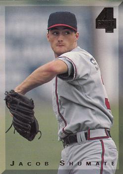
Saturday, July 15, 2017Set: 1994 Classic Four Sport (Rate) “ An ok look, but somewhat boring. ” -muskie027
“ ...at least the scan is good. ” -Billy Kingsley
“ I'm not a big fan of the Classic Four Sport sets and I'm too keen on very plain full "bleed" fronts, but I do kind of dig the beveled look as a kind of border. Also not a huge fan of products featuring High School kids. Not even big on the College issues, except when it is several years later and the College guys are now known pros. The Back is actually a little better than the front. ” -captkirk42
“ Kinda neat, but the design of the set is pretty lame. ” -DarkSide830
“ Kinda of liked the Four Sport cards as it gave you a little something from all four major sports (Baseball, Football, Basketball and Hockey). ” -carthage44
“ The card looks fine enough, but I really hate the 4-sport/multi-sport sets. Especially here when searching the database. Baseball is baseball, basketball is basketball etc... but if one wants to find every card for a team or a player, one must search all categories (which isn't an option to do all at once). And don't get me started on the entire Moody Blues set that is only found in the football (American) category, or Hall of Fame football players showing up in the baseball Hall of Fame listings because an athlete played both sports professionally. These multi-sport sets make searching and organizing a beast. I can only imagine what stuff like this does to people with OCD. ” -Doe MG
“ I hate it when they block logos out. ” -RoyalChief
“ The back is clean and balanced. The front looks like it needs something...perhaps a school logo placed on the cap, or up in the top left corner would have been nice. A plus for using different pics on each side. ” -CollectingAfterDeath
“ Seems absurd that they had to airbrush his high school uniform. ” -switzr1
|
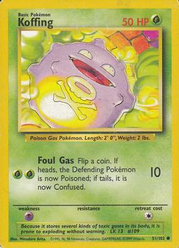
Friday, July 14, 2017Set: 1999 Pokemon Base Set (Rate) “ Not my thing. ” -muskie027
“ Foul gas is right. ” -mkaz80
“ I think I'd like Pokemon cards more, except my kids leave them everywhere, so I'm sick of seeing them lying all over my house. ” -dilemma19
“ Random card had to eventually get to Pokemon I guess. I have never gotten any of these cards and have no intentions. I'll dabble with other TCG sets for the collecting only of them (Star Trek, Doctor Who, Hercules, Xena) not playing the games. Ones that catch my eye but this I refuse to ever get into. Mostly it is the proliferation of counterfeit cards in circulation. It is also due to the sheer number of them and their variations. Different editions usually have subtle variants to them in much the same way as parallels they create with sports sets. A few years ago I thought that Pokemon and its short distant cousin YuGiOh had fallen out of the hobby but they are still hanging on fairly strong. If one knew enough about them and made some strategic purchases they could make some good money off this stuff. ” -captkirk42
“ I knew this day would come. ;) ” -Doe MG
“ Haven't looked at a RCOTD in months, and of course it's a Pokémon. My only comment is that I'm impressed my spell checker automatically put an accent mark on my E in the first sentence. ” -switzr1
“ That thing must have just eaten some Chipotle. ” -pistonfan
|
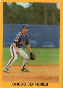
Thursday, July 13, 2017Set: 1989 Golden Superstars (unlicensed) (Rate) “ Ok Broder Cards are what they are, an attempt to capitalize on the "boom" of the late 80s early 90s, and I can accept that and will get any Tiger card I don't already own of this type as they become available to me but wow this is bad. The orange/yellow border, off centre photo, and lack of anything on the back is just awful. On top of that, it is obviously a photo from a spring training workout or game, but man this uniform combo is just hideous. ” -rmpaq5
“ Is this actually made by Broder or just tagged as such? ” -Billy Kingsley
“ Oh I remember when he was all the rage.....next big thing......well, it did not turn out that way. Pretty ordinary card.....the front is very similar to some of the Classic Trivia cards of the day. ” -tbshaw
“ Unlicensed because someone made these cards in their basement? ” -carthage44
“ "The story behind the card": 1. Due to intense hype surrounding Jefferies in 1989, the photographer was stuck behind a barricade erected miles away to impede snipers. This is the best that his/her zoom lens could do. -- OR -- 2. Due to Jefferies' super-human reflexes and speed, the photographer made sure not to frame him too tightly. This image was captured a split second before the future hall-of-famer disappeared beyond the top of the frame to rob a frozen rope home run. ” -dilemma19
“ Perfect example of a Panini Sticker. Oops its a 1990s Broder "card", excuse me 1989 card. At the very first glance I made of this card I saw the gold/yellow border and started to think it was Topps 2002, or perhaps a mid 1980s Fleer then noticed only the player's name and thought it might be a sticker, heck even the back looks like a Topps or Panini Sticker. It could almost pass for a 1970s oddball food issued card. ” -captkirk42
“ I think there are literally like a zillion Broder cards out there. ” -suomibear8
“ Everybody created a card in the late 80's and early 90's ” -kirkscards
“ I have to say this is one of the most boring cards I have ever seen ” -corozco
“ Very basic but very interesting photo. The back is obviously awful, but the front is actually not bad. ” -muskie027
“ I remember when he was supposed to be the next big thing in baseball! He didn't really live up to the hype, but he was still a pretty decent player. ” -cckeith
“ One of the most important card sets to most baseball collectors, I just know it has to be. ” -UKboogie
|

")