
Random Card of the Day |
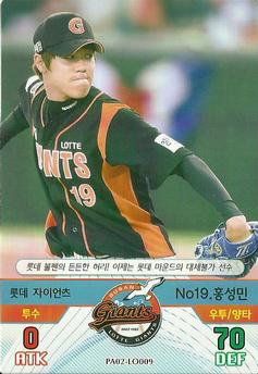
Friday, April 21, 2017Set: 2016 SMG Ntreev Baseball's Best Players Diamond Winners (Rate) Card: #PA02-LO009 Sung-Min Hong “ Wow! Racecar drivers double as baseball players in Japan? ” -Sportzcommish
“ Wow, these game cards must be popular. ” -carthage44
“ Odd looking gaming card (CCG, TCG) ” -captkirk42
“ Not a fan of the coloring looks too bright. ” -TradingCards964
“ No thank you. ” -jayoneill
|

Thursday, April 20, 2017Set: 1999 Upper Deck Retro (Rate) “ Why does football have such a high preponderance of digitally created backdrops? ” -Billy Kingsley
“ The sky is extra clear and blue in Pittsburgh today... ” -rmpaq5
“ Love it. Very nice Retro look honors late 60s Topps designs without actually using them. Back is excellent although stats should be full not limited. love the retro cartoon logo. ” -captkirk42
“ One of the weaker retro sets in my opinion. ” -carthage44
“ Never liked the Steelers logo which came from U.S. Steel. I like the factory logo which is on some team cards in the 50s. ” -NJDevils
“ Front so-so. Back--I like. Lots of info. ” -cjjt
“ I like the retro look, but prefer less white space. ” -Sportzcommish
“ Very simple and very much a failure. The card doesn't do anything for me. ” -muskie027
|
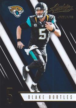
Wednesday, April 19, 2017Set: 2016 Panini Absolute (Rate) “ These cards are a tough scan but they have a nice shine in person ” -ketchupman36
“ Meh. At least the scan is great. ” -Billy Kingsley
“ absolute rubbish, I personally hate cards with generated backgrounds ” -aussiewayne
“ I hate that Panini has bought out the NFL licence and now they produce garbage like this because they do not have any competition. ” -carthage44
“ This is a pretty nice set. Now that Panini has exclusive to the NFL unfortunately all their sets have the same back looks and they seem to be limiting the stats to just the previous season. Other than that I am OK with this set. I have opened quite a few packs of this for the Football team Traders group I'm a part of. ” -captkirk42
“ Good photo on the front. I love the new Jags uniforms! A little too much going on on the front in my opinion though. ” -JoshReese92099
“ "Hi. I'm Blake Bortles. I don't play football, I just pose in front of a green screen - and only long enough for one shot so you'll need to use it on both the front and back." ” -dilemma19
“ Looks like Bortles is running away from a floating jaguar head. I've never been a fan of this type of "floating picture" design. ” -olerud363
“ Yesterday I praised the RCOTD's uniform (Winnipeg Jets), today...not so much. ” -rmpaq5
“ 2004 Leaf Rookies & Stars Longevity? No, just another crap Panini set. ” -cjjt
“ Insert would be cool, but base set no. ” -muskie027
|

Tuesday, April 18, 2017Set: 1995-96 SkyBox Impact (Rate) “ Never heard this guy's name, he's one all American. ” -dah15
“ The Quint-essential hockey set to own? The card has more positives than negatives. The good: A full-size photo showing the player ready to react and the Skybox logo is visible and out of the way. The bad: The side banner's mixture of color and transparent lettering and the lack of a bottom banner for the "Rookie" overlay. ” -Sportzcommish
“ Foil waste on left side. I'm pretty sure in person these are fairly easy to read, this scan however very difficult as foil doesn't scan well. At least they had a license to show logos otherwise there would be no way of knowing which team this rookie was on. Back very very plain but at least you can read his name and see that he is on the Winnipeg Jets. ” -captkirk42
“ Love the old Jets logo. ” -rmpaq5
“ The back of the card is weak. ” -carthage44
“ Typical 90s design, foil makes it hard to read ” -Lennoxmatt
“ Nice card. Hopefully someday I'll add a copy to my collection. ” -Billy Kingsley
“ Quint's career has lasted longer than this product , thankfully. Shane Doan & him are the last active players from the "original Jets." ” -uncaian
“ I never knew Skybox did hockey. Not bad. I would have like these. ” -muskie027
“ Very weird card ” -Bargunmaster
|

Monday, April 17, 2017Set: 1994 Sportflics 2000 Rookie & Traded (Rate) “ This card is so 90s looking, it's still a hot collector's item in Portland ” -ketchupman36
“ It's probable that technology and indecision provided us with Sportflics - the ability to overlay multiple pictures with a semblance of video and the inability to simply decide on one photograph to display on a card. No like. ” -Sportzcommish
“ Lenticular = always awesome! ” -Billy Kingsley
“ Great scan for a Sportsflics. ” -carthage44
“ If anyone needs an action hologram, it's Lance Painter. ” -wax_house
“ Ah Sportflics the 1960s/70s 3-D technology living and breathing in the 1990s I really liked those things, but after getting back into the hobby around 2004 they don't do anything for me anymore. In fact I'm trying to avoid them. I should try to dump whatever NON PC team cards I have of these things. ” -captkirk42
“ I was a fan of Sportflics as a kid, but not any more. These cards were also very easily warped. ” -suomibear8
“ I still think Sportflics are kind of cool. I'd never build a set, but I like them for the individual players I collect. This one could do without the profile picture in the corner. The back is an absolute disaster. I'll pass on this issue ” -AnalogKid
“ Cool concept but it seemed like the cards warped too much. ” -Joshua825
“ Love these cards! ” -Bargunmaster
“ I always love 3-d cards. ” -cjjt
“ When these types of cards first really hit the market I loved 'em. They were the first cards other than O-Pee-Chee packs that my local variety stores started to stock via the 1986 Sportflics series. As for this card, the scan is really good. You get an image of both photos. The back is too busy for my taste, but I do really like the front. ” -rmpaq5
|
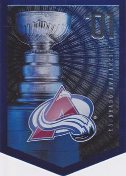
Sunday, April 16, 2017Set: 2012 Panini Molson Stanley Cup Collection (Rate) “ Like most trophy tribute cards, they don't mean much to me unless they're of the teams I follow. ” -Sportzcommish
“ Fitting that this appears at the start of the playoffs, bit of a slap in the face to Avalanche fans considering how bad the season was for them. ” -Lennoxmatt
“ This looks 3D...and die cut. Nice promo! ” -Billy Kingsley
“ Interesting concept, I feel as though they missed the mark and did a little too much foil ” -JoshReese92099
“ This team was stacked: Forsberg, Sakic, Hejduk, Bourque, Foote, Blake and Roy! ” -carthage44
“ Nice ! ” -uncaian
“ Nice design. I'm not a die-cut fan but whatever since it obviously represents the championship "banner" for each season. ” -captkirk42
“ Just really over designed and it looks muddy and cluttered ” -Bargunmaster
“ This is an awesome card. I cannot find this in the database, but I know it is here. I am going to keep looking. If this is a set of all of the Stanley Cup Champions, much like the 90 Pro Set Super Bowl sets, I am going to start collecting them. ” -muskie027
“ No one is more committed to lowering the bar than Panini. ” -UKboogie
|


Friday, April 14, 2017Set: 1995-96 Collector's Choice (Rate) “ It would have been cooler a second later, after he smacked all the letters in "NIEUWENDYK" into a big jumble with his stick. ” -revnorb
“ I first saw this design in the NBA set issued the same year. I thought it was bland and boring then. It wasn't until years later when I realized how good this design actually is. Now I really like it. ” -Billy Kingsley
“ Nice looking set , inexpensive & easy to collect. ” -uncaian
“ More points than games played is always an indication of an elite player. ” -carthage44
“ I've got a love/hate with Collector's Choice. First NO it wasn't the collector's choice it was whoever was in charge of submitting the set designs to be approved. OK so overall the front is pretty good the player's name you can't miss, the set name "Collector's Choice" could probably server better on the bottom reading the normal horizontal way not high and vertical. Team name is there at least, team logo would be nice to have. nice white border. Back is OK, but picture too big. Card number could stand being a little bigger. ” -captkirk42
“ Lets go flames!! ” -Bargunmaster
“ Big Red! ” -SFC Temple
“ Another card with what I deem to be the late 80's-early 90's pop font. Sadly, I think this would be a great card if not for the font. I really like everything else about it. I absolutely HATE the lower case first letter in the first name too. Joey was a great player. Not sure he gets the respect from modern day fans as one of the greats. Check out those goal totals over his first four full seasons!!! ” -muskie027
“ Landscape configurations are lame when every card in the set isn't in landscape. They're irritating to view in a binder when some are portrait and some are landscape. It's even worse when reading the name right side up on the front leads to the stats being upside down when in a binder. See the landscape cards in 2010-11 Score Hockey. ” -wax_house
“ And I thought Yasiel Puig was difficult to pronounce... ” -jayoneill
“ "He shoots! He scores!" ” -CollectingAfterDeath
“ The problem with many hockey action shots is there is too much white due to the ice. ” -NJDevils
“ Looks like they're having a great time on the ice. Is it adult skate only? ” -Sportzcommish
|

Thursday, April 13, 2017Set: 1995 Ultra Batman Forever (Rate) “ This was a terrible movie. For some reason DC just cannot get a good movie made. At least this sets inserts are mostly holograms. ” -Billy Kingsley
“ Guess I'll have to flip a coin over this one.. The "splash" effect on this scan reminds me of a Roman Gabriel card I have that until I had mistakenly gotten a duplicate of it years later, I didn't know had a problem ” -captkirk42
“ I bet Tommy Lee Jones loved doing that makeup everyday. ” -carthage44
“ Got a case of 87 topps had for 30 years . Bet the gum is real good Love them. k37jdd ” -Iceman392613
“ Not sure if I like this card or not. Maybe I will flip a coin to make my decision. ” -grim25
“ Tommy Lee Jones was great, but Aaron Eckhart was better. ” -Sportzcommish
“ At first this looked demonic, then I quickly new it was Two Face. Not bad for a movie set. Probably something I wouldn't personally collect, but I can at least appreciate it. ” -muskie027
“ Oh Dang... ” -Bargunmaster
|
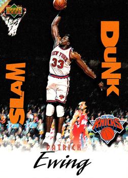
Wednesday, April 12, 2017Set: 1997 Upper Deck Nestle Slam Dunk (Rate) “ Yeah, but did they have a Free Throw subset? ” -Sportzcommish
“ Which idiot uploaded this crappy scan? Oh yeah....ME. now that I have a scanner that can handle the UD cards that my Canon scanner put lines on, I will rescan it eventually. This was one of three sets UD did that came with chocolate bars. This was the last of the three. Great photo. Right near the end of Ewing's time with the Knicks. Great memories for me. ” -Billy Kingsley
“ Just as Patrick was about to slam dunk , Scotty beamed him & the rest of the stadium up. ” -uncaian
“ The new Georgetown Hoyas basketball coach. Pretty cool! ” -carthage44
“ The funny font that the words "Slam Dunk" are in and their orientation makes me think this set is geared toward kids. If those words were oriented better and in a more standard font it might be an improvement. With the player name not sure if they are going for a signature look or not. Back for the most part is OK. Still an issue with the set title "Slam Dunk" ” -captkirk42
“ Coincidence that a Ewing card is RCOTD days after he gets a head coaching gig at his alma mater. ” -Brimose
“ Really hate the "Slam Dunk" lettering. ” -NJDevils
“ Yes! ” -SFC Temple
“ Front and back pics goes together nicely. Would like to see more that kind of pic choosing. ” -Duke
“ Not a bad card as an insert, but the font of "Slam Dunk" looks more like something from the late 80's or early 90's hip hop scene. It is awful! Somewhat coincidental that Ewing is RCOTD within a day of him getting hired as the Georgetown coach. I wish him the best of luck! ” -muskie027
“ It will be interesting to see if he can win at Georgetown. I hope he does. ” -UKboogie
|

")