
Random Card of the Day |

Thursday, February 9, 2017Set: 1998 Dune Eye of the Storm (Rate) “ Oh, darn. Low morale is always bad. ” -Duke
“ Decent little quote on the bottom. ” -rmpaq5
“ I guess if your into this, it isn't bad. I think it is a game card, and I so, then I think it looks a little light on the gaming aspects. The overall card has a cool look. This would have made a better front for a collector card as opposed to a game card. ” -muskie027
“ I'd have low morale too dressed like George Brazil. ” -sahal694
“ First time I've seen this card game before. Pretty generic picture. ” -Mihome316
“ All right, who didn't read the guidelines when entering this set. NNO171? Kind of an oxymoron. Anyways, not loving the artwork of this set. ” -CluelessJoe
“ Hope this game is better than the movie from the 80's, shouldn't be hard. ” -hphillips
|

Wednesday, February 8, 2017Set: 1995 Upper Deck - Electric Diamond (Rate) “ Very understated parallel. I like the holofoil on the NBA version better. ” -Billy Kingsley
“ Looks like it should be a promo card especially the back. Almost didn't see Ben's name there on the front. The back looks like a newspaper ad. The regular cards from the regular set and thus this "parallel" set look much nicer than these "Top Prospect" things. ” -captkirk42
“ Ahh close to the beginning of the scourge that has become parallel hell. At least back then it was only one, or two, and not every colour in a Crayola box. ” -rmpaq5
“ One of the more highly touted prospects that never panned out. ” -carthage44
“ Being more of a basketball collector vs baseball, I never knew there was a such thing as Electric Diamond. Much more familiar with Electric Court. ” -sahal694
“ I have so little patience for cards without stats on them. ” -DarkSide830
“ Thank goodness 'Top Prospect' was written so largely and 'Ben Grieve' in a font that required a microscope to read it. I guess that might be because he was bigger as a prospect than as he was as a player. Very ho hum card. ” -muskie027
“ Remember when Upper Deck produced like two parallels? Electric Diamond and Gold Electric Diamond. Looks like a Subway sign in the background? Fresh white uniforms too! ” -jasongerman9
|

Tuesday, February 7, 2017Set: 2007 Topps Moments & Milestones (Rate) “ Hands down the dumbest insert set....ever......eeeeevvvvveer! The sheer number of small print run cards, pretty much all with th exact same photo. Stupid, stupid, stupid. ” -rmpaq5
“ Good thing Clemens didn't have other memorable moments or milestones mentioned on the card, else they'd cover up the front picture. ” -Sportzcommish
“ Wanna get a baseball debate going ,talk about the Rocket. Actually not a bad card. ” -uncaian
“ UGH I did not like these Moments and Milestones cards. Too many cards with the same ding dang design the only difference is the number for the stat. ” -captkirk42
“ This looks good. I am not a big fan of how much is taken out for the bottom info stripe, but since this /150 and it appears to be an insert of some sort, I don't mind. Color on the back wouldn't have hurt, given the nice coloring on the front. It is weird to see Clemens as an Astro. ” -muskie027
“ This set has 12,475 cards. Can you say OVERKILL!!! ” -carthage44
“ Ugh.. Hated this set way too many cards. Nice to see the Rocket. but nope not for me. ” -Mihome316
“ Cool card of one of my favorite pitchers of all time. I hope he makes it into the Hall soon. I've never seen this set before. Obviously not the flagship Topps set but I don't have anything negative to say. ” -Mitch
“ First impression: Clemens looks very large in this photo. Low SN which is cool (love #9!). Confused on the strikeout portion however; 201, or 218? Statline on the back lists it as 218, so what's the significance of the 201?? ” -jasongerman9
“ Great pitcher, great scan ” -hphillips
“ When his son was playing here in Lexington, KY, the rocket took the team to Best Buy and bought the players a bunch of toys that single A players usually can't afford. ” -UKboogie
|
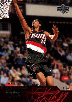
Monday, February 6, 2017Set: 2003-04 Upper Deck (Rate) “ Ahh, Qyntel Woods. The guy who tried to use his trading card as ID when he got in trouble with the law for some reason (I no longer remember). Not real popular among Blazers fans. Didn't have much success on court. Of course he hardly ever even got ON the court so it's not like he got much chance. I pulled a lot of cards of him back in the day, including this one which I got when the set was new. He only played 167 games in his NBA career, then went to Europe, where he still plays, this season in France. He was MVP of the Polish professional basketball league a few years ago. ” -Billy Kingsley
“ Are the woods on fire? Is he slamming down over flames in the Dunk Contest? ” -Sportzcommish
“ This guy was also in trouble with the law for staging dog fights at his house like Michael Vick. Did he get 2 years in jail like Vick did? No, he got 80 days of community service and a $10,000 fine. I am not condoning animal cruelty but we are talking about animals here not humans. People kill other people and get less time in jail than Vick did. Vick really got the short end of the stick on that one. Glad Vick was able to get back to the NFL and have some productive years after his jail time as the judicial system let us all down on that ruling. ” -carthage44
“ I remember getting a box of this set for Christmas 2003 hoping I would get a LeBron or Anthony rookie. Didn't happen. Did get my first NBA jersey cards from this set though. I don't have the base cards from this set anymore as I tossed them during a move. Wish I would have known I was going to get deep in the hobby again. Tossed my Chris Bosh Black Diamond RC I got that year too. I only filled a small binder of cards to keep. ” -sahal694
“ Ouch. Rough scan with the foil name on the front. I like the picture though. Overall I guess the whole card is meh; not great but not terrible either. ” -jasongerman9
“ Wow, drafted out of Northeast Mississippi Community College. A quick scan of notable alumni showed me at least two others have been drafted that played there. Dontae' Jones and Adrian Smith. Although neither was drafted directly from there. Qyntel is still playing. His accolades include an MVP award, 3 time league champion, 2 time all star and a slam dunk champion. All in foreign leagues of course. I like the card other than the inability to read the name on the front. I'm sure it looks better in hand. ” -Mitch
“ So-so Upper Deck design foil lettering hard to read name on the color scheme at least in this scan. Back is OK standard UD stats. ” -captkirk42
“ Pretty cool photo. Unfortunately, I would have no clue who this was if not for the header offered by the website. I'll assume card in hand is more legible, so I'll let that slide, but I am not sure why a sixth of the card is blacked out by a useless and overly dark basketball rim. Had this been a full card photo with just the name in the left, it would have been better. ” -muskie027
“ Upper deck and their blank space... ” -DarkSide830
“ If I could read the text, this card front would be great. ” -dilemma19
|


Saturday, February 4, 2017Set: 2001 Pacific - Retail LTD (Rate) “ How can you tell if it is retail or hobby? ” -Billy Kingsley
“ Nice numbering 299/299. ” -Duke
“ Beautifully designed card that starts with an iconic action photo of the QB dropping back over a team-colored banner filled with the Chargers logo and player's name. The chosen font is an excellent complement to the banner, particularly how it's used to display the player's name. Players I collect will certainly be added to my Want List based on this one card. ” -Sportzcommish
“ He is now the GOD of Michigan Football! ” -carthage44
“ the Buckeye fan in me wants so badly to say something snarky here... but it's pretty cool the scan is the final number in the print run. ” -Brimose
“ Can't read the players name. I do not like the foil names. ” -jayoneill
“ I like this. The coloring and design is clean and bright. The foiling makes it hard to see how nice the name might look, but I'll bet this looks great in hand. The back is nice as well. I'd take this! ” -muskie027
“ The University of Michigan head coach as a quarterback. Pretty soon the kids that he's recruiting won't have even been born yet when he was playing; I was 7 when this card came out! Interesting to see a 299/299 SN on the front. I always liked Pacific's number designation, being down at the bottom with the set information around it. ” -jasongerman9
“ Not bad, but not very original either, good scan ” -hphillips
“ Will feel weird next season getting cards of a team I used to follow. ” -volbox
“ This card reminds me why I miss the Pacific brand. ” -captkirk42
|
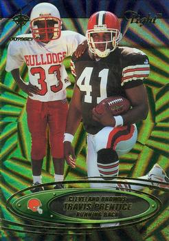
Friday, February 3, 2017Set: 2000 Collector's Edge Odyssey - Tight (Rate) “ Can I say UGLY? OK this card is ugly, rather the field or rug design they are on in front of. Back looks like some kind of promo for a kids day event. Is that "Tight Odyssey" or "Light Odyssey"? Or something else completely? Um this card is a failure in my book. ” -captkirk42
“ Who names their set "Tight"? Leave it to Collector's Edge. At least this is actually licensed, unlike most of their products. Would be nice if they said who the random kid was. Perhaps his son? I was going to comment on the fact that Angus would be happy to have a Brown come up, and then I see it's his scan. Reading his blog has actually made me care about a football team, something I never imagined would happen. ” -Billy Kingsley
“ Just awful. ” -Duke
“ If you focus the microscope you can see the rare brown travistus amoeba. ” -Sportzcommish
“ I don't get it...is the kid a picture of him when younger superimposed in, or a youth player in the Cleveland area? If it is a youth player why not give the kid his due and have his name on the card. That would have been thrilling for any young player to have your name on a real card. ” -rmpaq5
“ Cool photo, lousy background graphics for the pose. I'd rather see this on a traditional card with no alterations to the background. ” -Brimose
“ Never was a huge fan of the Collector's Edge card designs; too busy and jumbled for me. I'm guessing Prentice is pictured with a younger family member, or a young fan - that's sort of a neat deal. The three photos on the back look like they're the same as the front one, just at different magnifications. Some variation would have been cool. All in all though, this card ranks pretty low for me - way too much going on, the same photo used multiple times, etc. ” -jasongerman9
“ Reminds me of a screen transition from That 70's Show. ” -sahal694
“ Yeah, uh, no. This comes up lacking on so many levels. The most damaging level is that of desirability, as in, I have no desire for this card. ” -muskie027
“ Weird subset. I prefer the cards of the pros playing against the children. ” -UKboogie
“ Odd. Collector's Edge did some interesting things, but in general the cards were too dark, variations difficult to tell apart. ” -cjjt
“ WHY?! ” -hphillips
|
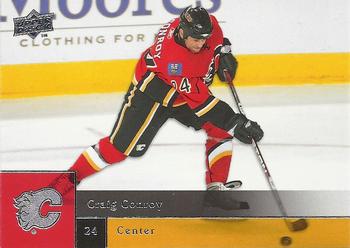
Thursday, February 2, 2017Set: 2009-10 Upper Deck (Rate) “ I really, really like the 2009-10 Upper Deck design. They used it in NBA also, and with a slight modification in MLB. To me it looks great. The NBA set is way expensive if you can even find it, but now that I'm collecting hockey maybe I can hunt down a box of them... ” -Billy Kingsley
“ I am a huge fan of this set. The colors really popped well, especially for teams like Calgary and Minnesota. The white ice often washes out hockey cards, so having bright colors really bring an impact. ” -Howintensive
“ Looks like a pretty solid player that bounced around a lot. ” -carthage44
“ Nice Action Shot. I do like they let you see the puck and stick through the coloring. ” -kirkscards
“ I don't follow hockey, but to me this guy could serve as a logo ala Jerry West for the NBA or MJ for Nike. He does remind me of the old Nintendo Blades of Steel or Ice Hockey characters. ” -Sportzcommish
“ Meh. Never really collected much hockey. However, the Upper Deck set for baseball (and I believe football too) was just like this. I'm okay with the design. The name, position, and number on the front seem a little small. I remember the codes on the back (lower left) for Upper Deck Kids - I ended up submitting so many as a 15 year old or so that I won a hobby box of 2008 Upper Deck First Edition baseball. But I digress. Overall I like this Upper Deck design, even if it doesn't carry quite the charm of the early 90s. ” -jasongerman9
“ I like this design for the baseball set, looks good with the hockey set as well. ” -tenlbpain
“ When I first saw the 2009 UD Baseball I hated it but sought to collect my Homie Nationals in it (might still need a few not sure) then grew to like the set. Hockey and the other sports followed suit with this design Now I like it, it isn't so bad. Upper Deck has had some sets that are worse. Back is pretty standard for modern cards. I miss the silly cartoons on the back myself. ” -captkirk42
“ On a day where Upper Deck failed on the ROTC with the Gretzky debacle, the card we get to write on is UD. Well, I say they redeemed themselves. This is a nice card. Good photo, coloring, name position and number boxes are not too large and are translucent so it doesn't ruin the picture. The team logo is nice and has the same effect as well. This was in my brief time off from collecting, but I really like it and would have been very happy that year with this design. ” -muskie027
“ Nice looking card, but Craig who? ” -Kirokyukan
|
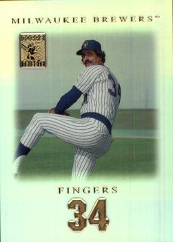
Wednesday, February 1, 2017Set: 2001 Topps Tribute (Rate) “ The best moustache in sports! I should really go full handlebar some day...just to see the reactions I'd get. ” -Billy Kingsley
“ An iconic player. Old school in the modern era. I have always loved the mustache and the name. It just breathes baseball. ” -Sportzcommish
“ Love the card! I only have a couple, hopefully will get more later! ” -Joshua825
“ Awesome! Always loved that "stash"! I'd love to own any of his cards, this one included! ” -bkklaos
“ Not a bad card , coolest mustache in baseball . ” -uncaian
“ Ordinary, but classy at the same time. Not as classy as that mustache though. ” -tbshaw
“ Rollie and Goose's mustaches were top five all time. I wish I were secure enough to rock that curl 'stache. ” -Brimose
“ Nice looking front. The problem is over there years there have been tons of tribute sets that look like that. The back looks like a commercial made Kodak commemorative slide from some theme park. ” -captkirk42
“ I can't believe the Brewers retired his jersey number 34. He is much more famous for his years with the A's and Padres than his final years with the Brew Crew. Yes, he won the AL MVP and Cy Young award in 1981 (his first year with the Brewers) but that qualifies as retiring a jersey number? I guess the Brewers were just eager to retire a jersey since the only number they had retired in 1992 (the year they retired Fingers jersey), was #44 Hank Aaron. ” -carthage44
“ Rollie Fingers the man with 'stache. ” -kirkscards
“ I like this design. The shadowed edges effect is intriguing, and the stamp in the upper left catches my eye. I assume that's a holofoil/chrome surface that looks better in hand than on a scan. All in all, I give this a thumbs up. ” -jasongerman9
“ Fingers 34 sounds like it could be a band name, or a nightclub. ” -sahal694
“ I loved getting a Rollie Fingers card!! That oh so perfect mustache!!! His flare gave him fame above his closer abilities. As for this card, it isn't bad. A few things could hae made it better, such as making the picture bigger, putting his full name on it, and maybe not having his number be so big on the front and back. Some more stats, perhaps an annual breakout, would have been nicer too. ” -muskie027
“ The best mustache in baseball...ever! The card has way too much wasted white space. Hate that. ” -C2Cigars
“ I like it. Minimal design. Good use of gold. ” -cjjt
|
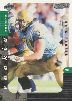
Tuesday, January 31, 2017Set: 1999 Collector's Edge Supreme (Rate) “ This looks like a Pinnacle design, and I'm truly surprised to see that it's not. ” -Billy Kingsley
“ Ah, the joys of college football photos without the logo! Reminds me of the 1996 Collector's Choice set. Not a terrible design, especially for a lineman. He's listed as a left tackle on the back, but as a running back on the front...? The back seems a little, I don't know, elementary? Not an overall terrible card, but I've seen better. ” -jasongerman9
“ does anyone know if Panini will redeem a 2007 Donruss Classics card? These are pre enter the code online cards....I opened a box yesterday and hit a drew brees significant sig card....thanks ” -Grizzlies24
“ Won the Outland Trophy, which is given to the best interior lineman in college, in 1998. He played a total of 3 games (1 started) in the NFL. ” -carthage44
“ I'm too old be turning cards left and right to figure out whose card it is and what team they played for. ” -NJDevils
“ Save Farris ” -sahal694
“ Am I missing something? Shouldn't there be UCLA written across the helmet? Were these not licensed or something? I feel like other cards from colleges have the helmet logos. I feel like the answer is something obvious that I am not remembering. ” -muskie027
“ I'll just use this card as an excuse to lament the advent of rookie, draft pick, future star, prospect cards. This guy played three games in the NFL. This card, unless I'm really missing something, doesn't even tell me what team he is a rookie draft pick for. And I'm confused or stupid or both. Why does it say "RB" on the front, if he's a tackle? "Really Big?" The back of the card is 1/3 empty, because he hasn't done anything yet. The whole concept makes me too depressed to be witty. ” -Vvvergeer
“ Not a bad college card. If it is supposed to be one of these Rookies and Prospects type card sets then it is awful. ” -captkirk42
“ Supreme? What exactly is so supreme about this card? The design is simple but the text in three different directions is annoying. The back is a waste of space. And Farris is definitely not supreme. Drafted in 1999 but didn't play with a team until 2001. And then it was only 3 games. A supreme failure, maybe. ” -C2Cigars
|

")