
Random Card of the Day |

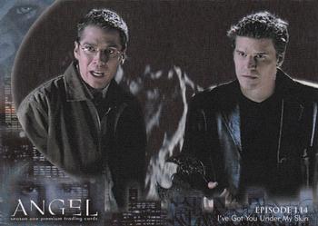
Friday, December 9, 2016Set: 2000 Inkworks Angel Season 1 (Rate) “ Buffy spin off. I liked this show at the time. ” -CluelessJoe
“ A Buffy spin off. If Sarah Michelle Gellar isn't in it, no thank you! ” -carthage44
“ I guess the episode summary on the back wouldn't be a spoiler to the ultra-superfans that would own these cards. Now I don't feel the need to watch it. If you squint a bit, the guy on the left and under the card number looks like Arnold Schwarzenegger ” -dilemma19
“ Non-Sport goodness in the random pot today. Nice overall card ” -captkirk42
“ Many of us are probably thinking the same thing. "The Bad Seed....The Bad Card" ” -NJDevils
“ I've heard I should get into this show but never did. As far as a card, I guess it is ok, I am not sure how critical the picture is to the series. I like the back, both graphically and info wise, and as for the front, it is cool enough. ” -muskie027
|

Thursday, December 8, 2016Set: 2008 Upper Deck Icons (Rate) “ Not a bad design...it looks like mirror foil which means it's an excellent scan. I have never liked when rookies were included into legends sets, which based on the name Icons, this might be, but it's the first time I've ever seen this set, so it might not. ” -Billy Kingsley
“ One of my favorite sets of all-time! So many good rookies like, Jordy Nelson, Matt Forte, Matt Ryan, Joe Flacco, Jamaal Charles, DeSean Jackson, Martellus Bennett, Chris Johnson, Darren McFadden plus all the rookies and inserts are all serial numbered! ” -carthage44
“ Nice design. I like it. ” -dilemma19
“ Nice later year Upper Deck product. ” -captkirk42
“ The Upper Deck Icons were just, I don't know...kinda meh. Not terrible, not good. Cool to get a SP rookie scan! Chad Henne: I thought he was over-rated in college, then over-rated in the draft (2nd rnd)...but I respect the dude, now. Serviceable backup. ” -rolmodel12
“ this is a pretty good card ” -Bargunmaster
“ GO BLUE. Only the second 4-year starting QB in Michigan's history. Ugly design of cards, however. ” -cjjt
“ The next Tom Brady from Michigan!!!! Lol, not quite, but he wasn't awful. As for being an icon, not so much. The card is ok, but it would look better as a card back. Think of how cool this would be if it there were stats over the picture! ” -muskie027
|

Wednesday, December 7, 2016Set: 2001 Press Pass Trackside (Rate) “ Huh. I see Press Pass can produce a Nascar set that looks just as generic as their football issues. ” -rolmodel12
“ Not a good scan...the real card does not have the"crosshatching" on it. Terry is my mom's all-time favorite NASCAR driver and has a small collection of his cards. ” -Billy Kingsley
“ He needs more sponsors. ” -carthage44
“ Nice looking racing card.I don't follow racing so I can't add any fun facts. ” -captkirk42
“ Not a fan of this card. It just doesn't have a trading card look. I like the look of other NASCAR sets a lot better. And where are the stats? Couldn't they put how many left turns he made in 2001? Hahahaha, sorry, I couldn't resist the bad joke, I hope the NASCAR fans aren't mad at me. ” -muskie027
“ Base card is nice, but I love the die cuts better! ” -Joshua825
|

Tuesday, December 6, 2016Set: 2001 Fleer Platinum (Rate) “ Is that an Excel spreadsheet on the back? ” -ketchupman36
“ Nice throwback design, and good scan...too bad about the water damage, I've had several cards get pretty much destroyed by flooding. ” -Billy Kingsley
“ I am a fan of all the throwback issues....Heritage, Archives, and Originals.....so why not go along with these...for nostalgia sake (I can get away with this as a kid of the 80s). I only wish the card insignia was a little smaller....too big and totally clashed with the rest of the card....could have done something smaller and merged it in with the top right corner and I think that would be better. But still....all hail the 80s! ” -tbshaw
“ The chart of the back is different and cool. ” -carthage44
“ I like this design, though it almost reminds me of an unlicensed basement-issue mash-up of 81 and 87 Fleer. You'd do well to pitch out every time Sweeney comes up. His average was 50pts worse when ahead in the count versus first pitches. ” -dilemma19
“ I really do like the effort here by Fleer to do an "Archives" type set, however they combine 2 different years (81 on the front and 87 on the back) so it loses some appeal. ” -rmpaq5
“ Nothing platinum about this card. ” -NJDevils
“ Doing that retro to overproduced years thing. Using the 1981 style as a guideline. Not sure if I like the bar graph on the back or not. Its different but doesn't say "trading card" to me it says "stock market". ” -captkirk42
“ Front looks like 1981 Fleer. Back looks like 1987 Fleer. I'm OK with this set. ” -switzr1
|
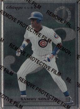
Sunday, December 4, 2016Set: 1996 Leaf Preferred - Steel (Rate) “ I think we have a new record for physically heaviest card of the day! Would be nice to see it without the coating over his face, though.An otherwise excellent scan. ” -Billy Kingsley
“ These were made of metal/steel and were pretty heavy for card. ” -carthage44
“ I don't know why there is "protective film", but still ok ” -Thomas555
“ grrrrrrr....I hate scans of cards with the protective film left on. How can you possibly enjoy the beauty of the card? ” -C2Cigars
“ Always leave the coating on. While the card is kind of dark, I like it. Nice card of a player I still admire, I don't care about all the drama of his last few years in baseball. ” -Doc Floyd
“ All kinds of NO for this kind of card. I don't know where to begin. I've never been a fan of the metal plate feel kind of cards this looks like it was going for. Not a fan of the "finest" protective film you have debate Shakespeare over "To peal or Not to peal, that is the question" Some people say they look better without the film. Some of them do but many of them are still just as ugly without the film. ” -captkirk42
“ I have one of these. Somewhere. Cool looking, I like it. But hard to find! ” -Joshua825
“ Remove protective film! ” -switzr1
“ What is the protective film? I am unfamiliar with this set and wasn't sure what was going on. ” -muskie027
|

Friday, December 2, 2016Set: 2004 Donruss Classics - Legendary Lumberjacks (Rate) “ The little write up on the back of these types of story inserts are what make or break these cards IMO. A little tid-bit of history, puns not withstanding. ” -rmpaq5
“ Poor design, too much wasted space. ” -carthage44
“ A nice card, but the front seems lacking. A patch or an autograph would really fit nicely in one of those blank areas. ” -dilemma19
“ I'd love to have on of these! Sweet! ” -bkklaos
“ Not a fan of colloquialisms or fad descriptions (calling a home run 'taters' in this case) and especially not when describing a legendary player that wouldn't have had that description used during his playing days. ” -Brimose
“ Maybe Lumberjacks should have been the name for the new Vegas hockey team because Golden Knights simply rots. ” -NJDevils
|


")