Random Card of the Day


Tuesday, November 1, 2016

Set: 1995 Stadium Club - Power Surge (Rate)

Card: #PS10 Tony Martin


“ Nice. Mid 90s were truly a golden age of cards. ” -Billy Kingsley

“ Hey look he's catching the Stadium Club logo. ” -rmpaq5

“ Maybe the front just scans poorly. Bonus points for having the subject appearing to catch the card manufacturer logo. The back is crazy busy but I like it, especially the scoreboard in perspective (more than 20 years before the 'perspectives' baseball inserts). ” -dilemma19

“ Cool Looking card. Excellent for an insert. If it were base it would be a bit too busy graphically with very little info. ” -captkirk42

“ Any cards with lightning are cool! ” -carthage44

“ This looks very 1995. You know what to expect with that era, and that's what you get. Some comes out good, some not so good. I like first names but otherwise it's fine. ” -switzr1

“ The glowing orb is his as he rides the thunderbolt down to earth. ” -UKboogie


Monday, October 31, 2016

Set: 2005-06 Parkhurst (Rate)

Card: #104 Martin Lapointe


“ One of my wife's favorite players, but she was a bigger fan of his when he was with the Red Wings. We have most of his cards, and many of the SN10 or less. I scanned in a big portion of the Lapointes in the DB. But not this one. (But we have it.) ” -vrooomed

“ This is a good design. I prefer a natural background but am flexible if the design looks good. This one looks good. ” -switzr1

“ I actually really like this set .Lapointe had a pretty decent career. Love the stash. ” -uncaian

“ Cool...QB24 has a hockey RCotD featured today and has this one coming down the pike! Sweet! ” -bkklaos

“ This was a few years before the Blackhawks became a power house! ” -carthage44

“ I like this set. I don't try to complete every hockey set since I'm mostly baseball and football, but this is a good set to go for. ” -captkirk42

“ Unfortunately, releasing a substandard product under a classic brand name doesn't automatically result in sales. I'm not big on the prospect-heavy set, but at least Topps realized that Bowman baseball wasn't going to fly on name strength alone... Nothing wrong with the card or the player. Just meh. ” -dilemma19

“ I was disappointed ad first, but then I flipped it over... ” -DarkSide830

“ I like these big, colorful sets from Parkhurst. ” -suomibear8

“ Not a hunge hockey fan, but growing up in Windsor Ontario got many Red Wings games over the aerial on good old channel 50 (Side note: try explaining to a classroom of grade 3s that you only used to get a handful of channels and half the time the picture was crappy) and Marty was one of the players I loved watching play. ” -rmpaq5


Sunday, October 30, 2016

Set: 1991 ProCards (Rate)

Card: #4073 Ken Marrero


“ MiLB card - Always liked the minor league stuff. ProCards had another fine effort in 1991. ” -vrooomed

“ I like this ProCards Minor League set. I just get frustrated when seeing that these sets were sooooooooooooooooooo big. Oh this set was sponsored by Wendy's. ” -captkirk42

“ He started out as a catcher then transitioned to a pitcher and made it to AAA but never made the majors. ” -carthage44

“ When I first glanced I thought "What is this???" Looking at it for a few seconds though, I appreciate the attempt at originality. I don't think it totally works for me, but innovation in design is really difficult, even back in 1991. ” -rmpaq5

“ This card looks really plain, but the back information intrigues me. ” -DarkSide830


Saturday, October 29, 2016

Set: 1969 O-Pee-Chee (Rate)

Card: #217 John Donaldson


“ Some vintage O-Pee-Chee Love! But man....that is one ugly uniform! This was the last year O-Pee-Chee was English only on the back. ” -rmpaq5

“ Nice vintage. Surprisingly rare to see vintage baseball come up here. ” -Billy Kingsley

“ Nice pajamas. ” -vrooomed

“ So the KC was airbrushed out due to the teams move to Oakland. His 68 Topps has the same thing, but with a different pose. I read a great article about the the photos for those set were affected by a player's association boycott. ” -joshthurman

“ you just have to like the vintage cards .This shot seems so genuine and spontaneous. Of course we play baseball in snow shoes in Canada. LOL ” -uncaian

“ John needs to get some meat on those bones. ” -carthage44

“ Thought it said Josh Donaldson for a second. I wonder if the cameraman accepted his request for a hug. ” -DanD

“ Love it! ” -bkklaos

“ Cool 1960s Vintage Baseball! Double points for being OPC! Fantastic that it is the old yellow unis for Oakland A's ” -captkirk42

“ Brilliant airbrushed IPC issue. Never heard of him, but probably no relation to Josh Donaldson. ” -dilemma19

“ It is great to see another 1960s card. To me this was the greatest decade for cards! I remember getting the Topps version of this card. All the 1960s cards and sets are beautiful!! ” -twinscollector34

“ My how athletes have changed. ” -SFC Temple

“ The head and cap doesn't look proportionate to the body of the player.. The logo on the cap is also missing or blotted out with marker or pen. ” -deporcoruña


Friday, October 28, 2016

Set: 1992 Fleer (Rate)

Card: #244 Steve Sax


“ You watch too many movies, Saxy Boy. ” -Howintensive

“ Everything I know about Steve Sax I learned on the Simpsons! ” -Billy Kingsley

“ I always liked the 1992 Fleer. They have good pictures. Although the short name on the side look weird for Sax. First thoughts on Steve Sax: 1) Struggled to throw to first for a period of time. 2) Was on the Simpsons episode. 3) Handsome. 4) Bill James wrote interesting comparison with R. Sandberg saying as rookies you could've tell which was a Hall of Famer and which was not. ” -joshthurman

“ Another player the White Sox picked up well after his good playing days. ” -carthage44

“ This and the 1992 Score design always gets me confused on first glance. Not the same but similar elements from the same year. ” -rmpaq5

“ Nice overproduced years card. In typical 1990s fashion, when these first came out I loved them, then I hated them, then really hated them, then started liking them again, then accepted them. Now days I accept most 1990s cards with the respect I had when they were first new and not from the disappointed after-the-fact view from massive overproduction. ” -captkirk42

“ IMHO the 90s was not a good time for card designs. I always thought Fleer was particularly bad and this one reminds me why I thought that. >.> ” -koloth42

“ Really out of place in a Yanks' uni. ” -NJDevils

“ I admit this set is kind of ugly....but I love it! ” -RoyalChief

“ I liked this set during my prime collecting years as a kid. ” -suomibear8

“ I think I would look back on 1992 Fleer better if they hadn't used this color of border again in 1993. Always liked the team logo and big lettering, and the backs are real good. It's a definite improvement over Fleer's 1990 and 1991 sets, and a lot better than 1993, 94, and horrible 95. Which isn't saying much. ” -switzr1

“ This is just amazing, end of the freaking story ” -Thomas555

“ I remember how excited I was when the Yankees got Sax. This was an ok set design, but nothing great. Back in 1992, I bought one pack of these, two packs of Donruss, and the result was I decided to collect Topps that year. Something I just didn't like about all that green. ” -muskie027


Thursday, October 27, 2016

Set: 1993-94 O-Pee-Chee Premier (Rate)

Card: #132 Ulf Samuelsson


“ Great mid-90s set. Truly the best era for cards in all sports! ” -Billy Kingsley

“ Hockey names are the best. ” -joshthurman

“ Front is blah! I do like the effect on the back of the card where the stats are, making it look like they are printed on top of an ice rink. ” -rmpaq5

“ I should have named my son Ulf, LOL! ” -carthage44

“ A decent, albeit unremarkable card of a solid, long-time player. Great job including all essential elements on the back without crowding. If they'd gone with almost anything other than a white border, the front would grade an A too. ” -dilemma19

“ Pretty basic design. Like it but would prefer team name/logo Love that there is no annoying shiny foil lettering. Back is pretty nice. ” -captkirk42

“ I'm not a hockey guy but I've got to a love an athlete from Sweden named Ulf Samuelson. Goes right to the roots of my Scandanavian heritage. ” -twinscollector34

“ im not really into hockey. the front photo captures his facial expression really well and also I like the back photo of him in his dark jersey. ” -sillybilly

“ This design always just seemed a little dull to me. Nothing particularly "wrong" with it. Just not an eye-catcher. ” -switzr1


Wednesday, October 26, 2016

Set: 1985 Barry Colla Postcards (Rate)

Card: #4085 Atlee Hammaker


“ Photographer --"Atlee, just stand there doing your best Statue of Liberty imitation." ” -rmpaq5

“ When I think of Atlee Hammaker, I always think of giving up the first grand slam in an all-star game. It was 1983 and Fred Lynn hit it. He was a nice guy who lived in Knoxville, Tenn., for a while post-career. ” -joshthurman

“ One of the many outstanding issues done by Barry Colla throughout the years. Finding the Giants sets is relatively easy, but good luck with tracking down the Mets, Twins, or Indians. In fact, I may have some Giants sets for sale or trade! ” -Dave Sosidka

“ Nice to see oddball stuff here, ” -captkirk42

“ I've heard Hammaker was quite a good pitcher, though I followed an American League team while he toiled in the NL (back before interleague play and the Internet), so I didn't see or hear much about him. Nice shot. Could have been cropped a wee bit closer to show a little less sky... ” -dilemma19

“ Nice , I'd get it just cause of the guys cool name , he was actually a pretty good pitcher too. ” -uncaian

“ Why don't people send postcards anymore? ” -carthage44

“ Nothing special about this. This is just an photo, and an awkward one at that. Not a big fan of the fake pose. This is obviously not an action shot, but meant to look like one. Even though it is a postcard, it would have been cool to put a name on the front and stats on the back to give it a card feel. ” -muskie027

“ Doesn't belong...IMHO ” -SFC Temple

“ "new ball, ump". ” -NJDevils
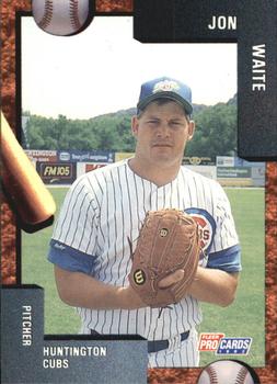
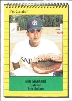

Tuesday, October 25, 2016

Set: 1992 Fleer ProCards (Rate)

Card: #3149 Jon Waite


“ I know this set has come up as Card of the Day before. I like the design then and I still do now. Of course, being early 90s Fleer, I'm pretty much guaranteed to like it. ” -Billy Kingsley

“ I bet these cards didn't sell very well, but that they made a pile of money selling the template to photographers of minor baseball associations nationwide. "Junior's first baseball card" Jon Waite was a pretty big lefty. I wonder how many cards from this 4071-card set have mostly empty backs, populated only by "first year in professional baseball". ” -dilemma19

“ It looks like a card you can make by downloading a template from the 'net and turning a picture of your kid in uniform into a card. ” -rmpaq5

“ I'm on a role with these "Random Card of the Day" as I think three of the last four I uploaded! ” -carthage44

“ Border over clutters the card. Looks like a cheapo Walmart frame ” -Lennoxmatt

“ And the 1990s bizarre designs get to the minor leagues. I like some of the elements in the border but it is too much too busy. Ether go with the bat and ball or the corner picture holders not both! Wow this guy has barely been signed it looks like. No wonder there is no stats on the back. ” -captkirk42

“ Too much going on with the border. Your eye should be drawn to the player, not the border. Don't like the oversized text boxes. Nor the text-wrapping corners. The back has more graphics than text and just seem empty. ” -C2Cigars

“ Not a bad design ” -switzr1

“ I wonder if he gets requests for "Missing You' and "When I See You Smile". ” -Jack Webster
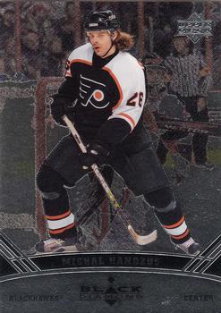
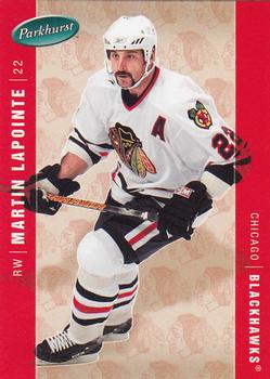

Monday, October 24, 2016

Set: 2006-07 Upper Deck Black Diamond (Rate)

Card: #18 Michal Handzus


“ GREAT scan of a Black Diamond card! I don't know who did it, but bravo! ” -Billy Kingsley

“ I'm not a big fan of Black Diamond, it just seems to be so dark and over priced for what it is. Good player won a cup with the Black Hawks. ” -uncaian

“ Outstanding hockey hair! It looks like an Upper Deck card. Not much more to say. ” -dilemma19

“ GO HAWKS!!! ” -carthage44

“ Not a fan of the Black Diamond sets. Too Dark. Like the standard back. ” -captkirk42

“ The last few years of Black Diamond look too much alike. I liked the late 90's versions. ” -suomibear8

“ Uck. ” -DarkSide830


Sunday, October 23, 2016

Set: 1971-72 Bazooka (Rate)

Card: #23 Guy Trottier


“ I didn't know Pee Wee Herman played hockey! Learn something new everyday. . . . yes, I'm joking! ” -Billy Kingsley

“ Almost a comical looking head on this guy -- like it was airbrushed in. However, classic cardboard is always cool, and Bazooka here is no exception. ” -Slug03

“ Iconic hockey card design. Very 70's. ” -dilemma19

“ I would buy gum if these came in their packs. ” -carthage44

“ Best Card of the day ever. Ever!!! Gorgeous. ” -Howintensive

“ Never knew these Bazooka versions existed. It's weird how the logo differs so much between the one on the jersey and the one on the card. Even if they matched, this set is still an eyesore. ” -DanD

“ I absolutely love this card. Just took a look at the entire set, it is classic. Too bad it was not an actual base set of a named brand and only a bazooka food set. I would have loved to see a back on the cards and a full set. The design is great. I have to give this an A+!!! ” -muskie027

Page:


Copyright © 2024 Trading Card Database LLC
Designated trademarks and brands are the property of their respective owners.