Random Card of the Day


Saturday, March 26, 2016

Set: 2002 Press Pass (Rate)

Card: #25 Joe Nemechek


“ Not a racing fan, and have never heard of this man. He'd probably make a better President than Trump though. ” -dilemma19

“ 2002 was one of his best years on the circuit. His son is now an up and coming young talent and Joe has moved into the mentor/proud father role for the most part. I've always been a fan of his, I was a fan of his brother John (who was killed during a race) and now I'm a fan of his son John Hunter. The Nemecheks are just good people. I'm not too much a fan of this set, typical Press Pass. ” -Billy Kingsley

“ His name looks like a hockey players. ” -carthage44

“ OK card don't collect racing so not sure what stats should or shouldn't be on the back. Press Pass did OK on racing stuff but I really hate Press Pass for Football since they were college cards. ” -captkirk42

“ Athlete. ” -wax_house

“ "Yeah, I'm Joe.... What's it to ya?" ” -SFC Temple

“ Don't like the front. Back is good. Would be interesting to see his results, and a picture of his car, if I were into the Nascars, so I would probably really like the back if I collected these. I would think that if I were into racing cards, I would be more interested in pictures of the cars than the drivers. But the repeated picture side-by-side on the front looks awful. ” -switzr1


Friday, March 25, 2016

Set: 2007 Topps - Josh Gibson Home Run History (Rate)

Card: #JG59 Josh Gibson


“ Neat card. Good history. Would have worked better if he had played in the era of photographers everywhere, every game, but the concept is sound. ” -Billy Kingsley

“ I read about this guy. AMAZING!!! ” -carthage44

“ Ugly front. the bottom panel with the 460 is too dark hard to read the number even though it takes up a third of the card. The 'photo' (painting? actually) should be the whole front with the 460 on top of it and a little smaller. Lets check the back... the info that is there is OK but the picture should be where the 460 is and the 460 shouldn't be its own logo. A headline yes, a "picture" or text box NO. ” -captkirk42

“ WOW!! Great little bio on the back....I wonder how much stats and records would be different if the likes of Gibson, and Satchel Paige played. ” -RoyalChief


Thursday, March 24, 2016

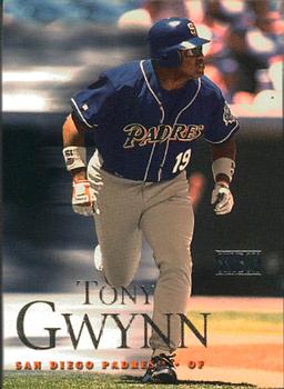
Set: 2000 SkyBox (Rate)

Card: #48 Tony Gwynn


“ I have never ever seen a more consistent hitter. Still remember my jaw dropping when he homered in the 98 WS ” -volbox

“ Euh...not a fan. ” -DarkSide830

“ One of the best (if not the best) pure hitter of all-time! ” -carthage44

“ I didn't think Tony was that fast!!! I was wrong. ” -RoyalChief

“ Flattering photo on the reverse. I like the design, it's a little different without being stupid. ” -wax_house

“ OK design. Don't like the foil of the brandname. Oh cool just noticed the "action" blurring effect. Thought it was just background blur at first. Back photo too big, a small bio should or career highlights would be nice. ” -captkirk42

“ Beautiful card depicting a legend. Love it!! ” -dilemma19

“ This was a nice looking set. ” -switzr1

“ A class act. ” -UKboogie


Wednesday, March 23, 2016

Set: 1991-92 Upper Deck (Rate)

Card: #262 J.R. Reid


“ The first Upper Deck NBA set...a classic. The first card I ever traded for was J.R. Reid's base card from 1995-96 Topps. It's in poor shape and I've since upgraded but I still have the one I traded for. ” -Billy Kingsley

“ Like the front some. The sideways stats on the back NO. ” -captkirk42

“ Again, the sideways stats on the back. Boooo! ” -NJDevils

“ Heck yea JR Reid! Decent player! ” -wax_house

“ Not sure what is happening on the back. Is he rebounding? Blocking a shot? Dunking with the worst aim imaginable? ” -Mitch

“ I have no idea what is going on with that picture on the back. ” -switzr1

“ The back picture looks like he's going to hurl the ball at the woman in the neck brace. Either way, this a clean, simple card that won't win any design awards but won't be added to the dumpster fire either. ” -ketchupman36

“ Pretty simple but solid design. ” -carthage44

“ I like the front. Court floor border. Lots of room for the picture. The back is another story. I like the backboard number. But could do without the picture in place of more stats/bio. ” -C2Cigars


Tuesday, March 22, 2016

Set: 1994 Upper Deck World Cup Contenders English/Spanish (Rate)

Card: #275 USA Women's Team


“ Their shirts look like they each have a towel on their right shoulder. ” -switzr1

“ My first card of the day. ” -deporcoruña

“ Well this is neat. Only player I have heard of is Mia Hamm, is she on here? Maybe #9. Nice perm #10!!! ” -RoyalChief

“ Nice to put only 11 in the photo. Heck with the rest of the team. ” -NJDevils

“ Cool card. U-S-A! U-S-A! U-S-A! ” -captkirk42

“ They're thrilled. ” -wax_house

“ Where is everyone? Only 11 players? ” -carthage44


Monday, March 21, 2016

Set: 1973 O-Pee-Chee (Rate)

Card: #650 Felipe Alou


“ The Alou brothers accounted for 5094 hits, 269 HR and 1656 RBI. Not bad. If you add Moises Alou stats, 7228 hits, 601 HR and 2943 RBI ” -volbox

“ I seem to remember when all 3 Alou brothers played outfield in the same game. I will have to look that up, but am sure someone else will mention it too. Classic Topps/O Pee Chee card. ” -Kaline6

“ His son, Moises, had a better career but Felipe had a very solid one. ” -carthage44

“ Love Vintage OPC cards. I don't have nearly enough of any sets of them. I should try to correct that someday. ” -captkirk42

“ Gotta admit, not a bad father son combo as far as stats go. both him and Moises were decent baseball players (though Moises was better) ” -DarkSide830

“ So many more words to repeat the same English phrase in French! Love the 1973s, by the way. My grandpa gave me a stack of the high numbers (Topps, not OPC, but same design) when I was pretty young, and for quite a while, they were the only cards I owned that were older than me. ” -switzr1


Sunday, March 20, 2016

Set: 1999-00 Upper Deck MVP (Rate)

Card: #175 Mitch Richmond


“ This was the first set I completed from my current local card shop, back when it was new. Not really a huge fan of the design. This set replaced Collector's Choice in the lineup. He quietly built up a hall of fame career, and is currently 12th all time in scoring in NBA history- of about 4000 players. ” -Billy Kingsley

“ He's tall! The card is so nondescript, I've already forgotten it. ” -dilemma19

“ Mitch was Rich. ” -carthage44

“ Too much garbage on the front detracting from the photo. ” -NJDevils

“ Not a huge fan of the MVP sets, but this one is OK. Cant read the MVP part but whatever. The player name could be a bit bigger as the team name, a team logo would be nice also. Going to the back...OK ah there is the team logo. Looks a bit wasteful, turn it to a horizontal (landscape) card and add a short bio and/or cartoon and you got a nice back. ” -captkirk42

“ Not too bad. Nice, overall. The name, team, jersey #, MVP layout seems a little disjointed. I like it when a HOFer is Card of the Day. ” -C2Cigars

“ This set is alright. Inexpensive to buy at the time. I don't mind collecting the lower-priced stuff. ” -switzr1


Saturday, March 19, 2016

Set: 1997 Bowman - International (Rate)

Card: #46 Dennis Eckersley


“ Not sure what makes this International, but the Flag design is cool. Looks like it's mirror foil which is always tough to scan. ” -Billy Kingsley

“ Is this the original form of state and hometown? I do like the flag, and I will acknowledge how good of a pitcher Esk was. ” -DarkSide830

“ Eck was sick! ” -carthage44

“ Looks like Bowman Chrome Hehe. OK front, can't read it probably due to blurry scan, unless it's a chrome card. Back I really really do not like the stats against other teams. ” -captkirk42

“ Wow, completely forgot or never realized he played for the Cards. And of course, sweet stache!!! I kind of dig the American flag backdrop. ” -RoyalChief

“ Due to my 24-years of military service, I am fuming when I see these cards. Did Topps intentionally disrespect the US flag? Or are they just idiots? The blue union should always be displayed on the left. IMHO, every card in this set deserves a UER and should be rotated CCW to properly display the flag. I'm glad I never bought these, I would have shredded or burned them immediately. ” -C2Cigars

“ Eck doesn't look right in a Cards uniform. The card design is decent though. ” -dilemma19

“ This is a Cardinals card I have never seen. I want it. ” -switzr1


Friday, March 18, 2016

Set: 2002-03 Pacific (Rate)

Card: #260 Daniel Alfredsson


“ Nice looking card. I was a big fan of the Pacific sets of this time period, in all sports. ” -switzr1

“ This is my favorite team logo in all of sports...I'm a huge history nut, and I don't just mean that in the physical sense (LOL) Ancient history is my favorite, especially ancient Rome, which this is a direct reference to. If I followed hockey on a regular basis I would root for this team for no other reason. ” -Billy Kingsley

“ The heart of the Senators for many years. This set is ok nothing special , really. ” -uncaian

“ There is an extra S in his last name, wink wink. ” -carthage44

“ Pretty good front design except for player's name in silver foil. It doesn't stand out it is easier to read his dang position than either his name or the team name. Back is mostly good except bio should be fully below the stats not to the side with all that blank space that has the black and gray background team logo. ” -captkirk42

“ Pre shaggy-hair Alfie - with (possibly Darcy Tucker's) backside prominently pictured as a bonus. Nothing spectacular about it, but all the right things in all the right places. Overall a nice looking card. ” -dilemma19

“ Pacific hockey are so well-designed. A bit of an Upper Deck rip-off, but at half the price. ” -wax_house

“ I like the overall design, but there is too much blank space under his stats on the back. Otherwise I like the design. ” -DarkSide830


Thursday, March 17, 2016

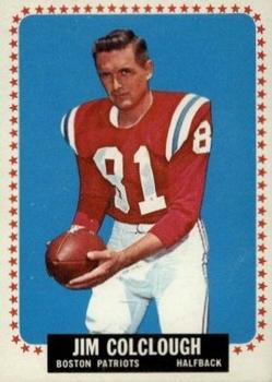
Set: 1964 Topps (Rate)

Card: #6 Jim Colclough


“ Great design. Great scan. I've never heard of this team although my football knowledge is subpar at best. The thought just hit me- perhaps this is the team I know of as a New England Patriots? ” -Billy Kingsley

“ This is a prank card, right? It was "Take Your Dad To Work Day" and Jim Colclough dressed his father up like a real football player. Alternate snark: This guy puts the "half" in "halfback" ” -jlamberth

“ "Hey Tom, is this the ball you wanted me to deflate?" This guy looks more like a presidential candidate than a pro football player. ” -switzr1

“ Ahhh 1964, when cards were cardboard, and skinny little men were NFL running backs. Classic card. ” -Kaline6

“ Another nice vintage card. ” -uncaian

“ Sweet...a football card (almost) as old as me! I don't have any from this set, but wish I did! ” -bkklaos

“ Love the vintage! ” -CluelessJoe

“ Cool Vintage Football. Back when there were two main leagues the NFL and this one the AFL. Topps had contracts with the AFL and Philadelphia Gum had the NFL. "Boston" Patriots they should have kept that name it is odd now that I think of it I think the "New England" Patriots are the only NFL team that uses their area not their city or state as part of their name. The Redskins should change their name as well to the "Mid Atlantic Redskins". ” -captkirk42

“ Football players sure have gotten bigger over the years! Would 6' 185lbs even qualify as a punter in today's NFL? ” -dilemma19

“ Come get some! ” -carthage44

“ To paraphrase Will Rogers, "I never met a vintage card I didn't like." Jim partnered with the Bruins' Derek Sanderson and Joe Namath to open the infamous "Bachelors III" restaurant/bar. ” -C2Cigars

Page:


Copyright © 2024 Trading Card Database LLC
Designated trademarks and brands are the property of their respective owners.