
Random Card of the Day |
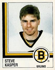
Wednesday, November 18, 2015Set: 1987-88 Panini Hockey Stickers (Rate) “ Looks like a giant hockey player looking out from behind half a goalpost. At least the goalpost colors match the logo, I suppose. ” -revnorb
“ Not a bad set,inexpensive & fun for kids. ” -uncaian
" Kasper, the friendly ghost. " -ToppsBawlyn87
“ Not a bad sticker design. Nice and simple. Accent lines with team colors is nice. Nice photo. I might have added position to the front. ” -C2Cigars
“ Great for kids, terrible for collectors. ” -carthage44
“ A "ghostly" amount of white on this sticker. ” -suomibear8
|

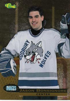
Sunday, November 15, 2015Set: 1995 Classic Images - Gold (Rate) “ Is he supposed to be holding a stick or did they photo shop it out? ” -carthage44
“ As much as I usually pan Classic, some of what they did was actually good. This card looks nice (I would guess, however, that they used the same flimsy card stock they used for all their other products). ” -vrooomed
“ Drafted ahead of Ryan Smyth in 1994,had a great first year in Tampa Bay than kinda just fizzled out.Not a great set,but I have seen worst. ” -uncaian
“ OK design I guess, but I have a hate/love/hate relationship with Classic. ” -captkirk42
|
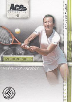
Friday, November 13, 2015Set: 2007 Ace Authentic Straight Sets (Rate) “ I don't have any tennis cards. Do know her name would total many Scrabble points. ” -Kaline6
“ Has a tennis card ever come up as Card of the Day before? Not a bad design other than her legs disappearing into nothingness. ” -Billy Kingsley
“ Couldn't justify an entire set of Anna Kournikova cards, so they had to add some fillers. ” -dilemma19
“ On the back Clothing: N/A Interesting. ” -carthage44
“ Nice a Tennis card. Nice change of pace and sport. Don't recognize her cause I don't watch Tennis. ” -captkirk42
|
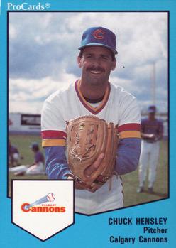
Thursday, November 12, 2015Set: 1989 ProCards Minor League Team Sets (Rate) “ Look up his stats...this guy had a rough career! How can you NOT strike fear into batters with a name like THAT?! ” -domentho
“ I liked the layout of these, but wasn't a huge fan of the colored borders, but that was the way for these upstart card companies to differentiate them from the established companies. Even Fleer & Donruss had been using colored borders in the recent years leading up to this set. ” -vrooomed
“ A fine Minor League '80s card. ” -captkirk42
“ How can you not be smiling when you're wearing rainbow sleeves like these? ” -dilemma19
“ This really isn't that bad of a one-size-fits-all generic design, except for the lame "ProCards" up top and the fact that the team logo is expected to fit into a home-plate-sized space, even when it's short and wide like this team's. ” -revnorb
“ They really liked the home plate design. ” -carthage44
|


Tuesday, November 10, 2015Set: 1984 O-Pee-Chee Gremlins (Rate) “ My FAVORITE Christmas movie! ” -domentho
“ I liked the movie, didn't collect the cards. I like the concept of movie cards. ” -Kaline6
“ At first glance I thought that was David LoPan from Big Trouble in Little China. "A Chinese girl with green eyes!" ” -Id8jlb8666
“ No name required. Is that a pipe?? ” -dilemma19
“ Another cool non-sport random. ” -captkirk42
“ Must be drinking chocolate milk with that flex-straw. ” -NJdevils
“ HAHA the Old Oriental Man. Nice to see that he got a card. ” -carthage44
|

")