
Random Card of the Day |

Wednesday, September 2, 2015Set: 1997-98 Collector's Choice (Rate) “ My least favorite of the Collector's Choice sets, for the sole reason that the number is too darn hard to read! Even in person it's miniscule. I have this same design in both NASCAR and Hockey and the numbers are larger in both...so not sure what UD was thinking when they did the NBA set. ” -Billy Kingsley
“ I don't usually like the Collector's choice designs, they usually all look alike and are generally boring. This one is a nice variation from the usual boring theme. ” -captkirk42
“ My first thought...AWKWARD. I like the card design, it doesn't overpower the subject...the player. ” -C2Cigars
“ This was the first Collectors Choice design that I didn't like. I always found the font used for the name hard to read. ” -switzr1
“ I normally wouldn't comment on a basketball card, but had to make mention of a former player from my alma mater, Seton Hall University in South Orange, NJ- Terry Dehere. Dehere was from the last great run of Seton Hall teams under coach PJ Carlesimo, including the one that was robbed of a national title by Michigan in 1989. A New Jersey schoolboy standout, he played for Bob Hurley, Sr. at St. Anthony's in Jersey City and remains in the area to this day. ” -Dave Sosidka
“ 1996-97 Clippers were a playoff team. Love me some 90s Clippers! ” -wax_house
“ That's an awkward looking rebound! ” -cckeith
“ Nice action shot! ” -carthage44
|
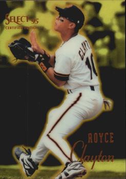
Monday, August 31, 2015Set: 1995 Select Certified - Mirror Gold (Rate) “ Several things: Great scan! Well-marked parallel. Stats indicate this was obviously pre-Interleague play. (I miss those days.) Considering this release was in addition to other releases by the same company, I can understand the different way of reporting stats (and the fact that it only shows the one year). ” -vrooomed
“ Very poor attempt here by Pinnacle. ” -carthage44
“ Another 90s product I don't like. ” -captkirk42
|

Sunday, August 30, 2015Set: 2007 Topps Turkey Red (Rate) “ I like this design. It looks old while still having a modern depth of field. The border looks three dimensional but I don't believe it is. Really well done effort by Topps here. ” -Billy Kingsley
“ I actually really like the Turkey Red Sets.They are not overdone design wise.Write ups on the back are well done too. ” -uncaian
“ Looks like s straight up picture frame you would hang on the wall. ” -carthage44
“ The original 1911 Turkey Red T3 Cabinets are beautiful. These "retro rip-offs"...NOT!! By the way Topps, this design was used for boxing not baseball. And stop using other company's designs. ” -C2Cigars
“ why? yuck! ” -SaveDaKid
“ I like Turkey Red. Don't like horizontal or Landscape cards but it works for this one. ” -captkirk42
|

Saturday, August 29, 2015Set: 1991 Topps The Addams Family (Rate) “ I know I saw this movie, but I have absolutely no memory of it. ” -Billy Kingsley
“ One of the better movie sets; decent graphics on front and colorful, back with awesome description. ” -SFC Temple
“ I actually like this card it's ooky,kooky & just a little spooky! ” -uncaian
“ I have an unopened box of these, but as I have never seen the movie, I won't open until I do. Gut feeling, with my love for the original series, is that I will be disappointed with the movie! ” -bkklaos
“ dadadadun *snap* *snap* dadadadun *snap* *snap* adadadadun, dadadadun, dadadadun. The Adams Family Love it. Still think Christina Ricci is hot. ” -captkirk42
|


Thursday, August 27, 2015Set: 2008 Inkworks X-Files I Want to Believe (Rate) “ LOL.... First I see todays card of the day showing a couple of ball players in what could be considered a "compromised" position and now this one! So many comments... we'll go with... "No, Sir...this IS the only place I can administer this shot." ” -SFC Temple
“ Non-Sport strikes again. X-Files this is a pretty ordinary looking card for that show. Haha. ” -captkirk42
“ SCULLY!!! ” -CluelessJoe
“ This may be the least interesting card I've ever seen. ” -switzr1
“ Keep that durn thing away from me! ” -Rod_Davis_86
“ This show was bad to put it nicely. ” -carthage44
|

Wednesday, August 26, 2015Set: 1997-98 Futera Celtic Fans Selection - Foil (Rate) Card: #52 Celtic 3 Dundee Utd 0 “ A card of the fans? That's a new one on me. ” -Billy Kingsley
“ I'm guessing this is a chrome card? Very ugly scan. One of many reasons I am not a huge fan of Chrome. Collecting Chrome cards is like having a separate hobby. ” -captkirk42
“ this hurts my eyes ” -lxnlxn
“ If this whole set is foil cards of pictures of crowds, this set goes right behind the Bratz set in urgency for completion. ” -switzr1
“ The regular, non-foil isn't much better, horrible card. A picture of fans in the stands. I think the upside-down signs speaks volumes. ” -C2Cigars
“ So this is what Curly sees after Moe pokes him in eyes. ” -NJDevils
“ Terrible all around. ” -carthage44
“ Is this one of those Magic Eye pictures? ” -ShoTime
|

Tuesday, August 25, 2015Set: 1998 Pacific Aurora - Pennant Fever (Rate) “ I like some Pacific sets and then some like this one I don't at least not much. OH wait this was an insert set. The base set looks a bit better than this. That Mets beam seems out of place for the Yankees. Ugh the backside. If they had matched up the attention grabbing colored beams with the team colors this sub-set might have worked. ” -captkirk42
“ the blue and orange stripes bother me. it is almost like he was on the Tigers or something. ” -lxnlxn
“ Always loved the Yankees' Orange and Blue! ” -NJdevils
“ You can't go wrong with Yankees pinstripes. ” -jlaz10
“ Just watched a Seinfeld episode that he was in. ” -carthage44
|

")