Random Card of the Day |
Sunday, August 9, 2015Set: 2002 Fleer - Tiffany (Rate) “ This card does not work at all. Yellow & white ? PLEASEEEEE ” -engine614
“ Serial numbered cards are great! ” -carthage44
“ Nice shot covering the guy's face up. Thumb's up. And I don't get the rainbow laces on the side. ” -ShoTime
“ I'm sure the Fleer photographer takes more than one photo. Was this the best option? Goofy, awkward stance. Face covered by arm. Windblown jersey makes it look like he has a big potbelly. ” -C2Cigars
“ Cheesy design. Used the same color schemes from the 1990 release. ” -addysdaddy
“ Still debating about this set. At first I thought it looked OK but the the banner at the bottom disturbs me a little. A numbered Tiffany Card? Huh? Tiffany cards are usually just the regular set with a glossy front and higher quality card stock, but serial numbers? ” -captkirk42
“ Chad would not be a fan of this photo at all! ” -hawksforever
“ Card not doing it for me - plus the UER (Provo is in UT, not VT). ” -vrooomed
“ Love serial numbered cards! ” -Dave Sosidka
|
Saturday, August 8, 2015Set: 1997 Score - Showcase Series (Rate) “ He really enjoyed the NFC East. He played for the Cowboys (twice), Giants and Eagles. ” -carthage44
“ One of the best ATHLETES ever. ” -vrooomed
“ This is a great action photo at an athletic angle and focuses on the player as opposed to the card design itself. I'm a big fan. ” -TheDoug
|
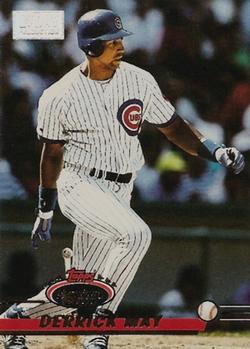
Friday, August 7, 2015Set: 1993 Stadium Club - First Day Production (Rate) “ I always enjoyed pulling 1st Day cards from Stadium Club packs back in the day. Parallels weren't as prevalent as they are now, and it had nothing to do with color, so colorblind collectors could know what they had. ” -switzr1
“ Typical less than exciting card from the 90's. ” -koloth42
“ I've always liked the look of the Stadium Club early editions. Not to big on the "1st Day" box up top, other than that this front design is pretty cool. It works better for the no-border style than some no-border styles have. The back has always left me with a too stuffy feel. I like that they show the player's Topps RC but not with the other photo being so dominant. I also prefer full stats when possible. ” -captkirk42
“ I personally thought the 1st Day Production cards were cool! ” -bkklaos
“ 1st day production were the beginning or the serial numbered era. ” -carthage44
“ Some of these parallels can get a bit pricy, but a nice set anyways. ” -suomibear8
|
Thursday, August 6, 2015Set: 2010-11 Panini Prestige (Rate) “ Every rookie card in this set is an ERR, as they all have an autograph guarantee...yet were not autographed. He never made it to the NBA, but he did play in the D-League in 2011-12. ” -Billy Kingsley
“ Such an ugly design ” -Young Kilo
“ I don't know if this card can get anymore bland! ” -carthage44
“ Panini should stick to stickers (heh) because they're way better at it. ” -wax_house
“ Prestige is usually pretty good. This one is fine but looks a little lacking. ” -captkirk42
|
Wednesday, August 5, 2015Set: 1994-95 Collector's Choice (Rate) “ Kidd was one of the best Point Guards to ever play the game- I would say only after John Stockton. If he didn't get a coaching job, he would still have been playing as his last contract expired at the conclusion of 2014-15 season. Currently coach of the Milwaukee Bucks. My mom's all-time favorite player. I give my duplicates of him to her. ” -Billy Kingsley
“ Definitely a fan of this. I sure wish I still had all my cards from mid-90s to early 2000s. A really fun era for collecting. ” -switzr1
“ Really dislike the layout of this card. ” -carthage44
|
Monday, August 3, 2015Set: 2011-12 Upper Deck Victory (Rate) “ Bad card design. Terrible sweater. ” -switzr1
“ I'm the only person that misses the Atlanta Thrashers. ” -wax_house
“ Very nice card design. Front simple like vintage but has a certain modern style. They really shouldn't put the jersey number by the Victory logo makes it look like the card number. Back design obviously more modern but nicely done. ” -captkirk42
“ I like the simple graphics on the tag line and the placement of the logo but the HUGE victory in the backround is offensive. ” -SFC Temple
“ I miss the Thrashers being in Atlanta, but I doubt the Thrashers miss being here. ” -jackal726
“ He was a big part of the Blackhawks Championship in 2010. ” -carthage44
|
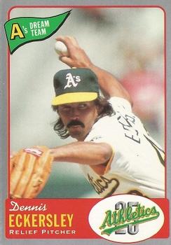
Friday, July 31, 2015Set: 1992 Oakland Athletics Baseball Co. A's Dream Team (Rate) “ I'm guessing this is actually a team issued card. Nice and simple design. ” -captkirk42
“ The Oakland Athletics had their own card company? I guess the more surprising thing was who didn't have a card company in the 90's! ” -carthage44
“ I love oddball sets, but I get the feeling this one is unlicensed. I hope I'm wrong, because this is a great looking card. ” -switzr1
“ That looks like a fun set ” -jackal726
“ Eck looked great in Oakland green and gold, but not as good as in the Sox unis. ” -jlaz10
|


