
Random Card of the Day |

Saturday, May 30, 2015Set: 2009 Wheels Main Event - Playing Cards Blue (Rate) “ My all time least favorite NASCAR set. The entire thing was built around poker. A waste of cardboard in my opinion, made doubly so by the fact that they dropped Wheels American Thunder for it. You could build an entire deck of playing cards if you so chose- the blue was retail, the red back version hobby. Vickers has battled blood clots and is out of the car again while he tries to get them fixed. For the first time a replacement has been hired that was not labeled as temporary so it may be the end of his career. ” -Billy Kingsley
“ Nice job Billy...another hit! I'm off to Seattle in a week and will be playing in my first Texas Hold'em Tourney...don't imagine I'll be dealt one of these cards though! ” -bkklaos
“ Are we playing Blackjack now? Gimme an Ace! ” -koloth42
“ I really dislike Nascar but these are cool cards. ” -carthage44
“ Hmm when I see cards like this by themselves I wonder were they part of a 52 card "deck" or where they for a set to look like playing cards and there could be any number of cards in the set/deck? Oh I should of just said "Who is the Joker who came up with the idea for this card?" ” -captkirk42
|
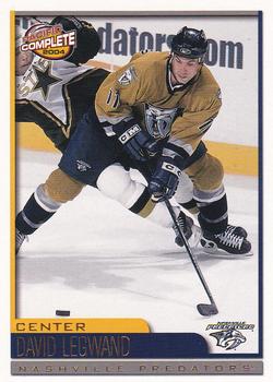
Friday, May 29, 2015Set: 2003-04 Pacific Crown Royale - 2003-04 Pacific Complete (Rate) “ Front design is fine, but the back design is somewhat disappointing. Complete stats would have been nice...especially on a set labeled "Complete" ” -Billy Kingsley
“ Should be called IN-Complete. As in incomplete stats. ” -vrooomed
“ Nothing complete about the design of this set. ” -carthage44
“ Ah Pacific. They rarely had any bad designs. I like the front. The back I prefer the stats to be horizontal even if the rest of the info is vertical and have more than just the previous year's totals. I also prefer the card number at the top not the bottom, but that seemed to be the Pacific way. ” -captkirk42
“ Another set I don't recall having ever seen before. If only I could figure out what was happening in this picture... ” -switzr1
“ I miss the mustard Preds jerseys. ” -wax_house
“ Love the front action scene but the back is less than "Complete". So used to baseball cards stat lines. ” -Mihome316
“ Cool design and great photo! The back leaves a lot to be desired, but overall I like this card. Who knew Pacific did hockey cards? ” -mkaz80
|
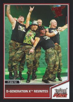
Thursday, May 28, 2015Set: 2013 Topps Best of WWE (Rate) Card: #27 D-Generation X Reunites “ Nice card, but hated this set. Not sure why they need multiple sets of WWE cards each year. ” -jupiterhill
“ Wrastlin' WooooooohWhooo! ” -captkirk42
“ I love this card, because I was in the audience the night this happened. 1000th episode of Raw in St. Louis. And if you're not down with that, we've got two words for ya! ” -switzr1
“ Nice card Amazing that they were able to get Triple H's & Shawn Michaels heads in the same picture ! ” -uncaian
|
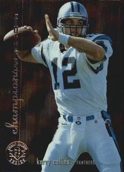
Wednesday, May 27, 2015Set: 1995 SP Championship (Rate) “ Kerry Collins took the Panthers to the NYC Championship game in 1996 season. Then, in the following preseason, Bill Romanowski broke Kerry's jaw. Kerry was never the same QB for Carolina after that. ” -duaned99
“ He was a solid QB for many years. ” -carthage44
“ Nice simple design I like it, but no stats on back. Oh must be an insert. Hard to tell now-days. ” -captkirk42
“ They were wrong. Sets should never have names like "Future Champions". Makes Upper Deck look foolish in retrospect. ” -switzr1
“ Actual shoulder loops! The way they're meant to be! ” -jlaz10
“ I would take this guy as QB over Johnny Manziel in a game of beer pong anytime. ” -EdTheStatMan
|

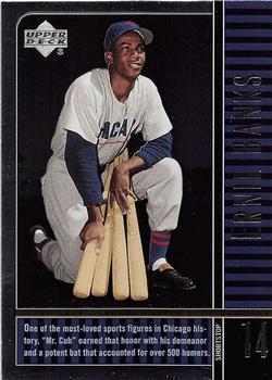
Sunday, May 24, 2015Set: 2000 Upper Deck Legends (Rate) “ Nice that we can have some licensed, newer, alternative cards of HOFers to add to the collection, without breaking the bank. I'm sure this is a foil-fest, and that's why a scan makes it look so bad. And I do actually like the reuse of the photo behind the stats. They did that part well. ” -vrooomed
“ "Mr. Cub"...what's not to like! ” -bkklaos
“ Not a Cubs fan but he was one of the best! RIP. ” -carthage44
“ Ernie Banks Mr. Cub was one of my fave childhood players. OK so my childhood was at the end of his career. That said this is a real ugly looking card. The front looks like a back and the back looks like the stats were cut and paste on or cut off on the right because of the ruler border. An Upper Deck fail in my book. Oh its a year 2000 that could explain it. ” -captkirk42
“ The world ain't the same without him. Great stirrups to boot. ” -jlaz10
“ I liked when companies started doing sets like this with the legends and old-timers. Seems like this was one of the first. Helps me build my Hall of Fame collection, which would be missing a lot more players without sets like this. And I know this card looks a lot better in person than this scan would indicate. ” -switzr1
“ A baseball great. ” -koloth42
|

Saturday, May 23, 2015Set: 2002 Upper Deck Vintage (Rate) “ Wait...isn't that a Topps design on the front? ” -Billy Kingsley
“ This is the guy that caused the Cubs to implode during the 2003 NLCS because of his fielding error. It's very sad that Cubs fans still blame Bartman when they should be blaming this guy because he couldn't field a routine ground ball in the 8th inning and the Cubs would have avoided the historic collapse. ” -carthage44
“ Don't have to worry about dripping mustard on the back of this card ” -NJdevils
“ Upper Deck Vintage The Original Archives LOL. When they first came out I hated them, I was in an anti-reprints, anti-retro look phase of my collecting. Now I love them. ” -captkirk42
“ The Blue Jays try with red didn't work out as well as planned. ” -jlaz10
“ One of the many design re-makes...this of the 1971 Topps set. I like the 71 set design, but this is so clean compared to the 71. ” -suomibear8
|

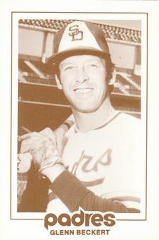
Thursday, May 21, 2015Set: 1977 San Diego Padres Schedules (Rate) “ This is actually pretty cool,especially if you were a Padres dedicated fan. ” -uncaian
“ Great concept. Didn't know these existed. ” -vrooomed
“ For some reason I like those 70s Mustard and Brown uniforms much better than anything they have had since. The Gold and Blue the wear a lot now does not suit them I always think they are the Brewers in blue. ” -captkirk42
“ Cool card, you get a player and a list of the special events on the back. They should bring these back! ” -carthage44
“ So Glenn's just happy to be there, right? Oh wait, he's an actual player... ” -Mihome316
“ You can never have to many cards!!! ” -BIGPOPA4U2NV
|

")