
Random Card of the Day |

Wednesday, September 24, 2014Set: 1995 Topps Widevision Star Wars: The Empire Strikes Back (Rate) Card: #143 Int. Rebel Star Cruiser - Medical Center “ These Widevision cards are confusing...there's multiple different sets with similar, sometimes even the same name, but different cards. I can't guarantee the ones I've posted are in the right set, even. I don't have this one- I don't have many. Never cared for the widevision cards to be honest. Of the Star Wars movies, Empire Strikes Back is my favorite. The Battle of Hoth that opens the movie is my all time favorite movie scene in history, and my earliest memory of anything was being scared of the ghost of Obi-Wan from middle of the movie. There's literally been no time in my life where Star Wars didn't play a role. ” -Billy Kingsley
“ I must be the only person in the world with a genuine dislike for all things Star Wars. ” -Id8jlb8666
“ Nice shot of everyone's back. I can still tell which one is R2-D2 though. ” -switzr1
“ It's like a 1965 tall boy card that tipped over! Plus Star Wars. ” -revnorb
“ That galaxy doesn't look "Far, Far Away" to me. ” -koloth42
“ Honestly, why can't we get a good baseball card in here. ” -jlaz10
“ I like the Widevision Star Wars cards, have a few in my collection. I really like the pictures on the front and the art work on the back. The size of the cards are a bit bulky and hard to sleeve and store. ” -Tigerfan22
|
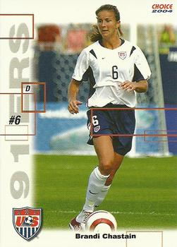
Tuesday, September 23, 2014Set: 2004 Choice US Women's National Soccer Team - 91ers (Rate) “ What does 91ers mean? I know less about soccer than any other sport. ” -Billy Kingsley
“ I like it for the most part, but could do without all the random boxes. Needs more stats on the back. ” -jupiterhill
“ Is there a card of her ripping her shirt off? ” -amine
“ 91'ers? Bizarre team name. And that's quite a thick neck for a lady. Looks like Bill Romanowski's neck. ” -Id8jlb8666
“ These rank below the California Raisins Sticker set...at least those have some sort of stats on the back. ” -SFC Temple
“ One look at this card and I knew it was a Choice design. The same design was used for minor league baseball team set that I collect. It is very interesting to see the design used for a different sport. ” -koloth42
“ With 192 caps earned for the National Team Brandi is certainly one of the team's greatest servants. Nice enough looking card but I got to admit to have never heard the nickname 91ers before. ” -Gunny
“ Clearly someone thought this design was too clean and felt the need to "fix" it with a bunch of pointless random boxes. ” -DaClyde
“ Please add more unnecessary rectangle things!!! There aren't quite enough here! ” -revnorb
“ It would be a nice card if it didn't have the rectangles. ” -dobbie
“ I love the uni-related quote on the back! ” -jlaz10
“ I don't collect women's soccer cards. But, if a memorabilia card of the famous sport's bra of the 1999 women's world cup final winning penalty shot ever came out, I would definitely chase it. ” -deporcoruña
“ A least her shirt is on. As an almost soccer fan, I know she was/is a phenomenal athlete, but she most will only remember her for her celebration. As for the design, don't like all the boxes on the front and I would have like some stats about her on the back on just a quote. Could have been a good looking set if not for those boxes. ” -yokonashiwa
|

Monday, September 22, 2014Set: 2014 Topps Heritage (Rate) “ A good retro design as they stayed with the classic look and did not over do it. ” -carthage44
“ The sideburns, gut and card design scream '70s to me. The forearm tattoo, not so much. Also, it looks like the bat knob is blacked out. Rickface Ramirez? ” -Id8jlb8666
“ Ahh, 1965 Topps. Wait, what? Oh, you mean this is NOT 1965? Topps reused a design? No, not Topps. They are always so creative and original. And why is this a "b" card? Intentional variation? Who would do that? ” -vrooomed
“ Heritage = Lame ” -NJDevils
“ I love Topps Heritage. The designs would only look better if they used only portrait shots and period-appropriate uniforms. ” -jlaz10
|

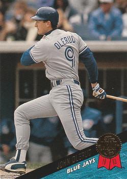
Saturday, September 20, 2014Set: 1995 Collector's Choice - Gold Signature (Rate) “ The gold signature parallel is much nicer than the Player's Club parallel done in the NBA release of this design, in my opinion. ” -Billy Kingsley
“ Gold is better than silver. I enjoyed collecting Collector's Choice cards as a kid. They did a great job of marketing these cards to children. ” -carthage44
“ This set design just doesn't excite me. It looks like the picture was taken during Spring Training or a practice as there is no one on second base or even in the outfield. Plus, I don't like the mass reproduced signature cards. I like the limited numbered signature cards. I feel like the mass produced ones are just fake autographs while the limited ones are more likely to be actually signed by the person and not just a reprint from a release form allowing the card to be made. ” -yokonashiwa
|

Friday, September 19, 2014Set: 2013 Topps Platinum (Rate) “ It always amazes me how quickly RBs fade from the spotlight. Two years removed from league leader to a mere afterthought this year in Fantasy drafts. ” -koloth42
“ YAAAAAWN!!!!!! ” -uncaian
“ The Jaguars never looked good in this set, even in Nike. ” -jlaz10
“ I don't really collect football cards anymore but have always liked the looks of the Topps Platinum cards, this card is what I'm talking about. It's different due to the fact that it showcases the player without any background picture, just the design. ” -Joshua825
|


Tuesday, September 16, 2014Set: 1986 Toronto Blue Jays Fire Safety (Rate) “ Nice 1980s promo design. Certainly blue enough :) ” -Billy Kingsley
“ His name seems made up. Rance Mulliniks? Really? ” -carthage44
“ Love the simplicity of these team/safety issues. If I collected Blue jays stuff, I'd have to have this set! ” -vrooomed
“ I don't think Rance Mulliniks really said that. Ever. At least I hope not. ” -jackal726
“ "Clearly unburdened by the demands of undue effort" is the nicest way I can put it... ” -revnorb
“ "If you start any fires, I will use my bat on you." ” -Howintensive
|

")