
Random Card of the Day |

Saturday, March 22, 2014Set: 1985 Mother's Cookies San Diego Padres (Rate) “ Mother's produced a nice little set. I was lucky enough to get some Astros sets from a friend in Houston. The photo quality doesn't show on this scan. ” -NJdevils
“ He was the one who FINALLY hit Pascual Perez in the epic Padres-Braves brawl in '84. ” -volbox
“ I always liked borderless cards. ” -suomibear8
|
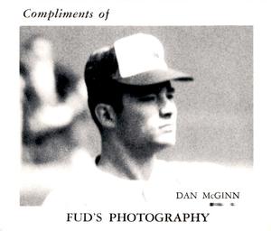
Thursday, March 20, 2014Set: 1969 Fud's Photography Montreal Expos (Rate) “ Damn. I just don't even know what to say ” -Young Kilo
“ "compliments" as if they are doing you a favor. ” -SFC Temple
“ I'm guessing this didn't help Fud's Photography as much as Fud had hoped. ” -jackal726
“ I know it's from the 60s, but this is a rather uninspiring card. ” -Billy Kingsley
“ "Fud's Photography"? Did the dog from that Far Side cartoon open a new business? ” -UNC_Samurai
“ "Shhhh, be vewy, vewy quiet. I'm photographing baseball pwayers. Now where's that wascally pwayer I need to get. Oh there he is." ” -vrooomed
“ Cool...nice to see stuff that you can't find in a Beckett Price Guide...I like it! ” -bkklaos
“ Elmer Fud went on to be a photographer after he gave up hunting for Bugs? Who knew ” -addysdaddy
|

Wednesday, March 19, 2014Set: 1994 Collector's Choice - Silver Signature (Rate) “ Silver signatures, huh? Today you got platinum signatures, gold signatures, copper signatures, red, blue and every other color in the rainbow signatures. Not to mention each of those signatures has it's own parallel. ” -Young Kilo
“ Looks like he's bent over to fist-bump a toddler on the way to the parking lot. ” -revnorb
“ My guess is Kenny Lofton was safe. ” -duaned99
“ I don' know if I've ever seen a card that had the same non-subject player in different front and back images. As a Kenny Lofton collector, I feel like I need to get this card. ” -jackal726
“ Excellent scan. The first Collector's Choice set is a good one because it features large photos with little distraction. The NBA version of this parallel has silver borders, interesting to see the MLB version doesn't. ” -Billy Kingsley
“ You're it. ” -vrooomed
“ Interesting that the two photos were from the same game. ” -jlaz10
|
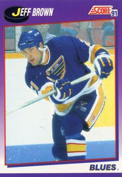
Tuesday, March 18, 2014Set: 1991-92 Score American (Rate) “ That's just an ugly looking card ” -Young Kilo
“ Team is Blues so the card theme is purple...that makes sense! Right? ” -Billy Kingsley
“ Great player,I remember him from Quebec.I liked this set for the back info & most of the front shots were great,BUT did we really need Score American,Canadian,& Canadian Bilingual ? ” -uncaian
“ The Blues looked best in blue and gold, but red surprisingly worked for them, too. ” -jlaz10
“ Every time I buy more cards, this 1990 and 1991 pro set always show up and I sigh. I'm not sure how many more doubles no one wants I can accommodate. ” -Dixxy
“ I give it a C+ ” -NJDevils
“ One of the 1st hockey sets I started collecting. I didn't like the Blue/Red Canadian set for some reason though. ” -suomibear8
|

Sunday, March 16, 2014Set: 2012 MultiAd Sacramento River Cats (Rate) “ Great team logo! Overall excellent card design, although the first letter of his first name should have been capitalized. ” -Billy Kingsley
“ Would make a nice placemat. I don't like it when they use the same photo on front and back. ” -NJdevils
“ I like this AAA uniform. Nothing like their affiliate, so it creates a unique identity. ” -jlaz10
“ Here's my pitch America, starting next year incorporate relegation into baseball, bottom 3 teams from the National league & American league go down top 3 from AAA that are "national league" teams, ditto for American. And do the same for AA & A ball. It would allow local clubs, small clubs, to have a chance to build up off of yearly performance, rather than just shipping their players off to the pro club. Obviously I'm stealing this from futbol, but I think it would spice up all American sports if we stopped allowing teams to tank their seasons for draft picks. Fans would be more passionate, loud, & supportive since they could be relegated, lose top players to better clubs or finances, as well as the opportunity to play against the best. I can see it now in the future the Sacramento River Cats in the World Series against the Asheville Tourists... ” -SaveDaKid
“ I like the team name and logo (although, if hadn't seen the name, I'd probably have thought that was a bear). For grins I searched for a set on eBay...not a cheap set for 36 cards. Once again, refreshing to see a brand I never heard of before. ” -bkklaos
“ Yeah! Stephen Parker! umm, I'm a devoted A's fan and I put this card up and I'm still not sure who this is. It's not Jarrod Parker's brother. ” -ray fosse's ghost
“ Looks like an old Sports Center design. ” -addysdaddy
“ The cat logo looks like the Pep Boys logo, and the whole design kind of looks like a high-tech version of the set of the Flip Wilson show. ” -revnorb
|
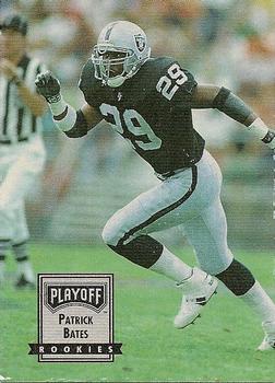
Saturday, March 15, 2014Set: 1993 Playoff Contenders (Rate) “ Excellent card front, but the back could use some stats. The large clear picture is a plus, but the text could have been made smaller, and some stats added in, to make it better. Still, a very solid card. ” -Billy Kingsley
“ Cards without stats are pointless to me. ” -SFC Temple
“ Team name would be nice on front especially for moveable teams like Raiders and Rams and Cardinals. Tough inserting team names into the DB when the card companies dont even know the city. ” -NJdevils
“ Black and silver. 'Nuf said. ” -jlaz10
“ My first full card (front & back scan) as CotD. Sorry for the poor quality of the card. Got a unopened box of these cheap recently...I know why now. Cards stick together after years of storage. It was hard to salvage many cards. Anyone has a better quality card, please replace my scans! ” -bkklaos
|

")