
Random Card of the Day |
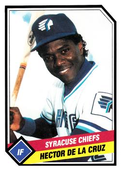
Tuesday, March 11, 2014Set: 1989 CMC Syracuse Chiefs (Rate) “ Great design. I could not think of a way to improve this card. ” -Billy Kingsley
“ The graphics on this card looks like the introduction of Action News at 11 in any major city USA ” -addysdaddy
“ SKY CHIEFS BABY!!!! Sniff sniff... takes me back ” -SFC Temple
“ The Syracuse Chiefs. Formerly the Syracuse SkyChiefs. And before that, the Syracuse Chiefs. Hey Teams, settle on one name please. Do you hear that Tampa, Anaheim Angels or whoever you are. Well done minor league card. ” -NJDevils
“ Great minor league uniform. Takes aspects from their affiliate (Blue Jays) and adds some unique parts as well. ” -jlaz10
|
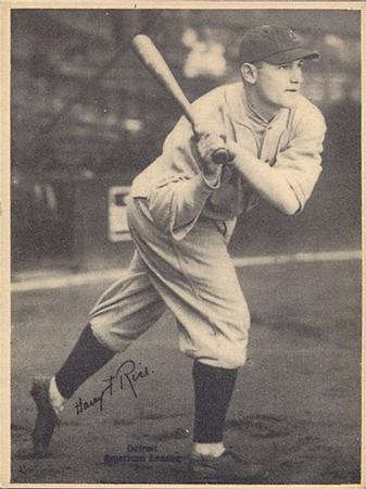
Monday, March 10, 2014Set: 1929 Kashin Publications (R316) (Rate) “ Ooh, vintage. This is one big card! ” -Billy Kingsley
“ Nice piece of vintage ! Very cool ! ” -uncaian
“ Apparently the only stat category he ever led the league in, was errors for his position. ” -UNC_Samurai
“ What a great picture! Nice to see the pants up to the knees. I am waiting for some current player to catch his spikes on his on pants and fall over. Plus this guy is just looks classier than Sabathia and his ilk. ” -NJdevils
“ Team, anyone? ” -jlaz10
“ On my screen, he's staring at my username and it's creepy ” -Hollywood42
|

Sunday, March 9, 2014Set: 2000 Future Bee Power League UL (Rate) “ Uh...is this "Future Bee" Power League, or Future "Bee Power" League? If it's the latter, I assume they have some sort of honey company ties? And why is the team name in English, when this person and card is clearly from Japan? I have absolutely no idea what's going on here, but strangely, I like it anyway. Except for the team logo, which is kind of creepy. ” -Billy Kingsley
“ Wow, never heard of this set, but love the international flavor! ” -bkklaos
“ Did Future Bee buy out Action Packed? Sure looks that way. ” -NJdevils
“ Let's play a game called...How much can you cram on one card! ” -SFC Temple
“ Success here gets you moved up to the Dogs The Shoot Bees Out Of Their Mouth When They Bark League. ” -UNC_Samurai
“ I like the contrast front number. ” -jlaz10
“ This a awkward card design, but probably not the worst. ” -addysdaddy
“ I usually don't like much made in the last 40 years or so but this is great! Great jersey, cool logo, nice design. I'm gonna go watch Ultraman now. ” -revnorb
|
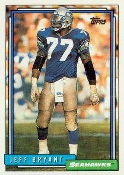

Thursday, March 6, 2014Set: 1988 Fleer Baseball MVPs (Rate) “ This card is a tribute for how cheesy the Baseball MVP set was or how bad the Orioles were in 1988...Nice 'stache there Larry! ” -flcardtrader
“ This is the definition of hangover ” -SFC Temple
“ Man, pranks back in the day were harsh. Does he even know his teammates are let something crawl up his face? ” -UNC_Samurai
“ It's amazing how little changed, other than the color scheme, the back and even front of this one looks to other Fleer releases from that time period. ” -Billy Kingsley
“ It's nice how the "Fleer Baseball MVP" logo dwarfs both the player name and the team and position, because otherwise i would have thought the MVP for that year was Jose Canseco. ” -revnorb
“ Wow, nothing says MVP like a boring pic on a boring card with boring lettering. Something about that typeface makes my brain think there are typos even though there aren't... weird ” -jackal726
“ I like the subtle placement of the Rawlings logo into the sleeve stripe. ” -jlaz10
|

Wednesday, March 5, 2014Set: 1999-00 Fleer Force - Special Forces Forcefield (Rate) “ This card looks a lot better in person. I don't have this one (or at least I don't think I do) but I have others from this insert set, and the textured rainbow foil just does not scan well. Not really a big Marbury fan...although I do have one of the replica jerseys of his Phoenix #3, which is where the Nets traded him to after the 2000-01 season. ” -Billy Kingsley
“ Still have a pair of Starbury's. Wish they still made them. ” -jupiterhill
“ Stephon Marbury is certainly part of the Very Special Forces. ” -UNC_Samurai
“ Holy ball, Batman. Talk about in your face. ” -vrooomed
“ Half card of the day. Where's the back? Please enter the back too! ” -NJdevils
“ Hahaha Brooklyn ” -jlaz10
“ Fleer sure knows how to come up with some interesting inserts. Can't wait to see this one in 2020 Fleer Retro. ” -jackal726
“ What a terrible sub set name...someday we'll be able to post images or video of our reactions to these cards...this card would get a head shake side to side with eyes closed... ” -SaveDaKid
“ Maybe I'm being too critical here, but I don't think there should be a "Special Forces" series unless there are military members on the card. Marbury's great, but let's not take away from the real special forces ” -Hollywood42
“ Whew, if Stephon hadn't saved it, that ball might have hit me in the face! 3-D! ” -DaClyde
|

Tuesday, March 4, 2014Set: 1996 Fleer - Post-Season Glory (Rate) “ Hmm, it almost looks like he's going to hit himself upside the head with his bat there. ” -Billy Kingsley
“ I hate cards that commemorate some real or imagined milestone, they always seemed like extraneous garbage to me. That said, this one looks kinda nice, although they should've tightened up the kerning on the script "Ken Griffey, Jr." so the letters touched each other. ” -revnorb
“ ... no ring ” -SFC Temple
“ As a baseball fan, something about this card bores me. ” -NJdevils
“ Griffey was my favorite player growing up. It's really too bad he didn't have more postseason appearances in his career. ” -duaned99
“ Looks just like the Mariners today. ” -jlaz10
“ Busy front, but nice overall. ” -vrooomed
“ Some people are probably going to hate this design, but I gotta say, I really like it ” -Hollywood42
|
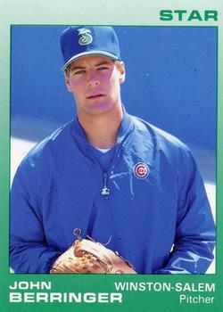
Monday, March 3, 2014Set: 1988 Star Winston-Salem Spirits (Rate) “ Is this the same Star that produced NBA basketball cards from 1983-84 through 1985-86? ” -Billy Kingsley
“ Your kidding me right? I have to stand here for a picture? Ok, here's my school yearbook pose. ” -addysdaddy
“ such a plain card and way too much blue. ” -nohascome
“ Ah man. It's John Berringer. Who the hell is John Berringer? ” -Young Kilo
“ Come on coach you just gotta let me play today. You can't say no to this face? ” -PDIZZLE
“ Dude was AWESOME in Platoon, a little less believable in Major League, though. ” -UNC_Samurai
“ I probably touched that card! ” -vrooomed
“ For just one moment in his professional career, this guy is #1. ” -ray fosse's ghost
“ Interesting that he's wearing a Winston-Salem cap, but a Cubs jacket. ” -jlaz10
|

Sunday, March 2, 2014Set: 1998 Collector's Choice (Rate) “ Solid card. ” -SFC Temple
“ Never liked Collector's Choice so I guess I am not a collector. ” -NJDevils
“ Man, his parents must have really put a hurting on the Scrabble tiles the day after he was conceived. ” -UNC_Samurai
“ The Expos use of pinstripes on their home uniforms in this set was a little too much. ” -jlaz10
“ This is some really self-conscious typography... everything is little and artsy instead of being big and bold and legible. Whomever designed this probably never owned any baseball cards when they were a kid. ” -revnorb
“ This is one of the strangest names I have ever seen ” -Hollywood42
“ Heard he came out of prison still pumping 90 ” -Young Kilo
“ Finally, a "Did You Know?" worth knowing on the back. ” -jackal726
|

")