
Random Card of the Day |
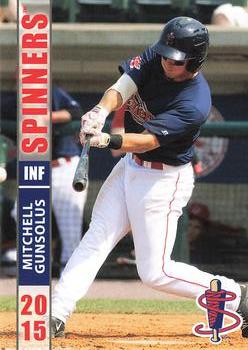
Saturday, April 1, 2023Set: 2015 Grandstand Lowell Spinners (Rate) “ Noticing that name may be stuck. ” -dah15
3
“ Love minor league team logos! ” -Tscastle
4
“ Nothing says manly like a logo that only appeals to grandmothers. This team's hated rival? The Worcester Doilies. ” -hiflew
8
“ Nice minor league card, but sideways printing. ” -captkirk42
1
“ Ugh I have to tilt my head to read the name ” -jdogg1228
3
|

Friday, March 31, 2023Set: 2020 Topps Chrome Sapphire Edition Formula 1 - Red (Rate) “ This is why books were not printed with sideways writing. ” -hiflew
11
“ Taas torille! What's happening here?? Just over month ago we had finnish F1 driver Kimi Räikkönen as RCOTD and now we have finnish F1 driver Bottas as RCOTD.
Champ. Wins Podiums
Kimi 1 21 103
Valtteri 0 10 67 ” -Duke
3
“ Looks like he is waiting to be called into the principal’s office. ” -Tscastle
4
“ Nice looking Chrome Red card. WAIT A MINUTE? Why is the set called "Sapphire" and this is a Red Variant? Shouldn't it be a Red variant of the BASE Chrome set? Now I am totally confused. ” -captkirk42
1
“ We call this pose "the fig leaf" ” -Musclebeech
3
“ Husband waiting by exit for wife to finish shopping ” -stdolan1
5
“ This dude was a beast in the GP3 Series. ” -CardFlipper1974
1
“ Action photo!!! ” -cjjt
3
|
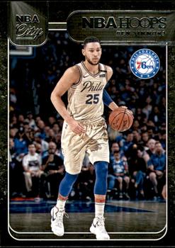
Thursday, March 30, 2023Set: 2018-19 Hoops - NBA City (Rate) “ Same picture front and back...I can't get over that! ” -domentho
6
“ Not sure what "NBA City" means. Ok front but typical terrible Pannini back. ” -cjjt
2
“ Like the old school uniform ” -tinyshogun
3
“ I take it this insert set is Chrome? (Just the scan making it look black on the front) ” -captkirk42
1
“ Poor Ben Simmons. The "Greek word for love" is not exactly what fans feel for him. Card is okay, probably dozens of them in every dimebox. ” -pjdionne12
1
|
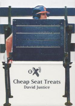
Wednesday, March 29, 2023Set: 1998 SkyBox E-X2001 - Cheap Seat Treats (Rate) “ Not sure I understand the point of the front of the card other than cheap seats get you bad views. Don’t think that translates well for a baseball card. ” -mrackar
8
“ Wasn't expecting to see David Justice's head and arm growing out of a bench that's for sure.
” -jdogg1228
7
“ First I didn't get the idea and was like "what a...¿". But this is really stupid anyway. ” -Duke
5
“ what the heck...looks like he got folded up by an usher.... ” -Tmac7
2
“ Peek-a-boo! ” -stevejrogers
6
“ If the intent of the "Cheap Seat" theme was to provide an obstructed view of the player, then job well done! ” -bevans
2
“ What in the holy cheap seats are these? Really?? ” -tinyshogun
3
“ ...and Fleer/Skybox wonders why they went bankrupt. ” -hamrlik22
5
“ "Mooooooom! David got himself stuck in that cheap folding chair you got at Wal-Mart again!!!!!" ” -Theron_Nett
3
“ I thought i had seen all the worst insert sets there are, but RCOD you come out and surprise me again. ” -parsley24
7
“ Mom was right, it is a bad idea to stand on folding chairs! ” -jackal726
3
“ It really makes you feel old to see what was once considered an idea on the cutting edge is now nostalgic gimmickry. ” -hiflew
2
“ Pretty lame . . . ” -georgecf
3
“ Kind of ugly card. Why did they have to block the picture? ” -sundin
3
“ Reminds me of those black censor bars ” -lildog7
1
“ Pretty cool concept, except the intricate die-cut design makes it very fragile. ” -captkirk42
5
“ What is this horrible idea of a card? ” -jupiterhill
4
“ Love this set! ” -pjdionne12
1
“ what. ” -702tpr777
3
“ I didn't know that seats played baseball. ” -BigBoyOnWheels
2
“ One of my favorites, one of the great 90's inserts from Fleer / Skybox insert sets. Die cut for the die cut lover that I am, and an insert rate of 1 per 24 [1 per box.] It folds down like a stadium seat, and the chair is slatted wood like in the cheap seats, no padding. How great is that? A paper card, when the base set was acetate. ” -abide
7
“ Ahh, the 90's...when card companies went wild with goofy ideas for cards and inserts! ” -cckeith
2
“ No. Just, no. ” -Sportzcommish
4
|

Tuesday, March 28, 2023Set: 2011-12 Upper Deck (Rate) Card: #200 Milan Lucic / Tim Thomas / Zdeno Chara “ This is a nice checklist. ” -Brendan Barrick
2
“ As a Vancouver fan, I have a lot of dislike for the Bruins of this particular time period. But as a card collector, this is a nice one from a nice set. The three portraits are all distinct and work well together. ” -DarthTempest
6
“ nice card ” -cjjt
2
“ Nice touch...Alternate, home, and away jerseys, all in the same pic. ” -hamrlik22
2
“ As a Montreal fan I have to deeply dislike this card ” -Lennoxmatt
5
“ Nice player checklist card.
” -parsley24
1
“ Not sure why, but never been a fan of multi-photo cards like this with teammates wearing different uniforms. ” -c634
2
“ I like that they are all wearing something different. It can end up pretty bland if they're all wearing the same uni. ” -jackal726
2
“ Hmm Hockey card as RCofD for the day and also for the upcoming. Nice hockey "checklist" card. I miss the days of the 2 sided checklist cards that were just the checklists, the pre Beckett days. pre internet days. These modern CL cards don't "feel" like checklist cards. ” -captkirk42
3
“ Nice images on the front of this checklist card. ” -CollectingAfterDeath
1
“ The 3 bears?
I learned today that a Bruin is a brown bear. ” -Derek McDonough
2
“ I freaking hate the Bruins! ” -sundin
3
|
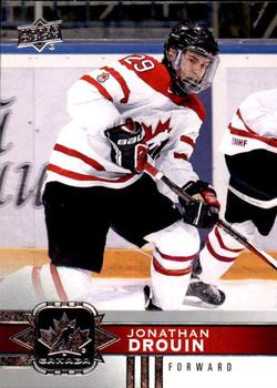
Monday, March 27, 2023Set: 2017-18 Upper Deck Team Canada (Rate) “ This is a nice card. ” -Brendan Barrick
2
“ Love the Team Canada set, Drouin not so much ” -Lennoxmatt
4
“ Nice looking Hockey card. ” -captkirk42
3
|

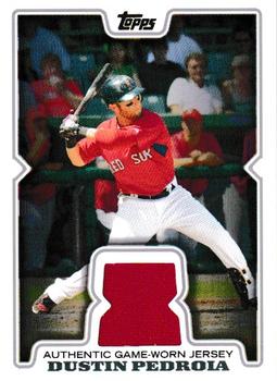
Saturday, March 25, 2023Set: 2008 Topps Updates & Highlights - Relics (Rate) “ Nice jersey card of a great player. ” -jdogg1228
2
“ Back in 2008, this set was my introduction to modern card collecting and the concept of relics. It was baffling to me that people paid premium prices for cards simply because they had a little piece of fabric on them. Fast forward to today and I have around 1000 Rockies relics in my collection. Yep I got sucked in too. ” -hiflew
5
“ Nice card ” -cjjt
1
“ About as good as a standard Topps relic gets ” -jackal726
1
“ I kinda like this card design, would have been better without the “game worn authentic jersey.” I guess we just have to take their word for it, because there isn’t any real proof. ” -Derek McDonough
2
“ 2008 Topps was a nices set. I'm not big into relics never have been as I've stated many times. ” -captkirk42
1
“ First word that comes to mind is; cheap. So many of these rotting in dollar boxes. Whether this set was over-produced or just boring, 2008 is when relics started to become lackluster unless they had a patch or were numbered. ” -pjdionne12
5
“ The intensity of Pedroia pulls off the front of the card, and the relic being Red Sox red is a nice add to its appeal. The back is so wonderfully colorful and full of energy, and with the baseball field inside the background for the name plate, it really shows a love for baseball by the person who designed it. This is a beautiful relic card. ” -CollectingAfterDeath
1
“ It's 2008 Topps, one of my favorite base designs of all time, so of course I need to show it some love. This relic design is nothing special, unfortunately. The red jersey piece looks good though and at least the back tells us it was worn in an MLB game. ” -ketchupman36
1
|

Friday, March 24, 2023Set: 1999 ArtBox Pokemon Action Flipz Series One (Rate) “ "In certain parts of Galar, Jynx was once feared and worshiped as the Queen of Ice." but now is imprisoned in a ball carried by a 12 year old child and forced to fight to experience any time outside such ball. ” -TripleLSupreme
8
“ The numbering is incomprehensible (#60 - #124?) but I see a fat lady singing so this should have been the last card in the set. ” -bevans
8
“ This one doesn't make it out of the design stage if it was created today. ” -jackal726
3
“ It's lost on this card (because there was only one form at this point), but cards of Pokémon with evolutions show all forms on one card, which is pretty neat. Still, this particular Pokémon doesn't make it out of the design stage if it was created today. ” -jackal726
3
“ i thought this was a beth chapman lenticular insert from the dog the bounty hunter series. ” -parsley24
5
“ At first glance I thought "What the HECK is this thing?" Then saw it was some kind of Pokemon thing.. ” -captkirk42
1
“ Gotta... catch 'em... all.... Gotta... catch 'em... all.... ” -Musclebeech
1
“ I like the shape. Though, the corners are all different shapes. ” -pjdionne12
1
“ oh my gosh it's so intimidating. ” -jdogg1228
2
|


")