Thursday, April 2, 2015
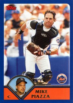
Year: 2003
Set: Topps (Rate)
Card: #500 Mike Piazza
“ I wasn't back in the hobby when this set came out. When I first saw it a couple of years later I hated it. Now I like it as I do a lot of the 1990s and early 2000s sets I had missed during my modern card hiatus. Piazza has a unique look here on this card. It almost looks like he just pulled something or his trow just missed the mark. ” -captkirk42
“ It seems like the headshot in the little speedometer would have made a better card photo. What a drab design. No wonder kids don't care about baseball cards anymore. ” -revnorb
“ This year of Topps always throws me off. I don't own any and rarely see them. Also, why isn't this man in the hall of fame already? Not that it's relevant anyhow nowadays... ” -Id8jlb8666
“ Not big fan of the design - never cared for blue borders - not professional looking in my opinion. The player, however, I am a big fan of, even though he played for 2 of my "least favorite" teams - Phillies rivals LA and NYM. His 5 games with my 2nd favorite team, can't really count. Still, one of the best catchers ever, and definitely the best of the 1990s/2000s. HOFer? I say - YES! Oh, and he was born 1 year before me - to the day! ” -vrooomed
“ I wasn't a "fan" exactly, but there's no doubt in my mind that Piazza belongs in the HOF. ” -jackal726
“ Baseball stats are great and Topps almost always gets it right. ” -carthage44
“ The Mets never looked good with black accents. Too much going on, plus an ugly color combination. ” -jlaz10
“ Nice to see a card of Piazza in the catcher's gear. Look forward to him getting in the Hall of Fame. ” -armac


")