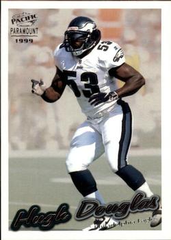
At the time I really liked the Paramount sets. However they didn't hold up at all, as this design is pretty bad. The front is okay, but I don't like the foil. The back is just ugly. One of the worst color schemes I've seen on a card, terrible use of stats (takes up too much space vs. how little stats are actually shown), not much of a biography, and the slanted name and team takes up too much space. I'd also probably switched the Paramount logo (and make it smaller) and the team logo around. I do like that the photo is different from the front and you can see his face, so that gets points.
Royal Card Review is my blog if you feel like checking it out, thanks if you do!- royalcardreview.blogspot.com/
In the process of updating my collection so don't trust any of my lists right now.


")