
Random Card of the Day |
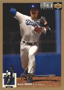
Sunday, November 12, 2017Year: 1994 Set: Collector's Choice - Gold Signature (Rate) “ These are much nicer than the NBA versions, which are mirror foil, except the International versions. The gold border really looks nice here. ” -Billy Kingsley
“ Parallel or not, I seem to be a sucker for cards with a cartoon on the front representing the position of the player. ” -rmpaq5
“ Both the company logo and the position icon seem misplaced or too big. I'd rather have a top or bottom bar with player info than the way this card is structured. ” -Sportzcommish
“ We had a Collectors Choice not to long ago. This was good set, even with the facsimile signature. ” -IfbBirdsCards
“ I liked the concept of CC's signature parallels. And I've always liked the 1994 CC card layout. ” -kents_stuff
“ Gross had a long interesting career pitching for 5 different teams from 1983-1997, an All-Star in 1988, pitched a no hitter in 1992, surrendered the first of Rafael Palmeiro's 569 career home runs in 1986 and was suspended for 10 games in 1987 for pitching with an illegal substance (sandpaper) on his glove. ” -carthage44
“ I bought soooooo many packs trying to get these gold parallels. Only got a handful after all that lol ” -Joshua825
“ From when parallels were more manageable, but still near-impossible to complete. My uncle attempted (possibly succeeded) to complete the gold set from this design of basketball. One per box. Helped pave the way for the current state of the hobby. Thumbs down. ” -switzr1
“ I am torn on Collector's Choice. This looks cool, but I always dislike the Collectors Choice branding. The UD branding by itself would be cool. The cartoon pitcher looks great, bbut why so big? A team logo may have looked better and the cartoon guy on the front. Then the name and team name. So so so so small! Like all other Collector's Choice cards, I like it, but could have been so much better. ” -muskie027
“ Now this is a gold variant/parallel. I have already said what I think about "collector's choice". OK the front of this card I like that you can tell its the gold version none of this just because the players name is in gold foil lettering makes it "gold". The player name needs to be bigger more prominent. Sheesh the cartoon position guy is larger than the player's name. UGH back. The photo is twenty times too big. And the stats looks like 5 years is the most this guy has 11 years according to the totals. Sigh.Oh and the team logo is on the back. Would look nicer on the front as well. ” -captkirk42
“ Whoa! Kevin! Your shoes are REALLY untied. ” -Vvvergeer
|

")