Friday, February 9, 2018
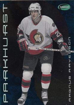
Year: 2001-02
Set: Parkhurst (Rate)
Card: #183 Magnus Arvedson
“ Although you can't tell from scans, this card is green and black mirror foil. This scan being so washed out doesn't really make it any harder to tell. ” -Billy Kingsley
“ I am not a hockey fan so I had never heard of Parkhurst. Looked it up and I guess it has been making cards, mostly hockey, since the 50's. As for the card, I like the design of the front, he pops out from the background where lots of times the player gets lost in the digital backgrounds. The back though I really don't like the black and white background just doesn't fit with the futuristic looking front. ” -davidhandberry
“ Magnus had a nice run with the Senators and these cards actually like pretty nice in hand. Oh, I miss my old Senators hat, best work hat I ever had. It didn't survive the rebuild of our deck during the summer of 2017. ” -Gunny
“ Not a big fan of this Parkhurst set , but I do like the back . ” -uncaian
“ Hmm? Parkhurst, the inspiration for Panini? ” -Sportzcommish
“ Sad I usually like Parkhurst designs. This one I don't tooo plain on front. Hate the vertical type. Parkhurst way way too big besides the brand logo is in the top right corner, larger ID NOT NEEDED. Needs team name printed on front. OK yeah he is a Senator seeing his jersey but what of the players who are only have a head and shoulders bust shot? Back with the bubbles reminds me of the old VH1 (or was it MTV?) Pop-Up Videos. Bad only one year of stats. Card number large enough to read but poor font makes it difficult to read. ” -captkirk42
“ So much foil. ” -carthage44
“ Magus "The Machine" Arvedson. The front isn't as dramatic as the designers probably hoped it would be, and the back looks like a mid-90s gar(b)age product. Good blurb, but nothing else worth a compliment. If the plan is to drape "PARKHURST" along the left edge in letters more than twice as big as for the player name, then could you at least have put the team logo in the corner and/or the back instead of that green parkhurst zit? ” -dilemma19
“ Pretty good card. Im not a Hockey card fan. ” -parsley24
“ For some one reason I want to think this guys name is Parkhurst. ” -kirkscards
“ Tough scan. I don't like front images over a fake background. I would rather see him on the ice or portrait shot.The back is ok...but only single season stats...don't like that either. I do like the Freddy Krueger photo bomb on the back though. ” -cnangle
“ All black front--cool and unique. Except for Topps Unique, of course. Which based on this, wasn't so much. ” -kents_stuff


")