Sunday, February 19, 2017
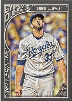
Year: 2015
Set: Topps Gypsy Queen (Rate)
Card: #179 James Shields
“ Not a huge Gypsy Queen fan, but this isn't bad. I like the photo and the overall design. I hate the lack of a first name on the front, and if the Gypsy Queen logo was actually the team logo, this would be real nice. ” -muskie027
“ Gypsy Queen is growing on me. This is not one of the better years. When Topps first revived the GQ brand I HATED it. Thought the border was too dark and looked too much like an attempt at the Upper Deck Masterpieces Framed cards. I like it sometimes now. I have grown tired of the mini parallels from this and A&G. ” -captkirk42
“ Hey, look, He's singing along with Snoopy! ” -Billy Kingsley
“ So glad the White Sox have this guy.... NOT!!! ” -carthage44
“ One of the better Gypsy Queen designs that takes just enough border and maximizes the player's picture. Even with the dull dual colors they chose for the 2015 series works to make an attractive card. ” -Sportzcommish
“ I bought a lot of retail packs of this set from the Seattle Mariners team store as they were always on discount. It's a decent looking set. ” -ketchupman36
“ HATE the card design and the pose. ” -cjjt
“ Still love the Gypsy Queens, as I've mentioned before. Great signature cards like the A&G for autograph collectors. Something about the texture and the photography. ” -jasongerman9
“ My face when I see how cool the Gypsy Queen logo is ” -lxnlxn
“ Interesting look on his face. I've always liked the look of gypsy queen cards. ” -Mitch
“ nope ” -hphillips


")