
Random Card of the Day |
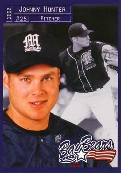
Tuesday, February 21, 2017Year: 2002 Set: Grandstand Mobile BayBears (Rate) “ I like it. Nice design, a well done back and a great scan. This one's a winner! ” -Billy Kingsley
“ Nice appealing design that keeps up with the big boys. The only improvement would be the name plate as the style used would be better served on the back. ” -Sportzcommish
“ I think this has everything you could ask for in a baseball card, and it's even a minor league one! I'm really impressed with most of what Grandstand has issued, especially these that are original designs (they have been known to use old Topps designs with very small variations). This one is VERY nice. ” -vrooomed
“ Album of the Year. "Johnny Hunter-Pitching for your Love" ” -sahal694
“ Nice card. ” -carthage44
“ Looks like a glamour shot / school pictures pose. Certainly not the typical minor league card from the 90s. ” -Mitch
“ Minor League Baseball! My favorite! Don't care for how they put the name in the upper left. And I always hated how minor league hats from the 1990s-early 2000s always tried to fit so much information on the cap; logo and nickname? Really? ” -jasongerman9
“ Very nice minor league card. Beats a lot of what Topps and UD and Panini put out. ” -NJDevils
“ I wonder how many teams make their name by just having the word "Bay" plus a random mascot. What even is a bay bear? ” -lxnlxn
“ This is the first I've seen of these cards and I like them. This is a great looking minor league team set. ” -cynicalbuddha
“ Nice MILB card. With the two photos on front looks like a 1990s Fleer or Upper Deck set. Back is nice. ” -captkirk42
“ Anyone else notice that the minor league cards seem to be far and away better designs than the major league cards? I might switch the sizes of the portrait vs in-action shot, but other than that, great design. ” -hphillips
“ At first, I hated it, but then, just staring at it, I turned my thoughts around pretty quickly. As a minor league card, I actually like it, and the back is better than most minor league sets. As a pro set, not sure I would feel the same, but I rather like this. Even the odd dual picture, one action in black and white and one portrait in color isn't making me hate it like it should. ” -muskie027
“ What ridiculous photos minor league cards have. ” -Quinn820
|
Additional Comments
| Posted By | Message | ||||||||||||||||||||||||||||||||||||||||||||||||||||||||||||||||||
|
Joined: Sep 2008 |
| ||||||||||||||||||||||||||||||||||||||||||||||||||||||||||||||||||
|
Joined: Dec 2012 |
| ||||||||||||||||||||||||||||||||||||||||||||||||||||||||||||||||||
|
Joined: Feb 2015 |
| ||||||||||||||||||||||||||||||||||||||||||||||||||||||||||||||||||
|
Joined: Feb 2016 |
| ||||||||||||||||||||||||||||||||||||||||||||||||||||||||||||||||||


")