Thursday, October 5, 2017
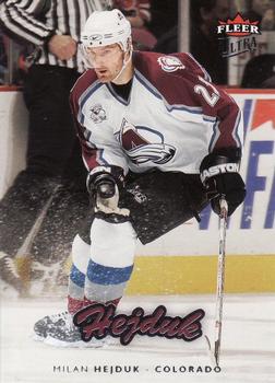
Year: 2006-07
Set: Ultra (Rate)
Card: #50 Milan Hejduk
“ If anyone from Upper Deck is reading this, please bring back Ultra as a standalone set! My all-time favorite brand deserves to be more than just an insert set in Showcase! ” -Billy Kingsley
“ Great card, would be better though if the Cursive Hejduk wasn't there and the Milan Hejduk Colorado was larger and in the color font that the cursive Hejduk is. The back looks weird in that the Avs logo is over the jersey just off from where his sweater logo is. I think it is the same photo, which is a downer. Ultra made some good cards. I wish I would have had more of them from back in the day. ” -muskie027
“ The action shot is crisp and lively making for an attractive front. I'd call icing (as if I really know what that means!) for the back, though, as it is bland, and they use a cropping of the front photo - a Paninian mistake! ” -Sportzcommish
“ Not a bad card at all , actually a nice set . Hejduk was the last player from the 2001 Stanley Cup Avs. to be still playing for them when he retired in 2013. ” -uncaian
“ He had a fine, long career with just 1 team. ” -wax_house
“ I feel this design works for baseball, but not for hockey. ” -IfbBirdsCards
“ I realy like the simple, Stadium Club-like design, except for the scripty name. ” -olerud363
“ I loved the foot on the shoulder of the uniform. ” -carthage44
“ I like this Ultra design a little. Not thrilled about the player name font, script fonts are more difficult to read than printed fonts. Team Logo would be nice. Back is fine but for players with shorter careers maybe some highlights in that blank space below would be nice. ” -captkirk42
“ The front is great. The back, not so much -- totally mailed in the effort (too much dead space; repeat photo). A lot like Panini cards of today. ” -mkaz80
“ Relative of Frank the soccer player? ” -deporcoruña
“ Not sure why the name appears twice. Good design otherwise. ” -switzr1
“ Other than the use of the same photo front/rear, I have nothing to complain about on this card. Pretty nice overall. ” -kents_stuff
“ HEJDUK! A classic player and a timeless card design. ” -nubala
“ Fleer Ultra was always one of my favorite sets, which featured one of my favorite parallels, the Gold Medallion. ” -rmitchell6700
“ pretty close to the football version, football version name on front is flat not curved and pic/stats are vertical not horizontal.....i miss fleer ” -Thunderfoot
“ Clean design on front. Back good except re-use of picture--I hate that! ” -cjjt


")