Monday, November 13, 2017
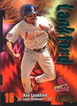
Year: 1998
Set: Circa Thunder (Rate)
Card: #130 Ray Lankford
“ I loved this design when it was new, in 1997, as Z-Force in the NBA. At the time it was in my top 5 favorite sets all time. Now, as I've matured (?) or perhaps just refined my taste in cards, it didn't even make my Top 20 Favorite sets countdown I did on Cardboard History to celebrate my 20th anniversary of being an NBA fan last year. Every time I see it I still get that old nostalgic feeling though. ” -Billy Kingsley
“ Ouch! What an eyesore! I'd only seek these to add to my player collection and not team set. ” -Sportzcommish
“ TOO much going on..... ” -parsley24
“ Yay Cardinals! Lankford was a fan favorite in a time when we didn't have much to cheer for in the early 90's, before LaRussa got there and started recruiting players like McGwire, Rolen, Edmonds, and others. Good to see him as a RCOTD. The card itself has never been one of my favorites, but not terrible either. For all the business of the graphics, they did seem to choose good action photos for most of the cards, at least. The back is average. The quote is pretty much exactly why Cardinal Nation enjoyed him so much. ” -Brimose
“ This set just screams "I am from the late 90s" with its lame computer generated background that has nothing to do with baseball, or even thunder for that matter. I never cared for this set. ” -YoRicha
“ Trippy background. ” -carthage44
“ I thought this was an insert set. Looks like its own full blown set. Reminds me of the latest Topps Fire. A bit too busy going on with the background. Back has some odd stats there or an odd way of presenting some of them. ” -captkirk42
“ I like the background ” -TradingCards964
“ The front of this card has a bit too much going on to suit my taste. The back is nice though. I'm left wondering if the stat illustrated by the bar graph was expressly selected for Lankford. One of these years is not like the others... ” -dilemma19
“ Wooo! Circa Thunder. The backgrounds on this set were crazy. Lankford looks like he's trying to avoid being swallowed by some sort of wormhole. Dig the back - OBP bars are pretty cool, quote is nice (these were on the front in '97), I can even live with the single season stat line. Just wish that shadow wasn't there. ” -marcbrubaker
“ Loud, very loud ” -rmitchell6700
“ I don't know about this design. Maybe there's a bit too much going on, especially on the front. But I'll say this about Mr. Lankford: if you're a St. Louis Cardinal and want to endear yourself to your fan base, quoting Willie McGee is a good start. ” -kents_stuff
“ It's different. Not sure if I like it or not. I will say that it looks like a better poster than card. ” -muskie027
“ Looks more like lightning! A+ for effort here. Not bad set because it is different. ” -cjjt
“ Cool, a Cardinal! Best Cardinal player of one of their worst eras historically. The early 90s were not kind to the Cardinals, and featured their only last-place finish since World War 1. Ray appears to be dancing. And this is a horrible-looking set. But I would take it. ” -switzr1
“ This is one of those sets that in my opinion the backs are stronger than the front. A good, and DIFFERENT photo, break down of different cyber stats, and a nice little quote. For a set with a computer generated background also not that bad comparative speaking. Also a good number of the cards numbers match the player's jersey number. It is one of those sets actually that I have partially completed and have the missing Tigers as 2 wants and the rest of the set that I am missing as a want to complete it. ” -rmpaq5


")