
Random Card of the Day |

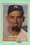
Wednesday, April 4, 2018Year: 1993 Set: Topps - Inaugural Rockies (Rate) “ Another one of the bland years for Topps. Nothing great but nothing bad. I believe the only difference between this parallel and the standard set is the little emblem in the bottom corner. ” -davidhandberry
“ Normally I would just think it, but since it's opposite day..."you've got to know when to hold them, no when to fold them, know when to walk away" and those are the only lyrics I know. ” -Billy Kingsley
“ Hated the backs of these cards. Too much dead space. Only good thing is the foil stamped Rockies logo. Genius idea! ” -IfbBirdsCards
“ The look on this card is amazing. I may start collecting this year. ” -parsley24
“ Hate this card , lousy pictures no info on back. ” -uncaian
“ This set blows every other set out of the water. ” -carthage44
“ The 1993 Topps looked SO different from the 1992s. Also, with the base card, Gold, Micro, Inaugural Marlins, and this one, there were 5 different versions of basically the same card. The wonderful beginning of zillions of parallels. ” -vrooomed
“ I love Topps' imagination, creating some of the hobby's first parallel sets to recognize the two expansion franchises. Player and team collectors are surely thrilled about the opportunity to chase exactly the same cards two more times, but with "impossible-to-forge" foil stamps on them. I totally knew that Kenny Rogers was a converted outfielder before reading the blurb. ” -dilemma19
“ Ahhhh....memories....I had so much 1993 Topps trying to get them new Marlins cards! Can't tell if this is the Rockies or Marlins parallel. I guess that's a preview of the 20-teens hobby. (Please note: I did not use the them of opposite day) ” -beansballcardblog
“ It's nice, clean and safe. The white borders make condition easy. The blue stripe on each bottom corner is pointless, but ok. Overall Meh+ ” -altaeria
“ it's opposite day, and since I normally wouldn't comment on this card, all I can say is "On a warm summer's evening, on a train bound for nowhere..." ” -Lennoxmatt
“ Kenny Rogers after his face lift Oops wrong Kenny Rogers. OK so I really really love the gold foil stamp at the bottom you don't need the team logo down there anyway. Hate the white border around the edge of the card come on this is a 1990s card the picture should be bleeding on the edge and embracing it's fullness. Where is the foil lettering? I can actually read Kenny's name. Glad the gold variant fixed that. Now onto the back Oh my slanted vital personal stats? Hey what is Topps doing by putting a completely different picture on the back? Card number too large too easy to read. Wait is his full player stats? What a waste they should only have his complete stats line maybe has just last year's stats. I will never ever get any cards from this set. I don't even want a full set of them Nope not for my PC. Please don't ever send me any. ” -captkirk42
“ Opposite day, huh?... I guess..."You don't need to forget when to unfold 'em" ” -OCHawkeye
“ He wouldn't know when to hold em. ” -sahal694
“ He does NOT know when to hold em, nor does he know when to fold em, he does NOT know when to walk away, and of course he does not know when to run. ” -RoyalChief
“ Kenny Rogers chicken is overrated ” -ketchupman36
“ Ladies and Gentleman!! You can NOT see the U.F.O that did NOT land on Country Music Hall Of Famer Kenny Rogers leg that did NOT turn him into a pitcher for the Texas Rangers! You saw NOTHING! ” -YoRicha
“ I wish the photo on the back had been the same as the photo on the front. ” -switzr1
“ I'll write more about the base set than the Rockies Inaugural subset. I remember hating this when it came out. I still do hate it and would not be looking to go back and pickup a series 1 or 2 unopened box at the right price. Topps had officially come off the traditional card board stock and into the modern era with this set. Loved the foil blotch over the knee. What a really awful looking set. ” -muskie027
“ This card doesn't remind me of fried chicken ” -BlueJays77
“ Opposite Day comment: Brilliant! I love parallels like this. Makes me want to collect them all. ” -cjjt
|


")