| Posted By | Message |
|
Mr Card Man
Posts: 5
Joined: Mar 2017
|
| Monday, May 22, 2017 10:04 AM | |
A few questions regarding the 2003 Topps Gallery Hall of Fame (74) set …
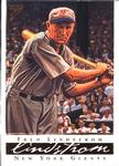
How does one discern an Artist’s Proof card; my observations seem to indicate the obverse has a yellowish/off-yellow border, while the reverse has silver/grey background bars behind the name, stats, and Topps logo line?
I have a # 21 Harry Heilmann with a reverse as described above, but the obverse has a silver/grey border as opposed to the previously cited yellowish/off-yellow. This does not seem to match any of the other “inserts” noted on Trading Card Database. Ideas?
Are the noted variations as (b) on Trading Card Database rarer, or distributed in a different manner, than the “regular” cited cards? I question this because the boxed set I possess, which includes the additional Harry Heilmann card, has only one such (b) card, 47b Red Schoendienst, no stripes.
Any insight regarding all the aforementioned is appreciated.
|
|
|
|
|

C2Cigars
Posts: 11,439
Joined: Oct 2014
|
| Monday, May 22, 2017 10:20 AM | |
My question is why does EVERY card in the base and parallel sets have a VAR note?
-------------------------------
Someday my cards may double in value and then be worth half of what I paid for them. |
|
|
|
|
Mr Card Man
Posts: 5
Joined: Mar 2017
|
| Monday, May 22, 2017 4:12 PM | |
Further investigation has brought me to the following interpretation — if any man out there has more accurate information, please furnish …
It appears the (b) VAR’s, as noted by TCD, were placed at a “collector” ratio in base (meaning TCD non-(b) VAR) packs.
The 75-card boxed set I mentioned in previous post has one such (b) VAR card, 47b Red Schoendienst, no stripes. I am uncertain as to the origin of this boxed set, but it seems odd that it would have one (b) VAR out of the 74 base cards!?
The boxed set also includes an additional # 21 Harry Heilmann, as described in earlier post. I believe this is a “refractor” card, although TCD has no mention of these under the set’s inserts, et al.
|
|
|
|
|

vrooomed
Posts: 14,919
Joined: Dec 2012
|
| Monday, May 22, 2017 8:58 PM | |
Mr Card Man - please be careful when uploading checklists. If you have headers in your file, please be sure top mark it as so, else we wind up with the pseudo-card of Name with the card number of "Number", and Note of "Note", etc.
I think your "refractor" is simply the "Artist's Proof" parallel.
-------------------------------
-- Dan -- Note: Please see my profile for more info regarding trading (section updated 3/4/2024). I have added a large portion of my inventory to the site, and currently have trading turned on (details are in my profile). |
|
|
|
|
Mr Card Man
Posts: 5
Joined: Mar 2017
|
| Tuesday, May 23, 2017 9:49 AM | |
The uploaded photo for card in question does not clearly display the “refractor” properties one normally associates with said variety. The physical card in hand, however, does have a distinctive reflective nature, and has silver/grey borders as opposed to the yellowish tone exhibited in image. It is also significantly thicker than a base set card. As I do not think I have an “artist’s proof” card, I am unable to ascertain if the same can be said for this variety. Perhaps someone with an “artist’s proof” can verify its thickness.
Other internet sources offer cards from this set in a “refractor” insert/related format, although TCD did not have noted prior to my earlier addition. I am curious to know if anyone has a card from this set revealing characteristics like what I alluded to in first paragraph, and can place side by side with base and/or “artist’s proof” cards to illustrate any differences.
Insofar as checklist upload, the Excel formatting used was the same as previous checklist uploads — format carefully following that outlined in TCD’s checklist upload instructions. I am equally perplexed as to why the CardNum heading got represented, whereby the other headings in the source spreadsheet similarly created (Name, Team, Note) did not.
|
|
|
|
|
vrooomed
Posts: 14,919
Joined: Dec 2012
|
| Tuesday, May 23, 2017 10:12 AM | |
The uploaded image for the card in question does not match the uploaded images for the other cards in the set. The image uploaded appears to have been done so in error. This is something that happens from time to time, and is easily resolved by informing Admin (using the report inaccuracies link on the card's page), which I did yesterday.
It would be VERY odd for you to pull something that was completely undocumented by any of the leading hobby publications or hobby websites in the last 14 years. I mean, I guess it could happen, but chances are, we all would have known about a "refractor" set by now. Sources I have found show the Artist's Proof cards as having a refractor finish.
As for the upload, there is a radio button selection for "Does your file have column headings (CardNum, Name, etc.)?" If it has headers and you do not select "Yes", then you will see a pseudo-card in the next screen. Please review the content there - Admin has set it up to allow for users to double check what they are about to upload, and to start over if there are issues at that point (I know, I have clicked that button a few times so I wouldn't upload something incorrectly). You won't see Note in the Note field as I deleted it so the set would stop showing up in the glossary missing definition listings.
-------------------------------
-- Dan -- Note: Please see my profile for more info regarding trading (section updated 3/4/2024). I have added a large portion of my inventory to the site, and currently have trading turned on (details are in my profile). |
|
|
|
|
Mr Card Man
Posts: 5
Joined: Mar 2017
|
| Tuesday, May 23, 2017 12:42 PM | |
I will review the checklist system if and when I have another checklist to upload. Prior uploads were processed before I went through the permissions procedure, which tells me administration cited heading question and corrected without me knowing. Without knowledge that there was an inconsistency in previous uploads, I simply went along as normal. It may behoove administration to remove the CardNum, Name, Team, Note formatting to avoid any potential confusion. It currently makes it appear this should be included in file upload.
You lost me in statement, “The uploaded image for the card in question does not match the uploaded images for the other cards in the set. The image uploaded appears to have been done so in error.”
The uploaded image for the Harry Heilmann “refractor” is an exact match relative to composition, etc of the Harry Heilmann base card. There was no error in its upload. In fact, all the Harry Heilmann cards, whether base, artist’s proof, or refractor, display the same composition. The only non-matching aspects would be the obverse day/night variations. Also note that my “refractor” reverse has silver/grey shading behind the name, stats, and Topps logo section, whereas the base cards are tan/brown.
Reading between the lines here, regarding refractor/artist’s proof, seems a simple matter of nomenclature — as they appear to be one and the same! Conduct a quick, easy “2003 Topps Gallery Hall of Fame refractor” search on Ebay and you will find a plethora of offerings. The TCD uploader, unfortunately, of the Harry Heilmann “artist’s proof” only included the obverse. It would be worth finding out if that card’s reverse matches my “refractor” entry reverse; silver/grey shading behind the name, stats, Topps logo section.
Do you own an “artist’s proof;” is it thicker than a base card, as such is the case with my “refractor” entry.
I will leave it up to administration as the possibility of combining my refractor entry with artist’s proof, or leave alone temporarily until a more definitive answered can be derived.
I wish I could remember where I obtained my 75-card boxed set that included two Harry Heilmann’s … one base (day) card, and one “refractor/artist’s proof” card. I find this rather unusual.
|
|
|
|
|
vrooomed
Posts: 14,919
Joined: Dec 2012
|
| Tuesday, May 23, 2017 1:47 PM | |
The image on this site for the #21 "Artist's Proof" is not correct. It looks like the base card. If you look at the other Artist's Proof cards, you'll see the refractor finish on them. And you even state, it's a matter of nomenclature, which means the "Refractor" set (which you uploaded only one card for) is not a set at all. It's really the Artist's Proof set.
Your card #21 that is refractor-like IS the Artist's proof. The scan that is there needs to be removed as it is erroneous.
The set is 74 cards. Sounds like the 75-card boxed set came with the 74-card set plus a "bonus" insert/parallel card. Looks like your boxed set had the #21 AP. A lot of smaller factory sets are packaged that way with 1 or 2 inserts. Larger sets usually have more.
-------------------------------
-- Dan -- Note: Please see my profile for more info regarding trading (section updated 3/4/2024). I have added a large portion of my inventory to the site, and currently have trading turned on (details are in my profile). |
|
|
|
|
Mr Card Man
Posts: 5
Joined: Mar 2017
|
| Tuesday, May 23, 2017 3:38 PM | |
You say/spell potato, I say/spell pototoe; you say/spell tomato, I say/spell tomatoe … tolerance, diversity, inclusiveness.
There is no way one can substantiate whether a particular upload under “artist’s proof” is truly a refractor/artist’s proof or not — Harry Heilmann card or others. As you even state, “It looks LIKE the base card.”
By studying the various obverse uploads under “artist’s proof” you find clearly many border shades, yellowish to blueish to white/off-white. Professionally speaking, this is due to scanner properties and/or user efficiency.
One thing is, however, evident. The reverse displays a faded silver/grey background over the name, stats, and Topps logo lines. Card # 42 George Brett reverse shows this “artist’s proof/refractor” characteristic, yet has a white/off-white border obverse, precisely as depicted in the Harry Heilmann “artist’s proof/refractor” which you presumptuously deemed not correct. That assumption IS disingenuous.
The upload image I presented for my Harry Heilmann card is NOT “erroneous.” It merely disagrees with your assessment insofar as “refractor” or “artist’s proof” description.
As a professional photographer and graphic designer, the term “artist’s proof,” in actuality, is improperly used in said regard, and applied by manufacturers simply to goad collector drive. These cards, in agreement with such offerings on Ebay, etc, in accurate and succinct terms, would more appropriately be described as “refractor.” There is nothing “artist’s proof” about them.
As I move forward to other more pressing matters, my final thought in this regard is precisely why I harken back to the glory, golden years of card production when you had each man with a single card in set, and perhaps the odd insert here and there. Refractor, superfractor, relic, autograph, foil, holograph, patch, parallel, variation, chrome, plates, buybacks … Oh, the Humanity!
|
|
|
|
|
vrooomed
Posts: 14,919
Joined: Dec 2012
|
| Tuesday, May 23, 2017 4:44 PM | |
Regardless of what you decide to call the card, Topps called them Artist's Proofs, the set is already listed, and there was ZERO need to add a "Refractor" set, besides, you didn't even add the whole set, you selfishly added only the card you have. That's not how we operate here.
That would be like me saying that I don't think the 2013 Topps Baseball Emerald is the right name, I'll call it "Sparkly Green", and since I own 5 of them, let me add a checklist for just those 5 cards.
That is exactly what you did. Please spend a little more time researching before adding insert/parallel sets to 14-year-old major releases. The chances that this collective here has missed something out of a major release are extremely slim. It truly took me less than 5 minutes to figure out exactly what was going on with the "refractor" vs. "Artist's Proof". Additionally, when you uploaded the single-card checklist that should have been a 148-card checklist if you had done the proper research, you didn't read the screen, but you want to deflect that by saying my observations are "disingenuous", when in fact, my observations were stated after enough research to deem them appropriate and well-informed.
We are trying to make this site the most accurate site for checklists on the net. We are probably already there. Our ultimate goal is to reach perfection. We're not close. But when sets like this are added, we take steps backwards. We value each individual who contributes positively. Please be that person. Thank you.
-------------------------------
-- Dan -- Note: Please see my profile for more info regarding trading (section updated 3/4/2024). I have added a large portion of my inventory to the site, and currently have trading turned on (details are in my profile). |
|
|
|


")