
Random Card of the Day |
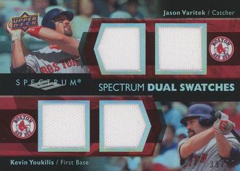
Saturday, December 26, 2020Set: 2008 Upper Deck Spectrum - Spectrum Swatches Dual (Rate) Card: #SDS-VY Jason Varitek / Kevin Youkilis “ Neat card. I like jersey cards and I always will. ” -Billy Kingsley
3
“ I love the idea but the all white swatches are a fail. ” -Blargh
3
“ Wow! Swatches from the day the Bosox wore those various fundraising uniforms. Varitek in his Polar Bear conservation theme. Youkilis in his Save the Icecaps theme. Wait--I think they have these swapped on this card. Shouldn't it be a UER?!?!
What a boring piece(s) of memorabilia. ” -kents_stuff
3
“ Seems to me, one larger piece for each guy would look better than two smaller. Unless they had used different colors, or maybe a Jersey + bat. ” -switzr1
“ Nice dual relic card. 2 players who were both pretty good for a time. ” -mkb
“ Cards like these illustrate how "old school" I am . . . I was a teenager in the 1970s when baseball cards were simply baseball cards, and NOTHING more . . .
I can't imagine getting excited about all the modern garbage they have in cards . . . game-used this and that . . . but again, it's just that the times have changed, so I am not condemning it . . .
The times may change, but I'm not . . . ” -georgecf
2
“ bawstun lejunds.... ” -parsley24
“ I'll try to stay positive here. First though I am not a fan of cutting up memorabilia and attaching it into a card. OK so pluses are the 2 players featured are on the same team. Even though each player has two swatches they are all plain white. Another drawback is UD didn't serial number this. I think relic cards and autograph cards should always be serial numbered. Maybe that is just me. ” -captkirk42
1
|
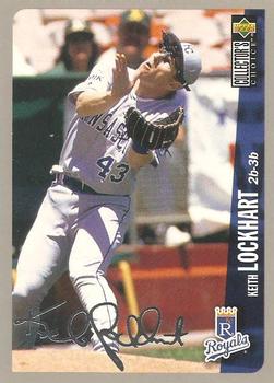
Friday, December 25, 2020Set: 1996 Collector's Choice - Silver Signature (Rate) “ Nice shot...great team. :) ” -TonyZ
“ Collector's Choice was such a solid release. A fun, low-cost release. ” -ketchupman36
3
“ If I'm not mistaken, this is back to back Royals cards featured as RCOTD. I also think another one was featured recently. What a time to be a Royals fan, though I'm sure Mr. Lockhart would have preferred a better picture for his card. ” -jupiterhill
“ Ahhh...back when parallels were sane. ” -rmpaq5
“ I don’t know why but I like this pose. Like that hat as well, didn’t see that one much. ” -mkb
“ I always like CC Silver Signature. And it's a good photo. So I like this card. ” -switzr1
“ Collector's Choice OOOOOH a Silver parallel ("Silver Signature") Don't like the sideways text. Picture reminds me of the goofy way Brooks Robinson looks on his 1971 card. The player is in a position that is not very flattering and in fact makes them look like they have some kind of physical defect. Back now the backs of the Collector's Choice cards I have always found very nice.
Note: I have already said many times these are not really the choice of the collectors nor are Bowman's Best their Best or Topps Finest their Finest. ” -captkirk42
“ I liked the 96 CC Silver (& Gold) Signature parallels...still do. But was this the beginning of the parallel explosion that I despise so much from more recent years? Red refractor parallels....blue background parallels....red refractor blue background parallels...reddish-bluish refractor bluish-reddish background parallels...geez! ” -kents_stuff
“ Something funny about all different ways his body and neck are bent. Not a bad card. ” -muskie027
|

Thursday, December 24, 2020Set: 2008 Topps Heritage (Rate) “ Great looking card from the 2016 archives set... i mean the 2008 heritage set.... i mean the 59 topps set. Either way great look. ” -parsley24
5
“ I just joined TCDB, I'm currently creating an insert card to put into a sleeve holder book . I'm finding some amazing cards I wasn't aware are valuable till I found this sight. ” -carder1956
4
“ I dont remember him playing for the Royals. ” -switzr1
“ Nice Heritage card of a very cool vintage design. OK so Football used the design before baseball but still like it. ” -captkirk42
“ I always liked the design of 1959. Mark was at least good for the Royals standard back then though... ” -mkb
“ The 2008 Heritage set is the set I credit with returning me to the hobby! It's also one of the few Heritage sets where I've tracked down all of the variations, short prints, and inserts. ” -NachosGrande
“ Just like you, Mark appears to be looking at his last name and wondering how anyone would remember how to spell it. ” -Hollywood42
2
“ I remember seeing him playing for Harrisburg. Super contact hitter ” -NJDevils
“ Another cool card from Topps Heritage. I like these more and more. ” -muskie027
|
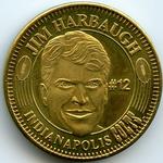
Wednesday, December 23, 2020Set: 1996 Pinnacle Mint - Coins Gold Plated (Rate) “ Not a trading card... not a trading card...not a trading card...head about to explode....not a trading card...not a....3...2...1....BOOM! ” -Dave Sosidka
21
“ I wish I had gotten more of the Pinnacle Mint sets when they were available, although at the time the only sets for sports I was collecting were the two NASCAR sets. I think I got a grand total of three packs between both sets. ” -Billy Kingsley
“ So which of the images in the checklist for this is correct? The coins only or the cards and the coins? ” -rmpaq5
2
“ Well this is interesting.
I’ve always enjoyed collecting coins like this though. ” -mkb
“ Decent token. I've thought about collecting tokens before. I probably have a few already. This RCOTD may have just prompted me to start a new hobby! ” -switzr1
“ I know this will probably get grief for being a "non-card", but I think this is awesome! ” -bkklaos
“ Me again!
As a huge Michigan fan, I gotta say Harbaugh has to go. He has shown a great strength in recruiting. But player development & game management sucks!
I went to college with him. We all knew he was a jerk, but he was "our jerk" so we liked him.
I had so much hope for him as coach. Drag.
Coin is okay.... tough to distinguish between gold & bronze coins. ” -cjjt
1
“ No thank you. I have no interest in this coin. ” -Brendan Barrick
“ It's cool, but not a card. I didn't collect in 1996, so I am sure it was some form of insert. ” -muskie027
“ I don't have any of these but they are pretty cool looking. i think I'll start a collection ” -biggiofn7
“ I've always wanted one for my collection. ” -MattyIce2014
|

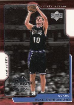
Monday, December 21, 2020Set: 1999-00 Upper Deck (Rate) “ This was the first season that Upper Deck short printed the rookie cards in their flagship NBA set, something they would continue to do until the NBA pulled the license to give an exclusive to Panini in 2009-10 season. Frustrating for those of us who wanted to complete sets. ” -Billy Kingsley
2
“ UMKAY some foil scanning pure white looking like the card is die-cut. Back is OK looking. ” -captkirk42
“ Too much going on in the design phase of the card. Give me a lot less fluff. ” -Camstone
1
“ A little noisy on the front, a little empty on the back, but I like it! ” -kents_stuff
“ Something I don't like about this. Maybe the white, maybe the lack of logo, I am not sure, but for Upper Deck, I think it isn't great. The back looks crooked. ” -muskie027
1
“ Nothing worth writing home about. Rather dull. ” -Phil
|


Saturday, December 19, 2020Set: 2004 Fleer Sweet Sigs - Autographs Copper (Rate) “ I don't like how the picture is so small. ” -muskie027
“ Reminds me of a colorblind test at the eye doctor. This time I can actually see there is something in the dots. ” -switzr1
2
“ I'm glad to see that this one has gotten scanned before it faded. My NBA example that I pulled myself has faded even with no sun or environmental exposure. ” -Billy Kingsley
“ An interesting auto. ” -Onemorepoint
“ This is an ok design. I am not a big fan of the front. A small picture of the player is above a large space for the autograph. The back is a typical back of autograph cards. ” -Brendan Barrick
“ A nice insert prize ” -kents_stuff
“ Nice looking card. A background with clouds is not something you see every day. ” -ajvlucky13
“ No much of an autograph and a bit of a goofy card, but with all that said, I'd still be thrilled if I pulled one of these while ripping open a box of these! ” -bkklaos
“ I like it, but then I'm a pro gimmick guy. Very different. I'm waiting for chunks of turf. ” -Camstone
“ I was going to praise the virtues of Upper Deck Sweet Spot autos but WHAT? Fleer? Sweet Sigs? OK I think I forgot these. I have never been a huge fan of "game used" cards of jerseys and other relics but for some reason autos from a hunk of the ball hide I don't mind too much. Usually the material used for the sig to go on is faux ball or a made for the card patch design. ” -captkirk42
“ I am trying to understand what makes this sig so sweet. Looks like he signed it while simultaneously getting a head injury. Other then that what a boring card. ” -YoRicha
|

Friday, December 18, 2020Set: 1970-71 A-1 Premium Beer Phoenix Suns Price Tabs (Rate) “ I'm not sure I would consider this a card, but it's very cool and I would collect it if I came across it. ” -Billy Kingsley
4
“ Well you can't beat that deal. ” -switzr1
4
“ Yes, Beer and sports...
” -Duke
5
“ This is a cool idea that someone should bring back. With all the "used-to-be-micro-but-getting-more-macro-everyday-brew" companies, someone could surely strike an agreement with a local team. ” -kents_stuff
“ This seems pretty interesting. Putting players on price tabs. Honestly would’ve tried picking these up. ” -mkb
“ With all the times I've fallen off the wagon, it is a surprise to me, that I've never heard of this brand. I hope this set survives the "Is this really a card, and should it be allowed" inquisition. {8o) ” -CollectingAfterDeath
1
“ Nice early 70s ephemera/memorabilia. I thought it was a matchbook at first. ” -captkirk42
“ I prefer to collect mostly standard size trading cards, but this is awesome! Fun stuff! ” -bkklaos
“ Never seen one of these before. I like it, something different. Would not want to collect these only but fun with the cards. ” -Camstone
“ Beer is Good! interesting little promo, honestly didn't know the suns have been around since 1970 ” -Thunderfoot
“ Well done. Nicely preserved. ” -cjjt
“ Looks more like a bookmark! ” -muskie027
1
|

Thursday, December 17, 2020Set: 2005 Ultra - Gold Medallion (Rate) “ Ultra's Gold Medallion parallels are my second favorite parallel concept in cardboard history (pun intended) after only the Refractors from various Topps sets. And I'm one of the few people who genuinely loves parallels. ” -Billy Kingsley
“ I have this like/dislike feeling about this card. The portrait photo on the front, and the easy on the eyes printing on the back, are good. One of the top corners being nipped off seems a bit unnecessary, and is more of an eyesore than a witty design, for this style of card. ” -CollectingAfterDeath
“ I have an appreciation for parallel sets. More of a challenge to build the parallel set than the base set. IN general, I like Topps parallels better, but the Fleer Ultra gold medallion series is a solid effort. A) gold, B) die cut [since 2000] C) clearly indicated its a parallel, for those that are card id challenged ” -abide
5
“ I dont mind this card, but the curve in the upper left hand corner is just not right. Doesn't flow. ” -parsley24
“ For some reason this has the look of a minor league card. Don't like the font used for the name. Just not fond of the card. ” -Camstone
“ I guess the gold wasn't enough to distinguish these parallels from the base, so they went die-cut too. ” -suomibear8
“ Good scan. I always liked Gold Medallion cards ” -cjjt
“ Awesome, Nick Swisher former Buckeye! He was the only reason for me to have a rooting interest in the Yankees for a couple seasons! So far I have over 100 unique cards of his. He’s a good dude in real life also; I am friends with a cousin of his ” -Brimose
“ Nice card overall, but I feel the rounded corner could have been smoothed out a bit better. The "traditional uniform font" for the name is cool at first, but after looking at a bunch of them it got old for me. ” -kents_stuff
|

")