Random Card of the Day


Thursday, May 2, 2013

Set: 1990 Upper Deck (Rate)

Card: #546 Hensley Meulens


“ I'm sure it was his career he's looking at. ” -Young Kilo

“ Well, to tell the family secret, my grandmother was Dutch. ” -UNC_Samurai

“ I thought I recognized that name. Meulens was a coach for the Indianapolis Indians from 2005 - 2008. ” -koloth42

“ Loved this design.....simple and clean. ” -suomibear8

“ "You talking to me?" ” -JasonCulley

“ Is it just the angle of the cap or is the logo askew? ” -jlaz10

“ he's like "What? I didn't do it!" ” -tonym


Wednesday, May 1, 2013

Set: 1993 Topps Traded (Rate)

Card: #118T Woody Williams


“ A most unfortunate pose for Woody. O.O ” -koloth42

“ Ah, the good ol' days of the Blue Jays... now the only thing for a Jays fan to hope for is to not end up in the cellar. ” -jlaz10

“ Bleh ” -Hollywood42

“ A Jays card to remind me how badly they're underachieving this year. ” -DanD


Tuesday, April 30, 2013

Set: 2007 Topps (Rate)

Card: #236 Boston Red Sox


“ I never understood the appeal of team cards, and considering the trouble Topps has to go through to create them without any non-contracted personnel being depicted, I would say they're not worth it. ” -Dave Sosidka

“ I am NOT a fan of dark color borders at all! ” -Billy Kingsley

“ What's with the 2 floating portraits in the background? ” -Hollywood42

“ It's really cool how they changed the scoreboard to say Red Sox 2006. However, this was in the 2007 set. ” -jlaz10

“ i like the old school team pics better, plus don't like the look of this card. ” -tonym


Sunday, April 28, 2013

Set: 2012 Topps - Prolific Playmakers (Rate)

Card: #PP-CB Cedric Benson


“ Because when you say prolific, I think of Cedric Benson ” -Hollywood42

“ I personally like this design for an insert set. Has the look of a regular set. Benson's card is particularly nice with the nice action pose. Two thumbs up since I don't have 3 thumbs. :-D ” -koloth42

“ It angers me how valuable card space is wasted for design instead of picture. ” -jlaz10

“ I like the overall design on this one. I suspect the bottom colors change with each team, which I view as a plus. ” -Billy Kingsley

“ It looks like I'm driving and I'm about to run him over... ” -Dixxy
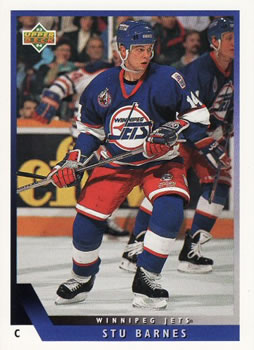

Saturday, April 27, 2013

Set: 2008 Upper Deck X (Rate)

Card: #3 Brandon Webb


“ whats with all the Xs ” -Colts12

“ Not a very good seller for UD. I did build the 09 X set though ” -Hollywood42

“ Just looks odd with the background pasted in. Sort of looks like Brandon is sitting on the lower part of the X. No thanks. ” -koloth42

“ Upper Deck should have Xed out this whole set. Garbage. ” -NJDevils


Friday, April 26, 2013

Set: 1993-94 Upper Deck (Rate)

Card: #94 Stu Barnes


“ I think Upper Deck made a beautiful set for 1993-94. This card features one of my favorite players Stu Barnes. The write up on the back of the card highlights his Junior career with Tri-City Americans of which he and former NHL Goaltender Olaf Kolzig are now the owners. Oh and that Jets uniform on this card was outstanding. ” -Gunny

“ Hard worker,one of the most underrated players.always out there making plays happen.I liked this UD set clean & simple . ” -uncaian

“ Nothing to complain about here. Large, clear image, not much "noise" coming from logo and player name. Nice. ” -wamk

“ The old Jets scheme of navy and red looks a lot better than the new Jets, who use navy, royal blue, and columbia blue. ” -jlaz10

“ The card has a clean look , and a simple design. I like it. ” -deporcoruña

“ STU!!! Wait, I don't know him... ” -Hollywood42

“ Jets are back *back.* Back again *gain* The 'peg is back *back* tell a friend *friend* ” -Dixxy
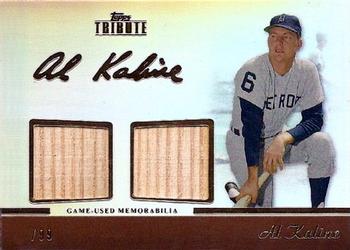

Thursday, April 25, 2013

Set: 2011 Topps Tribute - Dual Relics (Rate)

Card: #TDR-AK Al Kaline


“ Interesting card design, but the scan is hurt by the serial number being digitally removed for some unknown reason. Also, it appears the two pieces of wood are from the same source, so I'm wondering why they have two holes for them instead of one big one. ” -Billy Kingsley

“ I love the memorabilia cards, it's nice to own a piece of sports history no matter how small. ” -PDIZZLE

“ It's easy to forget that the Tigers wore numbers on their sleeves long before the Phillies made it normal. ” -jlaz10

“ LOVE these relic cards, giving the fan an shot to touch something once used by their heroes. Not overly fond of the design on this particular card, however. Maybe something else besides an expanse of white background behind the pieces of his bat.. ” -wamk

“ Not sure if I like the foil signature, but other than that it's a nice looking card ” -Hollywood42


Wednesday, April 24, 2013

Set: 1994 SP (Rate)

Card: #103 Chris Bosio


“ Is this payback for the Chris Bosio reference last month? ” -UNC_Samurai

“ Even though the Mariners have used the same logos and uniforms since 1993, it still is a good look. ” -jlaz10

“ ain't nuttin like holding in a wad of chew before throwing some heat! ” -tonym

“ Ehhh ” -Hollywood42

“ One of those guys that it seemed like I got in every pack, never really knew who he was, never actually saw him perform, but whenever I see his cards, he's always got chipmunk cheeks...smuggling pine tar eh? ” -SaveDaKid

“ Never knew Nintendo's Mario pitched for the Mariners ” -Young Kilo


Tuesday, April 23, 2013

Set: 1994 Topps (Rate)

Card: #530 Brett Favre


“ It looks like gold foil for his name...did all the football cards get foil treatment or is this a gold paralell posted in the wrong place? The design theme they used that year was not a particular favorite of mine, it was also the first time all Topps cards had a UV coating, at least in basketball. ” -Billy Kingsley

“ His face looks like Cornelius from Planet Of the Apes. ” -deporcoruña

“ Simple, elegant design. Large image, nice action shot. My only gripe is that the gold foil makes the name a little hard to see. ” -wamk

“ The packers white uniforms have always seemed too gold-heavy to me (gold helmet, gold pants). I think they should at least get green pants for the road. ” -jlaz10

“ Liked him better in a Vikings jersey. Still one of the all-time greats ” -Hollywood42

“ It's a football shape. How creative. I think it'd be awesome if topps screwed up and put a puck shape on this card instead. Or a golf ball... Also, who honestly can read hand writing nowadays anyways!? ” -Dixxy


Monday, April 22, 2013

Set: 1993 Upper Deck (Rate)

Card: #75 Eagles Checklist


“ I miss the days when they did checklists...I may be the only person ever who had a checklist as my #1 most wanted card (From 1997-2005 when I finally got it) I've stated before that my interest in the hobby started to wane in 2003-04...I realized later that's also when they stopped doing real checklists (roughly) While it's not due to the lack of checklists, the lack of checklists is a symptom of the overall whole that drove me away for a few years. When I was young I thought these team checklists were kind of pointless, but now that they are gone I miss them. ” -Billy Kingsley

“ Why is it all blurry? ” -Young Kilo

“ Not really a fan of this impressionistic type cards. ” -koloth42

“ I never understood this. UD put general checklists in the sets; why burn another 28 slots on a subset that has a duplicate function? ” -UNC_Samurai

“ The yellow flash leads me to believe that the photographer's camera can detect a methane release. ” -NJDevils

“ Upper Deck thought process: I wonder if we make the background blurry, will it make the card better? ” -jlaz10

“ I get making the background blurry to make the player stand out, but why do it to his lower body? ” -wamk

“ Is this a checklist? Someone wanna submit an image of the back, you know, THE ACTUAL CHECKLIST PART!!!!? ;) ” -DanD

Page:


Copyright © 2024 Trading Card Database LLC
Designated trademarks and brands are the property of their respective owners.