Random Card of the Day
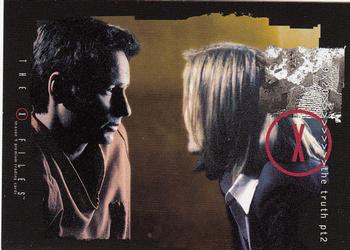


Monday, March 11, 2013

Set: 2003 Inkworks X-Files Season 9 (Rate)

Card: #63 (Credits) 9x20


“ Good to see a non-sports card chosen as Card of the Day, even though it's from a property I have no interest in. Non-sports cards date back to the 1870s and cover pretty much any possible topic. TV shows have been a favorite topic for the past 30 years or so. ” -Billy Kingsley

“ Yikes! I have no problem with entertainment cards. I use to collect them myself and have full sets of Star Wars and thinks like Raiders of the Lost Ark. My beef with this is that it is a lousy image for a card. ” -koloth42

“ So... ” -jlaz10

“ LOVE this design ” -thechestnut
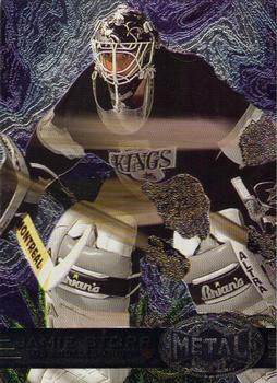

Sunday, March 10, 2013

Set: 1994 Pinnacle (Rate)

Card: #74 Joe Girardi


“ Another player that took steriods and that still didn't help his play. So it is fitting that he is the manager for the "Evil Empire". ” -carthage44

“ The '94 set was Pinnacle's best. Upper Deck should have taken a couple of notes from this. ” -jlaz10

“ Borderless cards never really appealed to me. They are WAY too easy to tear up. ” -SFC Temple


Saturday, March 9, 2013

Set: 1996-97 Metal Universe (Rate)

Card: #192 Jamie Storr


“ This reminds me of the Matrix, specifically Neo, when he takes the pill, touches the mirror and is engulfed by it. ” -SaveDaKid

“ Goalies always have such cool helmets. ” -carthage44

“ Looks like a topographic map behind him and meteors flying through him.. I don't think I like it.. ” -Mike67

“ this cards were shiny and nice new,but a few of mine look like they are disintegrating ” -uncaian

“ I always liked the Metal cards. This design doesn't really work much for me, but if it's anything like the basketball set that looks like it from 1997-98, pretty much every card in the set was different. This would would have been better without the asteroids? boulders? burned pancakes? flying past him leaving a trail. ” -Billy Kingsley

“ I'm drowning in a sea of confusion ” -Hollywood42

“ A goalie full of holes? Probably not what he'd like to portray. I was always a sucker for the Metal cards. ” -SFC Temple

“ It's hard to tell that there is a player on here. Bad. Bad. Bad. ” -sascards67

“ Another irrelevant card in the grand scheme of things....metal is better with Iron Maiden, Judas Priest, and Deep Purple...long live heavy metal! ” -flcardtrader

“ His mask sorta blends in there, no? ” -jlaz10
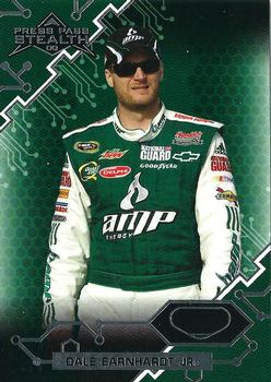

Friday, March 8, 2013

Set: 1990-91 SkyBox (Rate)

Card: #19 Kevin McHale


“ BRING BACK THE SHORTS!!! ” -carthage44

“ What were they thinking with this design? ” -Young Kilo

“ McHale was nearing the end of his playing days here, en route to having his #32 retired by the Celtics...one of many numbers hanging in the rafters in Boston. When 1990-91 Skybox came out, it was unique in that it used computer generated designs for the background, the first set (at least for basketball) to not even make any attempts at using a real action photo- not counting the staged photos Topps favored into the late 1970s- but digitally removing the background came to be the norm in the 2000s, building up through the 90s. I personally don't care much for cards that have been digitally altered like this...not that it stops me from collecting them, though. ” -Billy Kingsley

“ Yikes! That is a very ugly card. Good thing I'm not into Basketball cards. I might have quit over this design. ” -koloth42

“ All I can think about is Tron. ” -DanD

“ Great player, not so great of a card ” -Hollywood42

“ Ugh, Skybox. Hated how they made every ball look like a comet! ” -wamk

“ Comment banned for content! ” -SFC Temple

“ So, so, wrong. ” -sascards67


Thursday, March 7, 2013

Set: 1984 Topps (Rate)

Card: #143 Andre Tippett


“ Early and mid 80's Topps football nailed it! Great cards. ” -carthage44

“ He looks hung over ” -Young Kilo

“ There was really no need to have this card tipped. It reminds me of the 1960s Batman TV show's odd camera angles. ” -Billy Kingsley

“ Topps really had no sense of graphic design in the 80s, although this layout isn't nearly as frustrating as the black cards with giant white lettering they resorted to the following year. ” -UNC_Samurai

“ It's okay to have one thing on an angle, but not everything. ” -jlaz10

“ 1984 printing wasn't the clearest, but I remember it being a lot better than this! ” -Hollywood42

“ 84 Topps were the first cards I remember buying at the corner store. I can't tell you how many Elway, Marino, etc rookies got used and abused as only kids can! Man those were the days. Beautiful set. ” -SFC Temple

“ Wow. Incredibly bad scan. ” -sascards67


Wednesday, March 6, 2013

Set: 2009 Press Pass Stealth - Retail (Rate)

Card: #9 Dale Earnhardt Jr.


“ My all time favorite driver (tied with Ernie Irvan) Considering how many NASCAR cards I've posted since I joined, I think it's only a matter of time before one of mine is the random Card of the Day...I hope! Let's keep the hate comments to ourselves, please. ” -Billy Kingsley

“ The racing cards are the only ones where the sharp graphics and designs truly fit. I dont collect these but they are appropriate to the sport. ” -NJDevils

“ Seems kind of busy to me. ” -koloth42

“ 2nd Place at Daytona! Not too shabby. ” -jlaz10

“ I've never understood the "excitement" behind NASCAR ” -Hollywood42
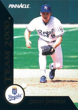
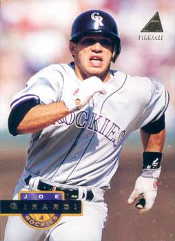

Tuesday, March 5, 2013

Set: 1992 Pinnacle - Team 2000 (Rate)

Card: #45 Gregg Jefferies


“ If you were involved with baseball cards in the late 1980's, especially in the New York metro area like I was, no name resonates like that of Gregg Jefferies'. It was like the sound of cash registers. Of course, all of his cards are in the dime bins at card shows now, but back in the day, your success as a dealer was predicated on how many Jefferies rookies you had in your showcase. ” -Dave Sosidka

“ As a kid, I thought this set was so cool. ” -suomibear8

“ Gregg's last Major League game was in May 2000, so I guess he qualified for this set. ” -duaned99

“ If their goal was to make it look like a Rubik's cube, they succeeded. ” -NJDevils

“ I've never liked Pinnacle. They try hard to make good cards but always fail. ” -jlaz10

“ Remember back to the last 80's when Jefferies was the next Babe Ruth? No? Me neither. ” -cynicalbuddha

“ Was the 2000 meaning these players would reach 2000 hits or was it just to sound futuristic? ” -DanD


Monday, March 4, 2013

Set: 1995 Topps (Rate)

Card: #589 Pedro Astacio


“ Since I have nothing to add about the card, a historical fact: In the 1300s, there was a "War of the Pedros" when three kings, all named Pedro, got their kingdoms into a war with each other. This was before Spain unified and each area was it's own seperate kingdom. It's such an obscure war it isn't even on Wikipedia, I read about it in a book I found called "Encyclopedia of War". ” -Billy Kingsley

“ Ugly design! ” -suomibear8

“ Even Topps went through a dry spell when it comes to good designs. ” -jlaz10

“ This reminds me of the mini-sets that Topps issued in the 80's. The irregular border. I guess I don't know "art" when I see it but I prefer linear borders. ” -NJDevils

“ I actually kinda like this Topps design ” -Hollywood42

“ BLAH ” -SFC Temple


Sunday, March 3, 2013

Set: 1995 Score (Rate)

Card: #290 Joe Hall


“ Horrible design. Horrible player. Horrible card. ” -Young Kilo

“ A career .319 hitter... in 52 plate appearances. ” -carthage44

“ I'm not very familiar with Score as a brand, but from what I've seen posted as Card of the Day here, and from clicking on random cards in the "Recently added" tab at the bottom of the page, I can say that I don't think they had the best designs. That holds true here. ” -Billy Kingsley

“ I applaud Score for letting the children design their 95 release. The only thing worse was their cards that were half covered with the team name...96? ” -SFC Temple

“ Does it matter that he's a rookie? At least make the name prominent. ” -jlaz10

“ The card layout is different. A lot of wasted space though, but at least you get a clear photo of the player. ” -yokonashiwa


Saturday, March 2, 2013

Set: 2001 Upper Deck (Rate)

Card: #239 Bruce Chen


“ He sucked than. He sucks now ” -Young Kilo

“ Still playing and still dominating my White Sox. ” -carthage44

“ Mediocre. Gold foil nearly impossible to read. ” -SFC Temple

“ Another example that being left-handed can get you a very long MLB career even of there are probably many better right-handed pitchers out there. ” -sascards67

“ The placement of the logo in this design reminds me of the 2009 UD set. ” -jlaz10

Page:


Copyright © 2024 Trading Card Database LLC
Designated trademarks and brands are the property of their respective owners.