
Random Card of the Day |
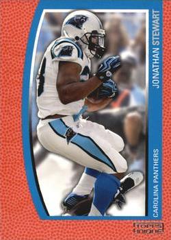
Saturday, January 13, 2018Year: 2009 Set: Topps Unique - Red (Rate) “ I have to give it that- the front is indeed unique. Border looks like a basketball, which this design/set was never used for. I'm not super familiar with football so maybe it has a similar texture? Either way, I like the front! Back is kind of generic, but it has a serial number, so it can't be all bad! Actually, the back reminds me some of the 2007-08 Trademark Moves set for the NBA. ” -Billy Kingsley
“ If this card were grievously miscut, it might look centered. ” -revnorb
“ It's unique in that there I a lot of imitation football, but very small picture. Seems like a waste ” -muskie027
“ Hmm Topps Ovation huh? The background looks more like a basketball skin than a football pigskin. Back looks like an Upper Deck or Panini back. What was Topps doing in 2009? ” -captkirk42
“ I won't criticize the conceptual design as it is unique. The set is made up of SNs. BUT, this just doesn't appeal to me. ” -Sportzcommish
“ Too much border on the front--not a fan of that. Back is decent. ” -KMack
“ Woah. Another design that worked OK with baseball but not with another sport. Too much orange on orange! ” -olerud363
“ Nothing Unique here. ” -carthage44
“ Pretty neat card. Simple yet bold. i dont like how the break out of stats saying here is what he did vs NFC teams and AFC teams. Kind of weird. ” -parsley24
“ A little too much football on the front. Otherwise alright. The fact that there is "Red" in the title makes me think this set is a parallel nightmare. ” -cnangle
“ Mmmm... nope. Bunch of wasted space over there. ” -marcbrubaker
“ It sure is unique... ” -IfbBirdsCards
“ Never heard of this set. Nice looking card. I like it. ” -switzr1
“ "Unique" with 20 parallel sets. Actually, think this is an ok set. ” -cjjt
“ i liked this set design, but i hate when certain cards of a set dont match the rest ” -Thunderfoot
|

")