
Random Card of the Day |
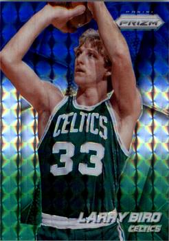
Wednesday, January 17, 2018Year: 2014-15 Set: Panini Prizm - Prizms Blue and Green Mosaic (Rate) “ Nice to have a run of NBA lately. The greenness of this parallel works great for the Celtics. This card is part of a problem I have with Panini though. They give the NBA very short sets, and ignore active players to cram in dozens or even a hundred retired players. This set was 300 cards long, but 100 of them are players who were retired. And it's the same players all the time, too. I love the history of the game, but not at the expense of the present. Create a Legends only set and do it right, use the Prizm technology for an insert or parallel or something, but don't cut out the players actually playing to make room for guys who retired 20 years ago. I actually have more cards of Larry Bird and Magic Johnson from the last few years of Elton Brand's career than I do of Elton, because Panini couldn't be bothered to include him. ” -Billy Kingsley
“ Bird is the word! ” -olerud363
“ If I collected Bird I'd get this. The picture is much like his shot, spot on. ” -Sportzcommish
“ Larry Joe Bird. I think a bit too gaudy of a card for such a no-nonsense, grit 'n guts competitor. Nonetheless, a card I'd like to own. Celtic Pride! ” -mkaz80
“ I like the throwback to Bird, but hate the card. Another of the infinite parallels by Panini. Useless junk. ” -cjjt
“ Nice photo! Not nice enough to use twice, but since they didn't print many stats on the back there was a lot of space to fill. ” -dilemma19
“ Beautiful. Larry the Legend. ” -parsley24
“ The Great White Hope. ” -carthage44
“ ACK Prizm. I'd rather have a regular Chrome card. OK getting over the fact that it is overly shinny Prizm the front is bare bones OK. Logo is not overly large, player name is good slightly larger than team name. Positioning or color of name could be better in this case a little difficult to read white "Larry" over Larry's white waistband on his uniform shorts. Back. actually looks a bit better than the front a bit crowded and many will complain it uses the same picture, but it is clearer on the back. Still typical Panini back with only one year of stats. ” -captkirk42
“ Pretty boring looking card. No imagination. No team Logo ” -NJDevils
“ There's a million reasons I'm not supposed to like this card (one of a million parallels, same photo front and back, crazy graphics instead of natural background elements, very small stat line, cheesy bio, doesn't even list his college...) I just can't hate this card. The classic pose of one of the greatest makes this a must have for me. ” -Brimose
“ Since it is a weird Mosaic insert, it accomplishes what it set out to do I guess. A tad bland, but Bird makes it cool. It's ok. ” -muskie027
“ I suddenly want to eat a whole wedding cake. Great card. I love the Prizm sets. And Larry still has some official title with the Pacers, though he doesn't seem to attend games anymore. We could have used him tonight! ” -switzr1
“ panini has this special talent to ruin any card ever, not even larry bird can help this ” -Bargunmaster
|
Additional Comments
| Posted By | Message | ||||
|
Joined: Jul 2017 |
| ||||


")