Saturday, April 7, 2018
Year: 1992
Set: Star Pics (Rate)
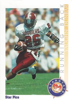
Card: #65 Vaughn Dunbar
“ Fix this card - Make it so we can SEE the name, and put it in the same orientation as the photo. Same for the position. Team or school? Sure would like to see that specified on either side. The back, there's no fixing. ” -vrooomed
“ Bar graphs on cards was never a good idea. ” -ketchupman36
“ Changed the grass to ice and added skates and a stick. =) ” -ranfordfan
“ I would have removed the whole anthony thompson comparison ” -Bargunmaster
“ Almost everything about this card could be improved! The picture is the best part of the whole card. Since Star Pics had a "structure" to their set design, I wouldn't change the bottom of the front. I would move the name and position to the top of the card and make them horizontal - Vaughn Dunbar RB. Then I'd expand the picture across the card to include his left foot. On the back, I'd change everything above the Star Pics logo! I like the StarStat beside the logo though. The rest needs real substance: that means stats and bio info. The words and graph are pointless for this card. ” -spazmatastic
“ Love to see the name on the bottom and probably less striping space on the left side. The picture could be much larger. ” -muskie027
“ Where do I start? 1. No vertical text 2. Less dead space 3. Fix the crooked logo ” -IfbBirdsCards
“ I wouldn't change a thing. For not being a major release card that doesn't have major marketing or licences, it's a nice college football card. ” -carthage44
“ Would have preferred the front border a color and not white. Also would have tried to have the photo a complete shot. i.e no limbs missing! ” -PapaG321
“ Where do I start? 1. No vertical text 2. Less dead space 3. Fix the crooked logo ” -IfbBirdsCards
“ I would swap the positions of the faint, hard to read player's name and the black, easy to read 'Star Pics' at the bottom of the card. ” -Doe MG
“ I remember this guy from when he went to high school at Snider High in Fort Wayne, Indiana! This is a decent looking card, but I am never a fan of having the name and info vertically like that. ” -cckeith
“ The guy's name should be more prominent than the position. The position should be on the back somewhere, not taking up so much of the front. ” -Billy Kingsley
“ Really cool college football card. It's a subset card, not his base card, comparing his stats to those of the greatest Hoosier running back, Anthony Thompson. So complete stats aren't needed. His base card has those. Maybe a picture of Thompson would have been an improvement ” -switzr1
“ always hated cards that cut off body parts. shorten the right side . put name at bottom or top and relocate the Star Pics opposite of name ” -tonym
“ not a fan of draft pick style cards, but this has a nice design ” -Thunderfoot
“ OK is this an all drafts set? Were any of these guys in the NFL? No vertical lettering. Player name would be horizontal and LARGER than the player position. Set name Star Pics I'd make look more like a logo than a name or position. I'd have the team name on front at least the college name or team nickname. Perhaps a team logo I'd do away with that "Star Stats '92" logo. I would put " '92 Star Stats" at the very top. I'd give the border colors matching the team colors. Onto the back: Card Number should be LARGE enough to read. I'd make it less of a colorful advertising flyer look. Raw cardboard. I'd do away with the bar graph and put that info in a regular text/spreadsheet type grid if at all then I'd put the brief description they have and the star stat thing I'd make a little bigger and maybe higher on the card. The Star Pics address I'd put on single line at bottom with copyright year info. ” -captkirk42
“ First, get his whole body in the shot instead of cutting of his leg. Second, improve the color where the name is. Either this card has been sitting on the dash of a '92 mustang for the last 16 years, or its color is not very contrasty. Third, change the brand name to Score. The back is not too bad, so keep that. And Lastly, get that hoosier of the card and put a real football player on it. ” -parsley24
“ Nice. Basic. No frills. Logos. Oh, how I wish there could be sets with college players in their college unis in a set like this. ” -beansballcardblog


