
Random Card of the Day |
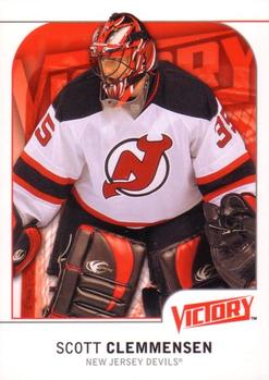
Monday, July 9, 2018Year: 2009-10 Set: Upper Deck Victory (Rate) “ Extremely boring front. Way too much white border. The Victory logo is huge, it should have been a team logo there and Victory or Upper Deck logo smaller in one of the massive amounts of white. I hate when pictures are so cropped that it cuts off legs, arms. The front is awful. The back on the other hand is not bad, besides being too much white. I would give the front a 3 and the back a 6. ” -davidhandberry
“ Kind of a lackluster design, but I can't complain about a semi-local NHL team showing up as card of the day! ” -Billy Kingsley
“ Needs more blank white space. Otherwise, pretty good! ” -mkaz80
“ Pretty nice Hockey card Team logo would be nice, Victory set name needs to be smaller. Otherwise pretty nice design. I usually like these Victory cards this one looks plain for some reason. Maybe it is just the team? ” -captkirk42
“ How bad were all the other photos that this was the one that was chosen? ” -wjhipwell
“ Backup goalies (and quarterbacks) rock! Always the best player on the roster when things are not going well for the team, and arguably the most valuable non-starter when things are going well. ” -kents_stuff
“ A very boring card. I do like the red background to match the team color though. ” -muskie027
|
Additional Comments
| Posted By | Message | ||||
|
Joined: Mar 2018 |
| ||||
|
Posts: 100 Joined: May 2018 |
| ||||
|
Joined: Oct 2014 |
| ||||


")