Friday, August 3, 2018
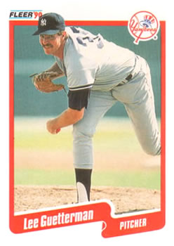
Year: 1990
Set: Fleer (Rate)
Card: #443 Lee Guetterman
“ 90 Fleer is one of those I don't understand why I love it so much. It has a gigantic white border that I usually hate. It cuts off body parts in the photo. For some reason though it is one of my favorite sets. I even have the Canadian version. ” -davidhandberry
“ I really wish I could write something good about this card, but back in the day I really hated this set. There is something to be said for its simplicity, but in general, it is just bland. The back is decent for its time. The "3-D" effect was a bit revolutionary for its time as Topps copied the concept the next year. ” -tbshaw
“ Nice "back to basics" design. It speaks to me. ” -kents_stuff
“ What has always bothered me about this design is how the head of the player is on top of the border while the rest of the body is behind. Makes it look like they are playing through a doorway. ” -rmpaq5
“ This maybe super overproduced but I love this set. I might have told this story before, but back around maybe 1991 or 92 at one of the few local cards shows I have ever been to, one of the dealers had "mystery" bags loaded with random cards. The bags were just brown paper lunch bags. There were two or three "sizes" by the card count in the bags (the bag sizes were the same) and ranged from like a buck to $5 I think. I'm also pretty sure there were football and baseball bags. I think I got two of each of the medium or large bags. Anyway there were many 1990 Fleer cards in these bags and often in at least duplicates, possibly triplicates or more sometimes. I recall getting a ton of Cubs. ” -captkirk42
“ Go Yankees!!! ” -jayoneill
“ Classic mid 80s early 90s pitcher. good looking fleer set. ” -parsley24
“ Somewhat boring, but there is something I’ve always really liked about this set. They have a nice look. ” -muskie027
“ Serious dead era card. ” -cjjt
“ nice, clean design ” -Bargunmaster


")