
Random Card of the Day |
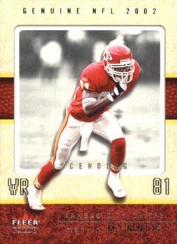
Wednesday, January 30, 2019Year: 2002 Set: Fleer Genuine - Reflection Ascending (Rate) “ I like it because it's a numbered parallel. Set design is rather forgettable- it was used in the NBA as well. ” -Billy Kingsley
“ Snoop a Loop ” -Alomar_Collector
“ Mixed feelings. I'm not a big fan of american football and card (or scan) is not very attractive. But nice numbered. Although I prefer SN to be in front. ” -Duke
“ It's..."Genuine NFL 2002". As opposed to? The ill-themed "Inauthentic NFL 2001" version that didn't go over well with collectors the year before. On a more serious note: I think its tight to have the player colored, back ground black, but picture overlapping the bottom border. Makes it look like Ol' Marvin is coming at ya! ” -Sonofearl
“ What a great name! The card ain’t bad either. ” -IfbBirdsCards
“ I like this design. I don't recall seeing it before. OK cons on front player's name should be 10 times easier to read than the brand/set name, had to enlarge picture to even read team name, and then player's name, still couldn't read first name but sort of can read last name. UGH foil lettering is my nemesis (more so as I get older). Back a little better. Seems to be a rookie with just one year of pro experience. Wouldn't mind having his college stats since he is a rookie. ” -captkirk42
“ Too much border on the bottom of the front and it could be the scan but I find the lettering difficult to read. Overall I would say the front is average. Similar with the back with 20% of what I consider bordering. A very average card. ” -BSwagger
“ The font of the W of WR hurts my eyes. ” -vanstryland
|

")