| Posted By | Message |
|
forester7
Posts: 131
Joined: Jan 2018
|
| Friday, January 10, 2020 6:38 PM | |
As I look through some gypsy queen cards, I can't help to notice the difference between the photos of active players versus retired ones. The old pictures often have interesting poses and/or interesting backgrounds (such as bystanders, ads, trees, buildings, fields, etc). It doesn't seem to matter what card set one looks at either. I find modern card photos very boring with littel variety (batting, fielding, running close-ups). To add to the drab... backgrounds are usually blurred out now giving photos a fake look. I would expect better shots this day and age. And them to see what companies are charging for today's cards, and for me it makes it hard to want to go buy them.
|
|
|
|
|

dgourlay
Posts: 84
Joined: Dec 2013
|
| Friday, January 10, 2020 7:47 PM | |
Very much agree - that is why Stadium Club generally stands out each year and of course, SP in the staple S1/S2/Update are usually really cool photos, but it's always cool to find a photo that is horizontal as opposed to vertical. I just hope Topps starts switching it up !
d
-------------------------------
David Gourlay - Kanata, Ontario PC ; Gary Carter (Expos only), Roberto Clemente, Brady Singer, Mike Yastrezmski, Corbin Carroll Currently collecting ; 2015-21 Topps Archives, Brady Singer, the Yaz(s) |
|
|
|
|

Sportzcommish
Posts: 6,012
Joined: Oct 2016
|
| Friday, January 10, 2020 8:22 PM | |
When it comes to action shots, modern technology is clearly better. As for backgrounds being blurred, that is more than likely simply depth of field as taken by the photographer. Posed pictures can be seen on sets like Topps Heritage.
Boring cards to me are from football sets that have players in training camp shorts, or from the NFL Combine, or vintage baseball cards like from the '73 Topps set that are action pictures but it's difficult to distringuish which player the card's for.
-------------------------------
Follow my blog - I Identify as a Card Collector. “Aslan didn't tell Pole what would happen. He only told her what to do. That fellow will be the death of us once he's up, I shouldn't wonder. But that doesn't let us off following the signs.” - Puddleglum in The Silver Chair by C. S. Lewis |
|
|
|
|

Jgamble
Posts: 219
Joined: Oct 2017
|
| Monday, January 13, 2020 8:52 PM | |
Some of the filtering on the stuff like GQ is obnoxious. It was really apparent on 2016 Topps. Since they aren't capturing clever poses or fun shots anymore, they have to hook my eyeballs some other way I guess.
I'm old and fussy, maybe.
-------------------------------
Cards come from a smoke/pet/Subway-bread/patchouli free home. |
|
|
|
|

shuedini
Posts: 68
Joined: Oct 2019
|
| Tuesday, January 14, 2020 1:14 PM | |
While I do agree that card photos are quite boring, I'd rather have a boring photo as opposed to something like these 2019 Leaf cards:
SUPER BORING LEAF
-------------------------------
|
|
|
|
|

Billy Kingsley
Posts: 7,512
Joined: Aug 2011
|
|
|
|
|

Firemedic1242
Posts: 34
Joined: Sep 2019
|
| Tuesday, January 14, 2020 1:57 PM | |
What about Panini branded cards, generic colors and logos removed because of licensing deals. I don't particularly care to collect those sets. I agree to that topps takes a safe approach in their design and presentation. Not like the Upper Deck cards of the early 2000s or the 90s.
-------------------------------
Looking to trade for Chipper Jones and Atlanta Braves (topps base) team sets 1990-2020 -Mike (Firemedic1242) |
|
|
|
|
Shadowmangmr
Posts: 127
Joined: Sep 2013
|
| Tuesday, January 14, 2020 2:05 PM | |
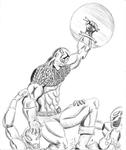
Those are some awesome pics, Billy. I have to agree with the OP, though, that modern cards are more boring than older cards as far as non-sport is concerned. A lot of the current cards use recycled art, whereas older cards would often be hand painted and original artwork. I'm speaking specifically about super hero cards, I guess, since that's what I collect.
This is one of the most egregious examples- three different years, three different sets, and the same picture:
https://www.tcdb.com/ViewCard.cfm/sid/136676/cid/9060227/2015-Upper-Deck-Marvel-Dossier---Foil-42-Psylocke
https://www.tcdb.com/ViewCard.cfm/sid/76921/cid/5517321/2012-Upper-Deck-Marvel-Beginnings-S3-472-Psylocke
https://www.tcdb.com/ViewCard.cfm/sid/75012/cid/5841608/2009-Rittenhouse-X-Men-Archives-51-Psylocke
|
|
|
|
|
jarosa04
Posts: 68
Joined: Oct 2019
|
| Tuesday, January 14, 2020 3:24 PM | |
The unlicensed stuff is pretty meh (Panini/Donruss/Leaf/etc.), and there is entirely way too much stuff put out by Topps. But I think their flagship stuff (Topps S1/S2, Update) is great and far exceeds anything else. And as someone mentioned already, the SP's in those have some excellent pictures.
|
|
|
|
|
Billy Kingsley
Posts: 7,512
Joined: Aug 2011
|
| Tuesday, January 14, 2020 3:59 PM | |
That is pretty bad. I'm not too fond of modern Non-Sports, because it seems like it's all TV and Movies. The creativity and variety has been lost. I watch maybe 2 movies a year, 3 or 4 depending on how many are in the Marvel Cinematic Universe schedule. Most of the TV shows getting cards are on channels I don't even get! I wish it was still like the early 1990s.
-------------------------------
VERY slow trading due to health problems. Not transferrable so safe to trade with, just moving is painful and can't always access the cards. Cardboard History My COMC New Collection Website: Cardboard History Gallery (Still under construction) Tips on how to make your scans look like the card does in hand (No more washed out, fuzzy scans!): |
|
|
|


")