| Posted By | Message |
|
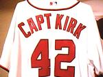
captkirk42
Posts: 2,268
Joined: May 2011
|
| Monday, October 30, 2017 12:03 PM | |
I was fooled and thought this was a new thread, but I had commented on it in Aug. I forgot they had previewed the 2018 design so early. As I said then I don't like this previewing things 6 months or more before they come out. By the time they do come out I've seen the thing so much it isn't even "NEW" to me anymore.
Other than the similarities to the last few years it seems that Topps has been catering to digital desin looks. I think someone mentioned it in some other thread for when '17 was being previewed about the "digital" look/design. It seems that they concentrate so much on making the digital version look so crisp and clean that it doesn't translate to when they actually make the cards.
-------------------------------
I collect: Baseball, Football, Hockey, Mostly Vintage pre1980, My Homie teams - Washington/Baltimore Teams Senators (Twins, Rangers), Expos/Nationals, Redskins, Capitals, Bullets/Wizards - HOFers - Non-sport (mostly TV shows and movies). My Trade List is very much a work in progress CaptKirk42s Trading Card Blog Curly W Cards Strive For '65 YouTube klandersen42 |
|
|
|
|
switzr1
Posts: 6,332
Joined: Dec 2013
|
| Monday, October 30, 2017 7:43 PM | |
I like it better than 2017. But it doesn't separate itself. They should make the consecutive years' designs look very different from each other. No set in the 70s looks even remotely like the year before. I would be all in on a base set with a colored border, but then you lose the player collectors who try to build their guy's rainbow. I realize I'm not their target demographic, but I feel like I should be. Its better than their final 3 football sets, or A&G, or some of those early 2010s Bowmans, but still too much like the last couple, and in ten years I doubt I'll have instant recall if you show me any card from this decade and ask what year it is.
-------------------------------
I'm going to reevaluate how I collect after the new year. It's just getting way too expensive for the new stuff. Sometimes I just want to buy a pack, not a whole box or even blaster. |
|
|
|
|

Vvvergeer
Posts: 2,058
Joined: Jan 2014
|
| Monday, October 30, 2017 7:49 PM | |
That's a good point. It might just be the differences in how I've collected various sets, but I can look at any of the Topps sets from 1951 to about 1998 and identify what year it is in a second. And I don't even have one of those kinds of minds. But in the 2000s, they just don't register. And 2016-2018 will be a blur in about two years.
Of course, everything might be a blur to me by then.
v3
|
|
|
|
|
switzr1
Posts: 6,332
Joined: Dec 2013
|
| Monday, October 30, 2017 7:57 PM | |
That's about my range too V3. Actually I could get 2000 too, because it says the year on the front. But I'm clueless after that. And what if they did 62 and 87 back to back? Or 63 and 83? Or 74 and 80? I don't think it would be quite as easy, and those sets would lose some impact.
That being said, I do like 2018 design when not comparing it to 2017.
-------------------------------
I'm going to reevaluate how I collect after the new year. It's just getting way too expensive for the new stuff. Sometimes I just want to buy a pack, not a whole box or even blaster. |
|
|
|
|

parsley24
Posts: 618
Joined: Oct 2017
|
| Monday, October 30, 2017 8:07 PM | |
please for the love of god, just put the card number in the back in the top left hand corner. Most people are right handed and that is how i sort to look at card numbers when flipping them over. I dont want to have to turn to the side, upside down and reading by standing on my head.
-------------------------------
This message sent from and old rotary dial up phone |
|
|
|
|

AnalogKid
Posts: 1,421
Joined: Sep 2016
|
| Monday, January 1, 2018 1:00 PM | |
I thought it was just me. Also the font is italic making it even harder to read.
-------------------------------
|
|
|
|
|

IfbBirdsCards
Posts: 836
Joined: Aug 2017
|
| Monday, January 1, 2018 1:15 PM | |
I like the design, but this is the third straight year with Topps going borderless, and the designs are becoming similar. I feel like Topps should change it up. I definitely think it’s a lot better than 2017, and let’s hope that all stats will be included again, and not “recent performance.”
-------------------------------
#2 Bowie Baysox, #12 Trey Mancini, & #3 Austin Wynns collector on the site. Also expanding my hockey, MMA, and Hofstra alumni collection. Collecting cards since 2011 (Age 8). -Ian |
|
|
|
|
IfbBirdsCards
Posts: 836
Joined: Aug 2017
|
| Monday, January 1, 2018 5:49 PM | |
And now I wait for the Bowman preview.
-------------------------------
#2 Bowie Baysox, #12 Trey Mancini, & #3 Austin Wynns collector on the site. Also expanding my hockey, MMA, and Hofstra alumni collection. Collecting cards since 2011 (Age 8). -Ian |
|
|
|
|
AnalogKid
Posts: 1,421
Joined: Sep 2016
|
| Tuesday, January 2, 2018 4:44 PM | |
You can see it now if you go to the 2018 sets > Bowman > Sell sheets/Ads
-------------------------------
|
|
|
|
|

SunDevilCollection
Posts: 1,745
Joined: Jul 2015
|
| Friday, January 19, 2018 12:22 AM | |
|
|
|
|


")