
Random Card of the Day |

Thursday, November 28, 2019Set: 2002-03 O-Pee-Chee (Rate) “ Bold choice to go with an eggplant colored border. I have to admit, the Senators have my favorite logo in sports. Both this one and the current one. ” -Billy Kingsley
“ An interesting OPC set, as it was produced by Topps at the time. Upper Deck would soon have full control though. ” -Mscott713
“ Overall very nice front, wish they hadn't put the grey part under the name, silver on maroon would have popped, silver on grey is hard to see. The same with the silver OPC logo in the corner, hard to see. The back is near perfection. I wish they had taken his helmet off but you can still see his face pretty clearly so that is a minor issue. ” -davidhandberry
“ Great front, great back, not so great prospect for the NHL but decent prospect for the KHL. ” -Gunny
“ not too bad of a card. i need more contrast in the name from the background. ” -parsley24
“ NIce OPC hockey card. Looks a lot like a Bowman card, glad they don't do that crazy code numbering/lettering that Bowman does. ” -captkirk42
“ The back of that card is everything a sports card should aspire to be. ” -mkaz80
“ Nice card. I like the look of it. ” -cjjt
|

Wednesday, November 27, 2019Set: 2015 Topps 60th Anniversary 5x7 (Rate) “ Nice throwback design. Even though it's just a cutout of the player, it works. I actually have an example of the 1968 set this is based on, kind of unusual as I'm not a football collector by any means. ” -Billy Kingsley
“ When doesn't Topps celebrate an anniversary? ” -ShoTime
“ Also...J.J. Watt sounds like a really good person, I've heard about some of the charity work he's done. No matter what he does on the field, it sounds like he's a winner. ” -Billy Kingsley
“ Superb over-sized card and serial #'d too!(of a future HOFer) Always a challenge to keep any card mint even more so for bigger cards. ” -baseballcardstoreca
“ Love this design on these cards on the front. The back goes back to the gross topps design from modern. ” -parsley24
“ Like these retro cards, but when Topps does this anniversary thing and makes the back a special ad for the anniversary instead of making a retro back I don't like them. Good player though. ” -captkirk42
“ nice throwback, to bad jj cant stay healthy ” -Thunderfoot
“ J.J. Watt is a TANK ” -Tylergallo
“ I love the design, though I would have preferred that Topps left the action shot background behind him instead of the blue background. The back of the card is the typical tribute style card that I don't really care about but I understand why it is used. ” -Corky
“ Scary to think how good he would be if he never got hurt. A true great even with the injuries. ” -muskie027
|

Tuesday, November 26, 2019Set: 2015 Upper Deck Marvel Ant-Man (Rate) Card: #12 Darren leads his guests to the Future's Vault... “ The card's a little lackluster but the Ant-Man movies are great. The sequel is actually better than the original. ” -Billy Kingsley
“ I don't collect movie/tv cards and one of the big reasons is cards like this that have no action and no big plot points. The front is bland, the back is awful. ” -davidhandberry
“ Nice to see Upper Deck taking care of good ol' Fleer's Marvel , too bad non-sports can't rely on any athletic skills to boost values. ” -baseballcardstoreca
“ I collected the basketball version from 1997-98. Completed the series 1 set and recently sold it. Remember some cool inserts and parallels. Only bought a few packs of the baseball however as this came out around when I quit collecting for awhile. ” -Sinnycool
“ One of mine and Mrs Gunny's fave Marvel movie. I enjoyed the card set as well. Nice base set and some cool inserts that paid tribute to the comic book origins. ” -Gunny
“ OK Non-Sport. At first I thought this was Vin Diesel but it isn't. ” -captkirk42
|
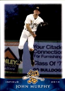
Sunday, November 24, 2019Set: 2014 Grandstand Charleston RiverDogs (Rate) “ I did not know Chris Angel had a baseball card!! I love minor league cards. I wish that hadn't used a white border but the faded look is nice. The back is better than most pro league cards. ” -davidhandberry
“ This is an A+ photo choice for any card, never mind a minor league issue. Nicely done, Grandstand! ” -mkaz80
“ I haven't had a card I have been excited about in a while, but this one has me jumping for joy. Great photo. Design front is not so bad, would prefer something different that the 2014 that is there. ” -parsley24
“ he's floating! love minor league stuff ” -Thunderfoot
“ Nice minor league card. ” -captkirk42
|


Friday, November 22, 2019Set: 2003 Bowman's Best - Blue (Rate) “ Calling this Bowman's best just makes me sad. Bowman you could have been great, I loved several of your sets especially 92. Over the last 3 decades you have faded so much in my esteem. ” -davidhandberry
“ I always say the same thing about Bowman's "Best" as well as Topp's "Finest". Y'all know what that is and it is negative. This is a chrome/refractor type card that looks much better in person than on scan. Back not a fan of these comparative stats they use. ” -captkirk42
“ Wow, football got Bowman's Best as late as 2003? The brand's last appearance in my sport was 2000-01. ” -Billy Kingsley
|

Thursday, November 21, 2019Set: 2008 Upper Deck Documentary (Rate) “ Remember, is the database ends up too slow, this is the set to blame. ” -volbox
“ When I first saw this set it seemed like a great idea for a set. A card for each game of the season. This could have been a great concept but they flunked as soon as they didn't use a picture from that game. The same photo across several games, sometimes the player on the front didn't even play in that game. Then the blurb about the game is off even more, talking about people or persons who aren't shown anywhere. ” -davidhandberry
“ Darn near the most ultimate set ever, 1 huge mistake no identifying name, not that Doc needs one but many others in the set do. ” -baseballcardstoreca
“ When I first saw these I though what a great idea. But after going through a few packs sumthin' just didn't work. Like this card references the Boston Ace but shows Roy Halladay of the Jays. Also the background doesn't look like Fenway Park. ” -Gunny
“ Yep- put the whole set together. Anyone want to try to do the same? Let me know and I can get you a nice starter lot. ” -Dave Sosidka
“ The concept of this set wasn't bad. A card from every game that season (from each team's point of view). Now for set collectors it ballooned way to large, but that is not the main nitpick I have of this set. The pictures are continually reused. For instance if you look at the back of this card at the boxscore, Halladay didn't even pitch it, the winning pitcher is Marcum. An actual shot from each game would have been epic. ” -rmpaq5
“ I like the concept of this set. I think others could copy the idea for football games. ” -cjjt
“ ACK it's a dreaded 1,000s of cards in one set card. Not only that they use the same images for each card the individual player appears on. ” -captkirk42
“ Great card of the great Roy Halladay! ” -Jd_sports
|

Wednesday, November 20, 2019Set: 2011 Topps Allen & Ginter (Rate) Card: #349 Yuniesky Betancourt “ Year after year there is no "funner" product than Allen and Ginter. No Position? A hit per game player , nice stats 785 hits in 810 games . ” -baseballcardstoreca
“ When these first came out I loved them. The painted look, though I bet they were just photoshopped to look that way. The vintage look. There have now been 14 years of Topps Allen and Ginter, there were only 2 years of the ACTUAL Allen and Ginter. ” -davidhandberry
“ one of the more palatable A&G designs ” -parsley24
“ I have always liked A&G. The 2011 design was a big departure from the "standard" A&G design with the border lines, block surrounding the brand name and the team logo. Back completely standard A&G. ” -captkirk42
“ I don't love the location of the name, but maybe that's partially a result of the longer last name. There's something about Allen & Ginter that's unique, but I'm not interested in collecting it on a yearly basis. ” -vanstryland
“ NAF - not a fan ” -NJDevils
“ Some of the Allen & Ginter stuff has such a cool look. I've really come around on these, just like Heritage, over the years. ” -muskie027
|

")