
Random Card of the Day |
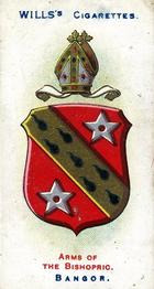
Wednesday, May 15, 2024Set: 1907 Wills's Arms of the Bishopric (Rate) “ I have no clue what this is, but for some reason I want it. ” -hiflew
2
“ I am trying to envision a time where a bunch of people were hanging out on the corner smoking and chatting about the coat of arms of churches that the lads had pulled out of their packs that day. ” -myrke
2
“ A real Bangor of a card. ” -tenlbpain
3
“ Very nice card! ” -cjjt
1
“ "Y'know what our coat of arms needs that'll make it stand out from other regions'? A couple of ninja throwing stars and a sash that looks like it's raining spermatozoa!" -Bangor's coat of arms designer (probably) ” -Theron_Nett
3
“ Nice tobacco era card. ” -captkirk42
1
|

Tuesday, May 14, 2024Set: 2003 Keene Sentinel Keene Swamp Bats (Rate) “ Minor league baseball has the best team names in sports by far. The Swamp Bats! Awesome! ” -jdogg1228
13
“ Interesting that a newspaper releases a set of trading cards for the local team. Also, 'Swamp Bats' is the most minor league-sounding name for a team (I love it, btw.). ” -Theron_Nett
6
“ Whooooo are you? Who? Who? Who who?......ahhh tell me who are you? ” -LeahHobbyShop
2
“ your 2003 Swamp Bat creepy smile of the year ” -fuzthepoet
5
“ Steve Blackwood seems like an appropriate name for someone playing on the Swamp Bats. ” -tinyshogun
5
“ The Swamp Bats? Are teams really that desperate for inoffensive names? Does the mascot hang by the rafters and drop guano on the fans or just dump smelly water on them? ” -hamrlik22
2
“ I like the very impressive resume on the back, as well as the fact that the author seemed to run out of things to say but needed to fill the space with random facts. Uh, parent names... then, uh, birth date. All done. ” -myrke
4
“ My little league picture. ” -Papayanz
6
“ A collegiate league card. I don't think I have ever seen one. Acceptable in design. But, Swamp Bats? Must be some sort of indigenous thing. ” -Rick Gentry
1
“ Nice minor league card. But it looks like one of those home-made little league cards. ” -captkirk42
3
|


Saturday, May 11, 2024Set: 1970 O-Pee-Chee Flags of the World (Rate) “ Interesting card set. ” -Theron_Nett
5
“ Love a good flag card. ” -scottwalker29
7
“ I can imagine the kids in 1970 begging their parents to buy them of pack of "Flags of the World". ” -hamrlik22
6
“ That is not a country where good things happen ” -Lennoxmatt
5
“ I do like that the one user who owns this card is named 'Peace', which is exactly what Haiti needs right now. ” -myrke
3
“ Citigroup's favorite country to exploit. ” -TripleLSupreme
2
|

Friday, May 10, 2024Set: 2004 Bowman - Gold (Rate) “ And for my next trick, I will levitate this football using only MAGIC! Prepare to be amazed! ” -Theron_Nett
8
“ It's the circle of life! And it moves us all! ” -Ganonthegreat
4
“ I forgot Garrison Heart was on the Broncos. ” -Matt9975
4
“ Never knew he played for the Broncos. Turns out he didn't much. ” -tenlbpain
1
“ Garrison Hearst, if I remember, he was drafted by the Cardinals in 1993, still have his rookie card since I thought he was going to be good. ” -Diggsfootball
3
|

Thursday, May 9, 2024Set: 2018 Donruss Optic - Rated Rookie Retro 1984 Signatures Black (Rate) “ Like the retro look of this card. ” -Theron_Nett
9
“ Yes! There are not enough farming cards around. I'll have to look if there are also farm animal and farm machinery cards in this set. ” -Duke
6
“ Ever notice that the newer athletes autographs are getting increasingly incoherent? My first auto was from Bart Starr and it looked great. Reggie White signed well. Now you're lucky to get initials and sometimes that looks terrible. ” -hamrlik22
15
“ "We are Farmers!" Da, da da, da,da, da! ” -althib
6
“ Best case scenario for an unlicensed card photo? A picture of their back. ” -UKboogie
7
“ I love this card. It has a throwback/retro Donruss look and I'll bet it felt good in hand. I wish I had collected these cards. ” -Rick Gentry
4
“ You can also get yourself a date with him on farmersonly dot com. ” -TripleLSupreme
2
“ Kl Fu? ” -rmpaq5
2
|
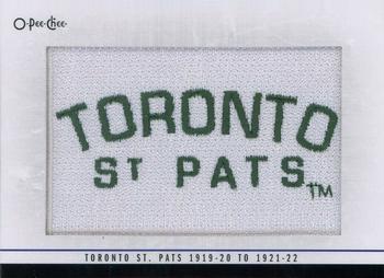
Wednesday, May 8, 2024Set: 2013-14 O-Pee-Chee - Team Logo Patches (Rate) Card: #196 Toronto St. Pats 1919-20 to 1921-22 (Primary) “ Neat patch card. Imagine a card that had a piece of game-worn jersey for the card. "Cool! I got a game worn jersey card for a team that's nearly a century old. But...um...it looks moth-eaten and smells really old and really bad...." ” -Theron_Nett
2
“ Old time hockey! ” -BuccaneersDen
5
“ Color me not impressed ” -tinyshogun
3
“ It seems like a crime to have cut up whatever it was to have made this card. ” -myrke
4
“ I can't decide if it's really cool or really not... ” -Rick Gentry
3
“ I actually don’t know what sport this is, is this soccer, or something? ” -Diggsfootball
|

Tuesday, May 7, 2024Set: 2007-08 Bowman - Chrome (Rate) “ How times have changed. Only 9 chrome and paper parallels plus printing plates! ” -mrackar
6
“ "Hello darkness, my old friend. I've come to dunk on you again...." -Julian Wright (maybe) ” -Theron_Nett
17
“ Tough to make jump shots in the dark. ” -tenlbpain
6
“ This is a very nice card... Typical Bowman quality. ” -Rick Gentry
1
|

Monday, May 6, 2024Set: 2020 Topps UFC Knockout - Green (Rate) “ FALCON PUNCH! (Sorry, I couldn't think of anything better for this CotD.) ” -Theron_Nett
5
“ Is she hitting herself? Is this somekind of a mirror image card? ” -Duke
5
“ I love UFC and MMA, however I have never gotten into collecting UFC trading cards. My wallet cannot afford more cards. ” -tinyshogun
4
|

")