
Random Card of the Day |

Monday, February 28, 2022Set: 2016-17 Panini Court Kings - Portraits Sapphire (Rate) “ I like Booker, but I don't like this card. ” -muskie027
3
“ A typically boring Panini parallel; at least it’s not as ugly as some of their other designs. ” -pugchump
2
“ Wow! That's awful. ” -BigDaddy
5
“ All that color and then a white box. Its like making a huge box cake and not frosting one side. ” -TwinKiller
“ Court Kings - first thing I thought was will this be a tennis player?, but basketball obviously makes sense as well. ” -Tscastle
“ I'm not crazy about this one. ” -switzr1
“ MMMKay, This is a parallel of an inserrt? Front looks awful. Back is plain but OK for an insert. ” -captkirk42
“ Ah yes. This is a good card here. If Booker keeps up his pace until he retires, he may get into the hall of fame. ” -BigBoyOnWheels
1
“ Dude can play some ball!! ” -tinyshogun
1
|

Sunday, February 27, 2022Set: 2002 Fleer Platinum - Nameplates (Rate) “ I think this is a really great card. I never saw one before. Amazed at what can be done when designers put their mind to it ” -NJDevils
4
“ Very nice patch card. The front text doesn't show up well on the scan because it's chromed but I bet it looks great in hand. ” -pugchump
4
“ I remember this guy being a fan of Batman. I will always remember an old Snickers commercial where a football player gets knocked senseless and when asked if he knows who he is replies, "I am Batman."
” -freakizon
4
“ Very Cool Card. This is a great MEM card. ” -parsley24
“ Nice looking relic card and I don't like relic cards. ” -captkirk42
1
“ A lot of Green on this card! ” -BuccaneersDen
3
“ I love the NBA version of this insert and hope to complete it some day. ” -Billy Kingsley
1
“ This is a pretty nice insert. ” -Brendan Barrick
“ Nice looking card. I liked Ahman. He was a studd in Green Bay. ” -BigDaddy
“ I need more green. Someone get me some more green. ” -TwinKiller
1
“ Lots of Green, very appropriate! ” -Tscastle
“ Card-Patch ratio is terrible. Somehow I've heard of this guy, being a Lions fan and all. ” -BigBoyOnWheels
1
|

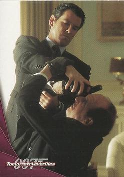
Friday, February 25, 2022Set: 1997 Inkworks James Bond Tomorrow Never Dies (Rate) “ The character is Dr. Kaufman and the actor is Vincent Schiavelli. Weird that they didn't put that on the card. Somebody should probably create PIDs for both of them, too... ” -pugchump
1
“ No ” -BigDaddy
5
“ Batting glove on left hand. ” -NJDevils
2
“ Hmm James Bond card. Not a very good photo for a card. ” -captkirk42
“ "Here comes the airplane! Open up!" ” -TwinKiller
4
“ What exactly is going on here? ” -NickyCollects
|
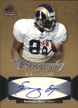
Thursday, February 24, 2022Set: 2006 SP Authentic - Chirography (Rate) “ Needs some more detail but I like it overall. Interesting name for a set too lol. ” -pugchump
1
“ Should be called a Hieroglyphics card. Not the worst looking signature I've seen, but pretty much illegible. ” -hamrlik22
4
“ Great scan and good looking card ” -parsley24
1
“ Okay. I don't remember this guy at all. ” -BigBoyOnWheels
“ There is NO WAY you get "Dominique Byrd" from that signature. "F" for handwriting. ” -Musclebeech
2
“ An OK autograph card. Somewhere I have a Dominique Byrd Signature card but I forget which year/set/brand. ” -captkirk42
“ Byrd didn't have much of a career. He need to work on his signature. This is an ok design of a card. ” -Brendan Barrick
“ This guy never turned out to be big. ” -tinyshogun
2
“ That's a cool artistic looking signature. ” -muskie027
1
|

Wednesday, February 23, 2022Set: 1999 SkyBox Star Trek: Deep Space Nine: Memories from the Future (Rate) “ A Star Trek card open for comments on the same day a Star Wars card is RCOTD should be enough to make the “coincidences” list as far as I’m concerned. ” -pugchump
7
“ A Star Trek Card up for comments when a Star Wars Card is on the main page....let the fanboy arguing begin! ” -rmpaq5
4
“ What? You didn't see him grab that face mask? Are you blind? ” -hamrlik22
4
“ This is the look I get from my kids when I try explaining how I didn't even have a cell phone when I was 10. ” -jackal726
5
“ I thought this was some SNL parody of a Sci Fi movie. Those clothes! ” -switzr1
2
“ These dudes always freaked me out. Probably a big reason i dont like star trek ” -parsley24
3
“ They don't look green to me. ” -TwinKiller
4
“ That was such a good episode! I've got a few autographed DS9 cards, but should seek out some sets like this one as well. ” -DanD
|

Tuesday, February 22, 2022Set: 2019 Topps Heritage - Black Border (Rate) “ I can live without the black border. ” -Brendan Barrick
4
“ I love the parallels in this set; this photo does not do them justice. The chrome ones are even better. This card's scan needs a replacement though. ” -pugchump
3
“ Very nice Cardinals card that I don't have. ” -switzr1
2
“ He's had a great career, even with me hating the Cardinals!!! ” -tinyshogun
2
“ That's what a baseball card should look like. 👍 ” -sundin
1
“ Such an odd parallel. It looks OK but that is one of the things about Heritage I don't like so much is the parallels and extra insert sets that Topps feels they have to add because current sets have them. ” -captkirk42
“ I was not a fan of this heritage set, but if they were all black i may have had a different opinion. ” -parsley24
“ I wonder when the Cardinals will move on from him... ” -BigBoyOnWheels
1
“ I like Heritage. I like how it brings the old designs back into the limelight. Originally, I hated them when I got back into collecting, but now I am hooked. ” -muskie027
3
“ I remember seeing Paul once while he was with Peoria. I had no idea them that he would become a star. ” -Derek McDonough
1
“ He was an up and coming star, but then he had a bad year and now I kinda forgot about him until I saw this RCOTD. ” -jdogg1228
2
|

Monday, February 21, 2022Set: 2003 Topps 1st Edition (Rate) “ I love 2003 Topps baseball and it looks like the football set is just as nice. Hopefully they don’t brick as badly as the baseball ones do though. ” -pugchump
3
“ Garcia was an underrated QB. I'm not a fan of this design. There's too many things floating randomly in the picture. ” -BigDaddy
4
“ Never turned out to be what I thought he would! ” -tinyshogun
1
“ Not bad, but way too many logos. ” -parsley24
4
“ Nice looking card but player name I can't read in the scan ” -captkirk42
“ I know the odds are against it, but one of these days I would like to have one of my scans show up on RCD. I love seeing NFL cards as that is what I collect, especially NYG. I submitted front scans for card #s 105 and 307 of this set, both Jeremy Shockey. ” -freakizon
“ This is a nice card. ” -Brendan Barrick
“ i usually like parralells, but this style where everything is the same bugs me cause you can miss it so easy, other than that the 03 topps designs is enjoyable ” -Thunderfoot
|
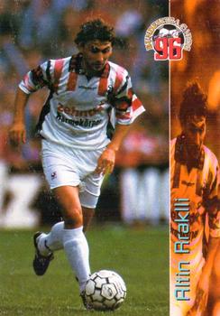
Sunday, February 20, 2022Set: 1995-96 Panini Bundesliga (Rate) “ Totally into this card and sets of foreign leagues! ” -muskie027
1
“ Near looking card. Lots of color, action photo, stats on the reverse. Pretty cool. ” -Derek McDonough
1
“ Wow they managed to use the same photo 3 times on one card, that’s kind of lazy. ” -pugchump
5
“ Fussball??? ” -tinyshogun
“ ACK sideways player name. Team name or logo needs to be on front. ” -captkirk42
|
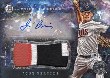
Saturday, February 19, 2022Set: 2016 Bowman Inception - Autograph Jumbo Patch (Rate) “ Very cool front. Needs more on the back. ” -pugchump
2
“ Awesome card! Great pitcher!! ” -tinyshogun
1
“ Hi-End Relic card looking way to flashy with a back that is far too plain. ” -captkirk42
“ MUST. OWN. THIS. CARD! ” -TwinKiller
2
“ Nice card. I would take it. I don't remember an autograph patch card coming up as RCOTD before. ” -switzr1
“ For a memorabilia card, I like it. ” -muskie027
|

")