
Random Card of the Day |
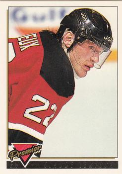
Saturday, April 18, 2015Year: 1993-94 Set: Topps Premier - Gold (Rate) “ Didn't Claude Lemieux appear recently as another card of the day? I guess when you've won Stanley Cups with three different teams you get to do that. ” -armac
“ Decent set. I like the back design. The pattern printed under the stats "works" for me. I think it's supposed to be an ice design. ” -Billy Kingsley
“ As a Rangers fan, I hated Claude during this playing days. Respected him, but hated him! By the way, this is a great looking card. Love the photo choices on the front and back. Simple, attractive design. A winner! ” -mkaz80
“ This is a perfect example of how NOT to do a gold parallel. So hard to read the name. ” -switzr1
“ Very weak design. ” -carthage44
“ Claude Lemieux again? On a scale form 1-10, this design gets about a 5. ” -vrooomed
“ Maybe it's the clunkiness, but I surprisingly like the Devils' number font. ” -jlaz10
“ The great agitator,I like this set. ” -uncaian
“ I think the design of this card isszzzzzzzzzzzzzzzzz ” -C2Cigars
“ I hope that gold foil name is easier to read in real life. I can't make it out in the scan. That is why I hate many of the Junk Year designs. They strayed from the tried and true easy to read simple designs. They started to go with flashy and trashy. ” -captkirk42
|


")