
Random Card of the Day |
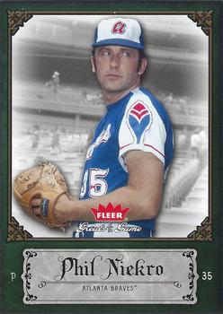
Friday, January 29, 2016Year: 2006 Set: Fleer Greats of the Game (Rate) “ Excellent card design and all. Why can't the regular issues be like this? ” -captkirk42
“ Good picture and back, but the frame is poor. ” -cjjt
“ A true great from the 70's & 80's. Most of that with one team. Knuckleballer Kniekro! ” -Kaline6
“ def great.. ever try to hit a knuckle ball?? ” -tonym
“ Classy design. I like it. ” -Billy Kingsley
“ What's not to like about this card? In my opinion, Fleer did a good job on this set for several years. The nearly-illegible font might be the only thing I can nitpick about... ” -dilemma19
“ The last year of the Greats of the Game sets. I got screwed by Fleer in 2004 when I had some high end auto redemptions and got basketball cards instead when they went bankrupt. These sets are my obsession. ” -CluelessJoe
“ I really like it, except for the weird pirate font going on. ” -RoyalChief
“ Interestingly enough, I prefer the back to the front. Also, I'm a big fan of retired player cards with stats on the back, like this card. ” -DarkSide830
“ Good all-around! ” -carthage44
“ LOVE IT! My HOF binder would be a fraction of its size were it not for sets like this. ” -switzr1
“ Nice back and I like the thickness of the stock on which the Fleer GOGs are printed ” -NJDevils
|

")