
Random Card of the Day |
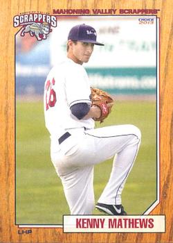
Thursday, September 8, 2016Year: 2013 Set: Choice Mahoning Valley Scrappers (Rate) “ I like it. Minor league cards lately are better than most pro cards of the 2000s it seems. ” -Billy Kingsley
“ I have grown to love minor league card sets. They usually have a great design, as this card does. It is always interesting to look through these sets to see how hard it is to make it to the majors, as most players never make it. Also, you never know who will show up on a card as a coach or manager. As a Twins collector I was surprised to see Scott Erickson in this set. Very nice set!! ” -twinscollector34
“ Wow neat card, total 87 Topps. What exactly is a scrapper? And what does that say on the back "Scrappermania"? ” -RoyalChief
“ Nice variation on the 1987/1962 Topps themes. This team is in the New York-Penn League, which is the same league as the team a mile away from me (HV Renegades), so I may have actually seen this guy play. Nice design to the card. ” -vrooomed
“ Fantastic minor league card! Wood border on front: Check. Subtle baseball background on back: Check. Despite not signing until the second time he was drafted, this guy was still only 20 when this card was printed. Would have thought he'd still have a shot, but presently he's carrying a 6.23 ERA in A-ball. ” -dilemma19
“ Nice minor league card. Nothing bad to say. I like the faux wood background reminiscent of 1962 Topps, Actually with the lighter color more like 1987 Topps. I don't follow minor league baseball but I do collect the mascots. I have a card of their mascot Scrappy that I made a "Mascot Monday" for on my blog http://captkirk42.blogspot.com/2012/11/mascot-monday-scrappy.html I really need to do more of those posts soon. ” -captkirk42
“ I really like the wood border style cards. This is really well done for a team issue minor league set. ” -rmpaq5
“ Glad they still make minor league baseball cards. They went with the 1987 Topps look. I like it! ” -carthage44
“ Nice looking card, clean easy to read front ” -aussiewayne
“ Wow a curveball here! A set I've never seen before. It definitely pays homage to my favorite all-time set 1987 Topps Baseball, Which was the first set I ever completed by purchasing packs and trading with friends. Enough about 1987 Topps. The name is easy to read. The logo is on the front another plus. The only negative i can see other than this being posed is the Position is a bit hard to read with the black on wood grain at this resolution. It could have been an oval or something with the postion. I am shocked that the card producer is not more prominent...and I love it! The bio could of included a highlight for the players career at some level. ” -collect-a-set
|

")