Wednesday, February 1, 2017
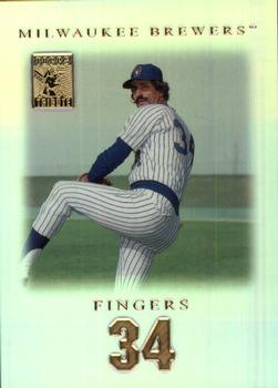
Year: 2001
Set: Topps Tribute (Rate)
Card: #64 Rollie Fingers
“ The best moustache in sports! I should really go full handlebar some day...just to see the reactions I'd get. ” -Billy Kingsley
“ An iconic player. Old school in the modern era. I have always loved the mustache and the name. It just breathes baseball. ” -Sportzcommish
“ Love the card! I only have a couple, hopefully will get more later! ” -Joshua825
“ Awesome! Always loved that "stash"! I'd love to own any of his cards, this one included! ” -bkklaos
“ Not a bad card , coolest mustache in baseball . ” -uncaian
“ Ordinary, but classy at the same time. Not as classy as that mustache though. ” -tbshaw
“ Rollie and Goose's mustaches were top five all time. I wish I were secure enough to rock that curl 'stache. ” -Brimose
“ Nice looking front. The problem is over there years there have been tons of tribute sets that look like that. The back looks like a commercial made Kodak commemorative slide from some theme park. ” -captkirk42
“ I can't believe the Brewers retired his jersey number 34. He is much more famous for his years with the A's and Padres than his final years with the Brew Crew. Yes, he won the AL MVP and Cy Young award in 1981 (his first year with the Brewers) but that qualifies as retiring a jersey number? I guess the Brewers were just eager to retire a jersey since the only number they had retired in 1992 (the year they retired Fingers jersey), was #44 Hank Aaron. ” -carthage44
“ Rollie Fingers the man with 'stache. ” -kirkscards
“ I like this design. The shadowed edges effect is intriguing, and the stamp in the upper left catches my eye. I assume that's a holofoil/chrome surface that looks better in hand than on a scan. All in all, I give this a thumbs up. ” -jasongerman9
“ Fingers 34 sounds like it could be a band name, or a nightclub. ” -sahal694
“ I loved getting a Rollie Fingers card!! That oh so perfect mustache!!! His flare gave him fame above his closer abilities. As for this card, it isn't bad. A few things could hae made it better, such as making the picture bigger, putting his full name on it, and maybe not having his number be so big on the front and back. Some more stats, perhaps an annual breakout, would have been nicer too. ” -muskie027
“ The best mustache in baseball...ever! The card has way too much wasted white space. Hate that. ” -C2Cigars
“ I like it. Minimal design. Good use of gold. ” -cjjt


")